In the spirit of “create the things you wish existed,” I’ve finally begun work on a project I’ve been thinking about for several (!) years: the autistically detailed map of photo booths in Portland, Oregon, that my autistic brain wants to see in the world. It’s called the PDX PHOTO BOOTH MAP and I’m very excited about it.
The map is organized into two categories: “bars and restaurants” (purple icons) and “everywhere else” (reddish-orange icons). I chose these categories because I love photo booths, I don’t drink or eat out (and therefore don’t spend time in bars or restaurants), and I wanted a list of photo booths I could visit that weren’t in those spaces. My hope is that these categories will be useful to others, too (teenagers, families, other adults who don’t drink and/or eat out, etc.).
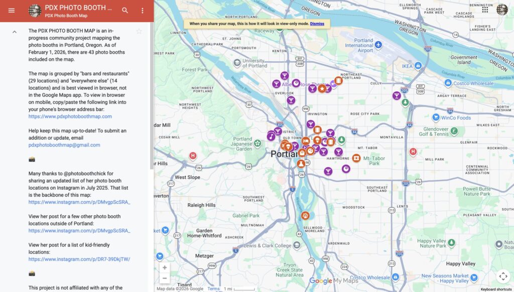
View of the map on desktop/laptop.
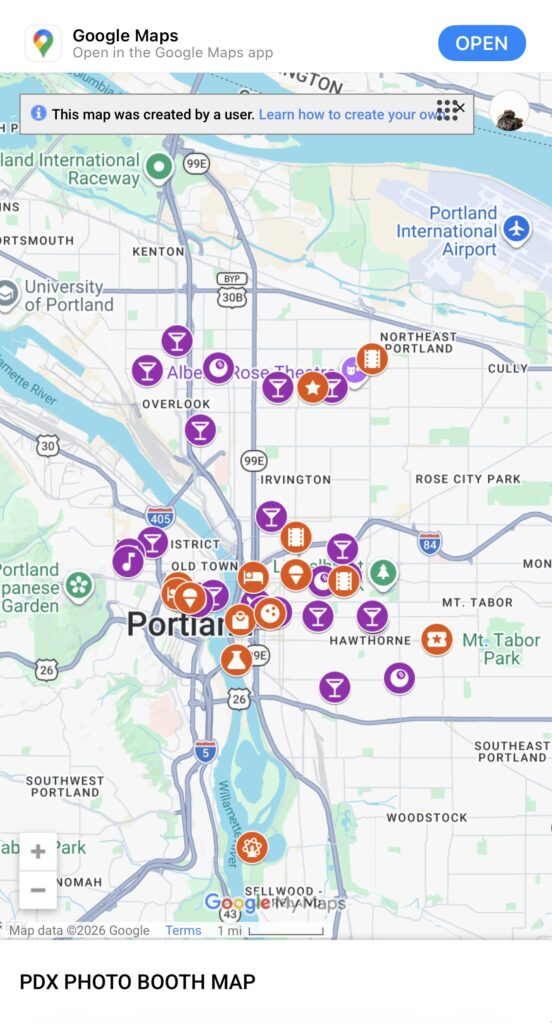
For whatever reason, the map doesn’t consistently work in the Google Maps app—sometimes a location’s details show, sometimes they don’t. According to the internet, this is a known issue with no solution. If the details of each location matter to you, you’ll have the best experience accessing the map from browser on mobile (copy/paste or type www.photoboothmap.com into your phone’s browser), or from a laptop/desktop. If you’re after only the location and don’t care about the other details, accessing the map in-app will work fine.
View of the map on mobile, in the browser.
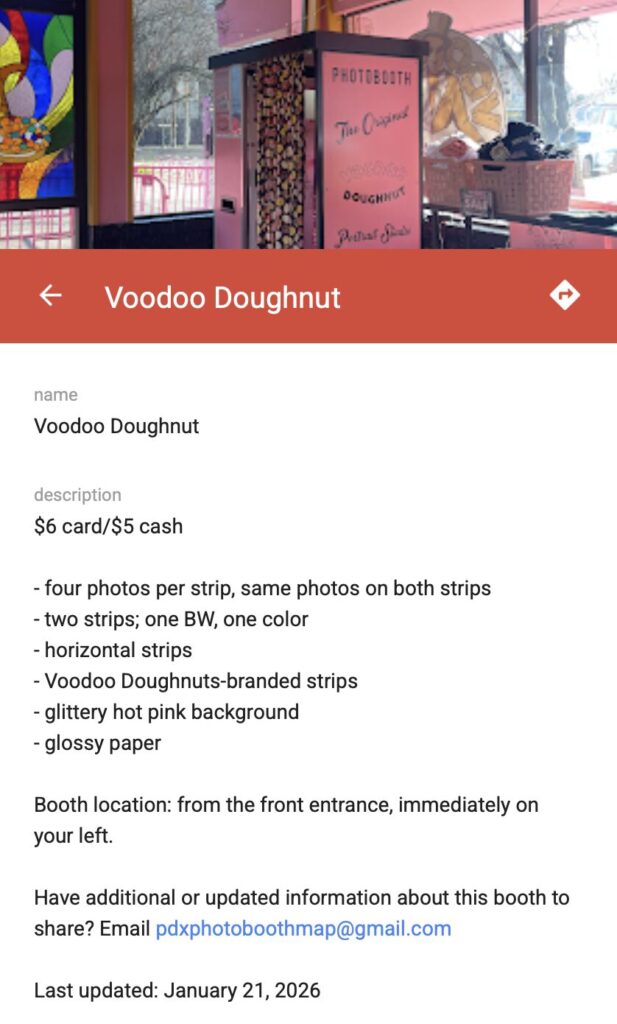
As of publication of this post, there are 43 entries on the map: 29 photo booths in the “bars and restaurants” category, 14 in the “everywhere else” category. Not all of them are complete. Here’s what a completed entry looks like (on laptop/desktop):
In addition to these details, the entry also includes three photos of the booth itself that I took: one showing what it looks like and where it’s located (as seen in the screenshot), one showing what the background option looks like (hot pink sequins), and one showing what the photo strips you get from it look like. My goal is for every entry on the map to include the same details seen in this photo booth’s entry, and the same three types of photos.
Almost every photo booth in the “everywhere else” category is complete. The one exception is QuarterWorld, which has a few details but is missing others. It’s also missing photos. Almost all of the photo booths in the “bars and restaurants” categories are incomplete—they have no written information or photos. Can you help complete these entries? Do you have additional or updated information about any of the photo booths included on the map? Do you know of a photo booth in the city that’s not yet listed on the map? Email me (please!): pdxphotoboothmap@gmail.com. And, of course, please share the map with your fellow Portlanders, visitors, and photo booth enthusiasts. Happy photo boothing!
UPDATE – 2/2/2025: I added 11 more word searches—for a total of 24—and made a digital version that you can print at home available for purchase. If you’d like to be notified when a physical, bound version is available, you can sign up here. Thank you for your support!
In early 2025, I got very into word search puzzles. After completing a few hundred of them, I decided to try making my own. Almost immediately—like, minutes after thinking, “I want to make my own set of word searches”—the creative gods blessed me with the idea of making a Severance-themed collection. And so ensued a three-week-long descent into extreme, all-consuming autistic hyperfocus. The result: the most fun outcome possible.
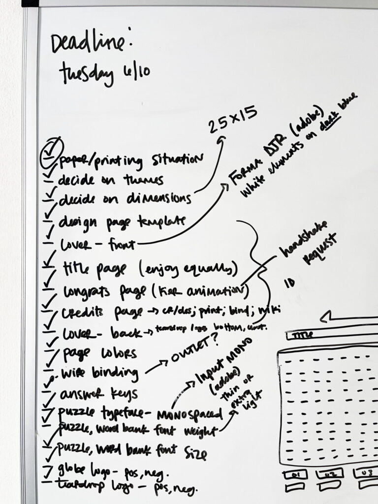
By the end of that first day—the day the creative gods blessed me with this idea—I’d:
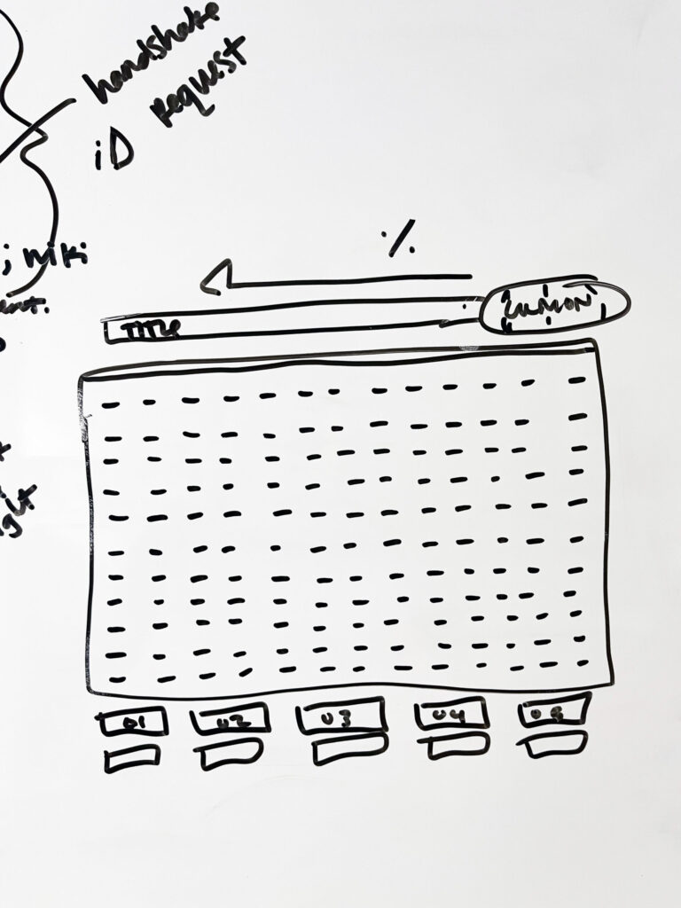
sketched on my whiteboard a very rough idea of what I envisioned each word search puzzle would look (the MDR terminal screen);
begun scouring the Severance wiki for every bit of information I could find about the typefaces, colors, and branded assets used for Lumon documents;
started researching different printing techniques, paper types and suppliers, and local print shops and their capabilities and prices;
created a spreadsheet to organize puzzle theme ideas;
and begun the first of a ridiculous number of rewatches of both seasons, to collect possible word search themes in my freshly made spreadsheet, and to note color and design details of documents in the show.
Within a week, I’d:
ordered paper samples,
emailed various stationery brands and print shops across the U.S. with questions about specific materials and techniques I wanted to use,
researched word search puzzle generators,
researched which design program was best for this project (Adobe InDesign),
watched hours of YouTube tutorials on how to do a bunch of basic things in InDesign,
scoured YouTube for a decent tutorial on how to create a word search puzzle in InDesign,
finished several rewatches of the entire series,
updated my whiteboard to include a very rudimentary checklist of the main project tasks and decisions,
tentatively decided on a local print shop,
and started a file of reference material (colors, paper weights, binding examples, printing techniques, etc. I wanted to use) to bring to the print shop with me.
At this point, I also realized I needed to make two important decisions, or else I’d never get the project out of my head and laptop and into my hand:
I needed to pick a number of word search themes for this first run, and
I needed to pick a date by which I’d start Adobe’s seven-day free trial.
In the spirit of “make it exist first, make it perfect later,” I decided on 13 puzzles and a June 10 deadline, which gave me till June 17 to do everything I needed to in InDesign before the free trial was up.
After deciding on the number of puzzles and my “design by” deadline date, I:
completed a few more rewatches of the series, each time paying attention to a specific puzzle theme or Lumon document design;
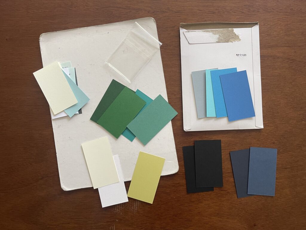
decided on cover and page colors, and word search dimensions (25 letters across, 15 down);
reviewed all the entries in my spreadsheet; chose the first 13 themes with word and letter counts that would fit the puzzle dimensions;
created the word searches using two different online puzzle generators;
rewatched the YouTube tutorial I found on how to create word searches in InDesign several more times;
decided which pages would be what color; and
committed to a printing technique (digital) and local print shop.
Because I was on a tight budget for this project, I needed to complete the entire thing within Adobe’s seven-day free trial window. Before I signed up for the free trial, I made every possible decision about the project’s design that I needed to, including visiting the local print shop I decided to use to select my cover and paper options in person, and watched enough YouTube tutorials enough times to feel confident I could do what I needed to in InDesign to bring this project to life on such a tight timeline.
Then, I researched how to cancel the free trialand walked through the steps to make sure the instructions were accurate—I needed to know in advance how convoluted of a process it would or wouldn’t be so I knew how many spoons to allocate to it (thankfully, and surprisingly, it’s a very straightforward process). Only after confirming Adobe’s cancellation process did I sign up for their free trial—which I immediately cancelled so I didn’t forget to do so later/wasn’t charged at the end of it—and got to work. I had seven days to figure out the program and get the project done.
It took me a few days to create all the puzzles and answer keys; figure out how to format the word banks (which didn’t go as planned); and settle on font sizes and weights, and the placement and spacing of the Lumon logo, letterheads, and lines. During this stage, I spent a lot of time browsing other Severance fan art/projects, mostly on Etsy and Reddit, to study the design choices other people—people with actual graphic design skills and experience and knowledge—made. Once I was happy with my project, I sent it off to the printer. A few days later, I picked up the proof.
I was elated. It was so cool to see something I worked so hard on come to life. To hold it in my hand. Prior to this project, I had no experience with or exposure to InDesign (I’d never even opened the program); I had no experience making word searches; I had no experience with professional printing concepts or conventions; and I had (and still have) no graphic design experience or skills. I was thrilled that it all turned out.
A few months later (finances), I formally approved the proof, which officially moved my project into the print queue, and the rest is history.
Here’s a closer look at the final product:
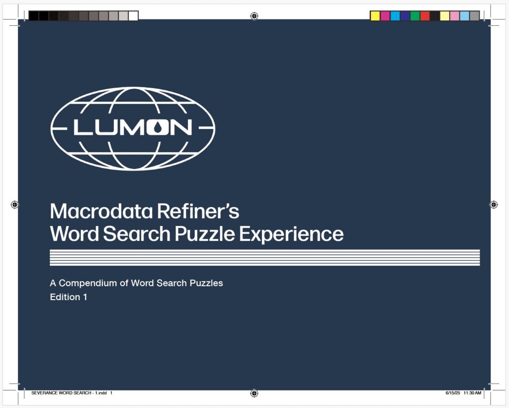
Front cover
Overall, I’m very happy with the front cover—the design, the color, the typography choices I made (typefaces, fonts, leading and kerning, placement in relation to the logo and band of lines).
The Lumon logo is a high-res image from this logo pack. I created the band of lines manually—line by line—in InDesign, using this image, this image, and various other stills from the show I took on my phone as reference for the weight, spacing, and placement, including running the band of lines closer to the right edge than to the left edge.
I’m less happy with the actual title. Or, rather, the second word of the title. I’m not sure why I went with “Macrodata Refiner’s…” instead of “Macrodata Refinement…” While some document titles in the show contain a job title (e.g., “Senior Refiner Morning Checklist,” and “Innie Resignation Form”), not a single document I noticed during my rewatches contains a possessive in the document title. These details are important to me—from the beginning, it’s been important to me this project be as true to Lumon branding and design as possible.
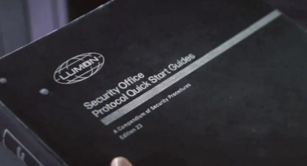
Originally, I’d subtitled the booklet “A Collection of Word Search Puzzles, Volume 1.” Ultimately, I modeled the subtitle off the subtitle of the Security Office Protocol Quick Start Guide, using “Compendium” instead of “Collection” and “Edition” instead of “Volume.”
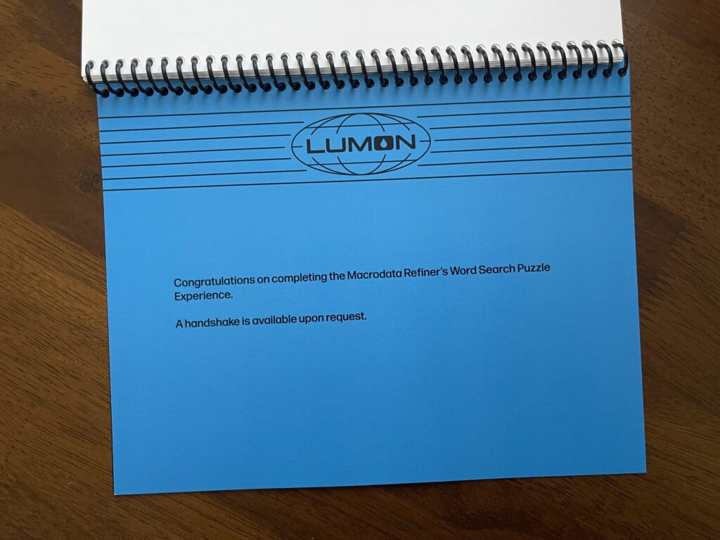
What I plan to do differently next print run: Change the title to “Macrodata Refinement Word Search Puzzle Experience” (I plan to do this on the “Congratulations” page at the end, too).
* * *
First page
Mostly good.
I modeled this page (and the “Congratulations” page at the end) after the Lumon letterhead, as seen on the Music Dance Experience selection card.
I created the letterhead using a high-res logo included in the same logo pack linked above, and by individually drawing each line using the line tool in InDesign. I’m not sure why I didn’t use the black Lumon logo. It’s true that the logo pack I purchased didn’t include it. It’s also true that it’s available on the Severance wiki. I have no clue what I was (or wasn’t) thinking.
What I plan to do differently next print run: Replace the transparent Lumon logo with the black one. Add the word “backward” after “diagonally.”
* * *
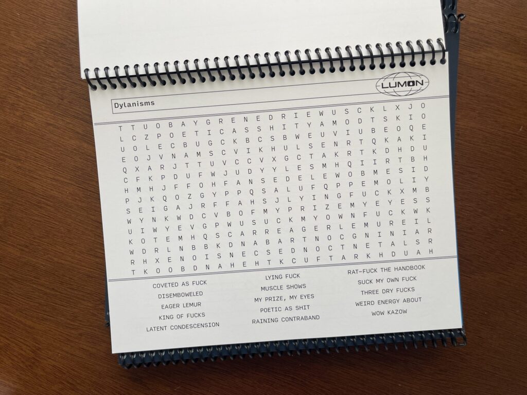
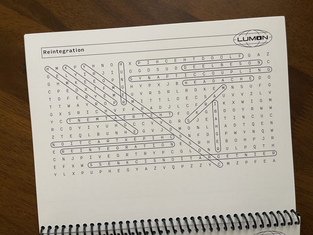
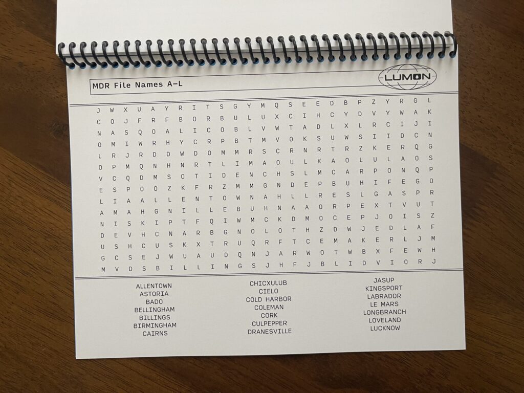
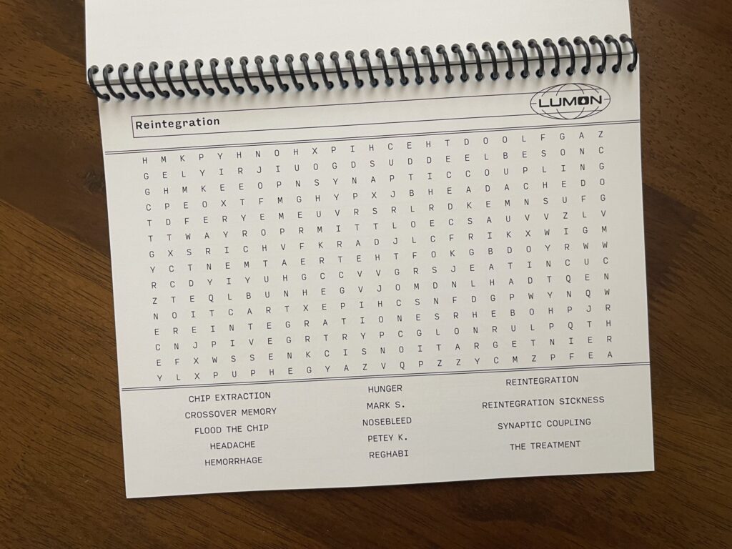
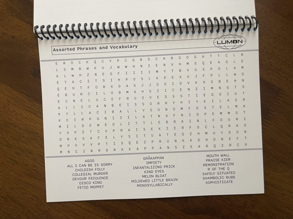
Word search pages
Overall, these pages turned out great. I’m very happy with how well they mimic the MDR terminal screen. My biggest frustration: the word banks.
In the show, the MDR terminal screens display five evenly spaced columns at the bottom. I wanted to mimic this and divide the word bank into five evenly spaced columns. To my infinite frustration, I could not for the life of me figure out how to both divide the word bank into five equal columns and, when necessary, get the text to wrap correctly. The only configuration I could get to consistently work across all pages with all word options was three evenly spaced columns.
My other frustration: the sets of double lines bounding the top and bottom of the puzzle area don’t fully extend to the left side of the page.
What I plan to do differently next print run: Try to figure out how to divide the word bank into five equal columns and how to get the text to wrap correctly. Ensure the sets of double lines bounding the top and bottom of the puzzle areas fully extend to the left side of each page. Add more word searches (13 isn’t enough!).
* * *
Answer keys
These pages turned out great. I wasn’t sure that they would. To make the answers easier to read, I removed the sets of double lines bounding the top and bottom of the puzzle area. I also removed the word banks and left the placement of each puzzle alone instead of centering it on the page. I wasn’t sure how this would look and feel to the eye. I worried it might look and feel ungrounded. When the proofs came back, I was thrilled at how they turned out.
Each puzzle’s answer key is on the back side of the page the puzzle is printed on, with the puzzle reversed so that when you flip up the page you can easily see the answers key without turning the booklet around. The weight of the paper I chose is thick enough that the answer keys aren’t visible through the page.
What I plan to do differently next print run: Nothing.
* * *
“Congratulations” page
Similar to the first page, I’m mostly happy with this page. The color turned out great, and I like the size and placement of the text. My two issues with this page: the transparent Lumon logo, and the possessive in the text.
What I plan to do differently next print run: Replace the transparent Lumon logo with the black one. Remove the possessive: change “Macrodata Refiner’s…” to “Macrodata Refinement…”
* * *
Credits page
Modeled after the show’s end credits, I’m very happy with how this page turned out. Perfect. 10/10. No notes.
What I plan to do differently next print run: Nothing.
* * *
Back cover
In this first run, the “credits” page doubles as the back cover (it’s printed on cover weight paper). It’s fine. In a dream world, the “credits” page would be a regular page and the back cover would be thick chipboard, with a small Lumon teardrop icon debossed into the bottom center on the back. Unfortunately, none of the local printers I asked are able to do this.
What I plan to do differently next print run: Convert the current back cover (which is the “credits page”) to a regular page and use the same cover weight and color of paper as I did for the front cover, with a small white Lumon teardrop icon centered at the bottom on the back.
* * *
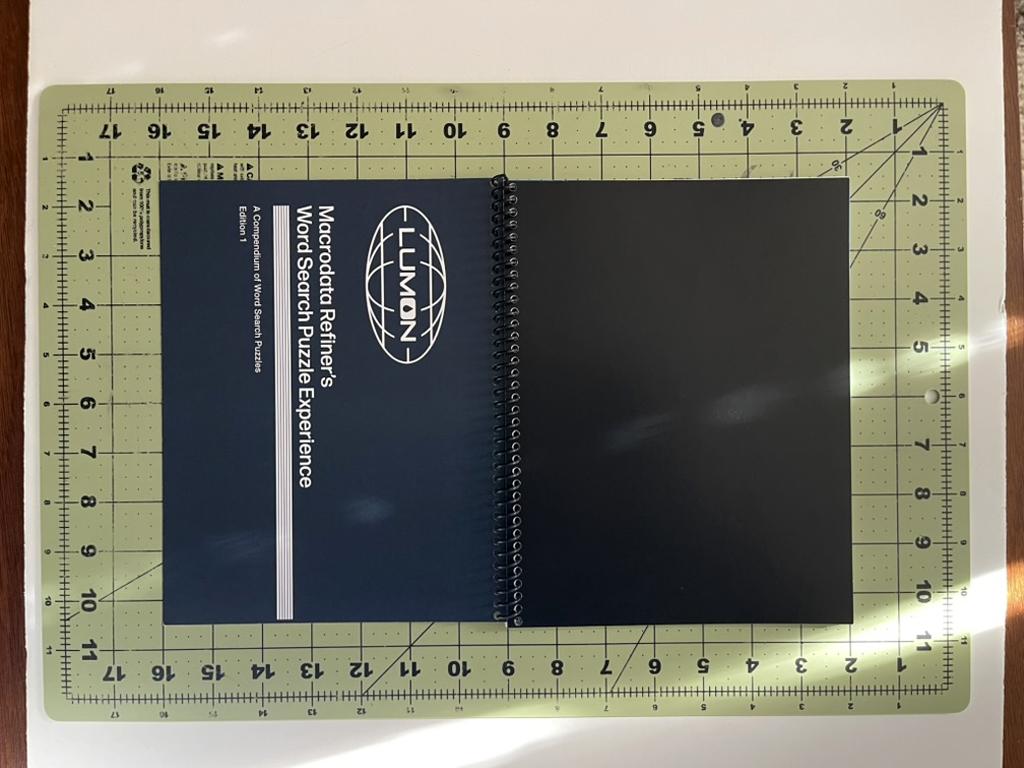
Binding
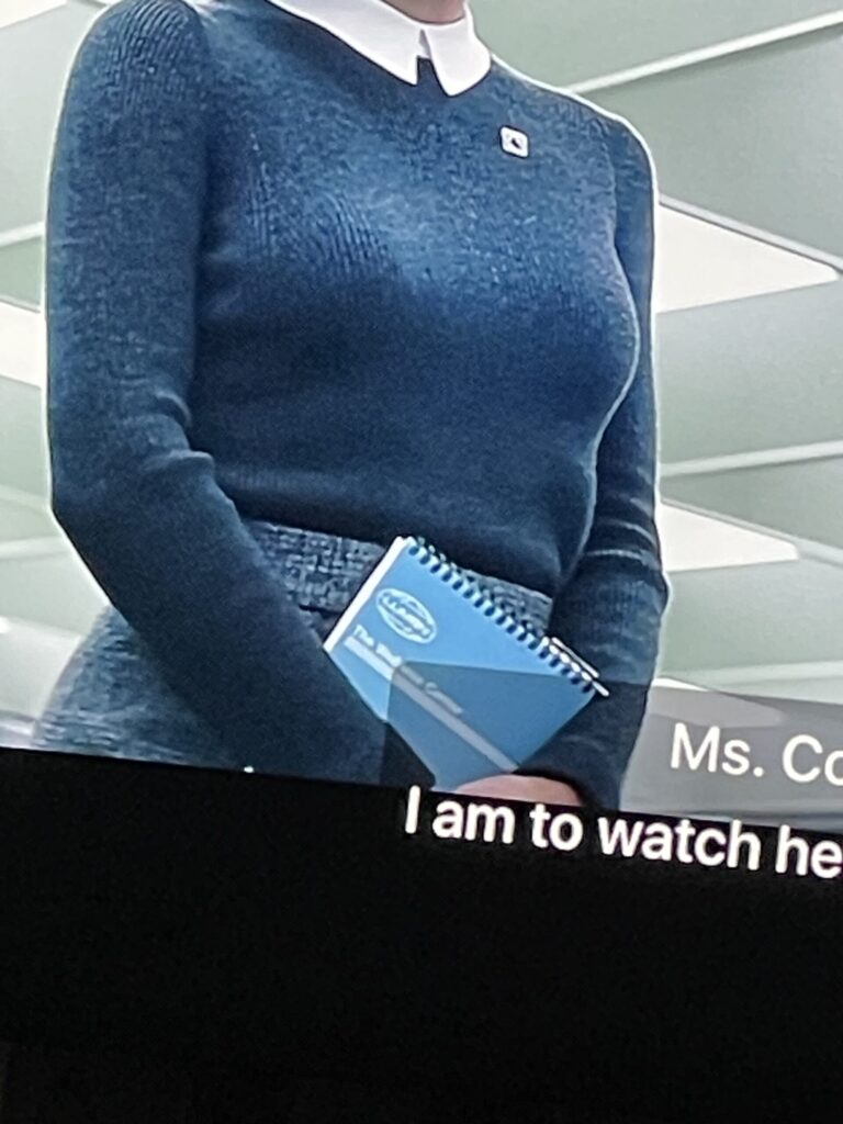
In all of my rewatches of the show, I noticed only one example of a bound notebook—the Wellness Center steno notebooks carried by Ms. Casey (in S1E5, she’s holding one while observing Helly R. in the MDR office upon her return to work after her elevator incident, and is later seen holding a stack of them while walking through the halls). These notebooks are bound using Wire-O binding color-matched to the front cover.
For this reason, I was determined to use Wire-O binding color-matched (as best as possible) to the blue of the booklet’s front cover. Unfortunately, the printer I worked with doesn’t offer Wire-O binding in-house and the binding service they outsource this type of binding to quoted me a ridiculously high dollar amount that was miles outside my budget ($100 for 5 bindings; $20 each). I found a place in town that lets you Wire-O bind your own material using their supplies and tools, for only $0.60 per binding plus a $7 facility day-use fee. After reviewing the proof and seeing how thin each booklet is with only 13 puzzles, I decided to skip Wire-O binding with this first batch and opted to have the printer spiral-bind each booklet in-house, which ran me $5 per booklet.
Two things are true: the binding is well-done, and it’s not what I wanted—and for that second reason alone, I’m not happy with it. I had my heart set on Wire-O binding for three reasons: it’s authentic to the bound notebooks in the show; it’s more durable; and it provides a more polished look. I’m determined to use it for the next print run.
What I plan to do differently next print run: Wire-O binding. The next print run will have more puzzles/pages, and will therefore be thicker and, I anticipate, better suited for Wire-O binding. I’m hoping to use a dark blue identical or similar to the color of the cover. If that’s not an option, I plan to go with black.
* * *
Orientation and dimensions
Because I was set on having the word search puzzles mimic the MDR terminal screens, the collection of puzzles is bound horizontally. It was also important to me that the size of each booklet adhered to common word search book dimensions. Each booklet measures 7″ x 9″, which is similar to many other popular collections of word search puzzles. Before committing to those dimensions, I measured all of the word search books I have at home, and researched the dimensions of a number of top-selling word search book online.
What I plan to do differently next print run: Nothing.
* * *
Colors
I’m very happy with the colors I chose.
Originally, I was set on having the text of everything except the puzzles and answer keys printed on colored paper, so I ordered a bunch of paper samples in different finishes, weights, and colors. I quickly learned digital printing made more sense for this project (you live and you learn). No problem. I used the CMYK values of the colored paper samples I liked to make each colored page the correct color in InDesign.
What I plan to do differently next print run: Nothing.
* * *
Typography
I stayed as true to the show’s typography as much as Adobe Fonts allowed, and I think the typography—all of it—looks great.
What I plan to do differently next print run: Nothing.
* * *
I’m very grateful I had enough time, executive functioning, and money to take this project on. I had so much fun working on it, I’m very proud of how it turned out, and I cannot wait to bring version 2.0 to life.
UPDATE – 2/2/2025: I added 11 more word searches—for a total of 24—and made a digital version that you can print at home available for purchase. If you’d like to be notified when a physical, bound version is available, you can sign up here. Thank you for your support!
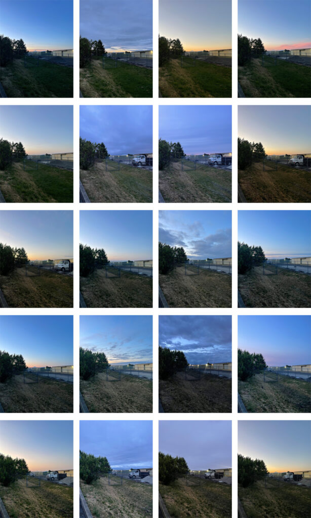
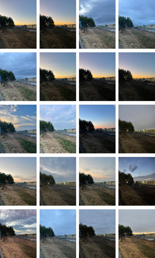
Two hundred and twenty-two sunrises later, I’m officially done with this project. I had a lot of fun with it, and I’m glad to be done (“done”) with it (I’ll almost certainly have a photo book printed at some point).
September 16, 2025, through October 20, 2025.
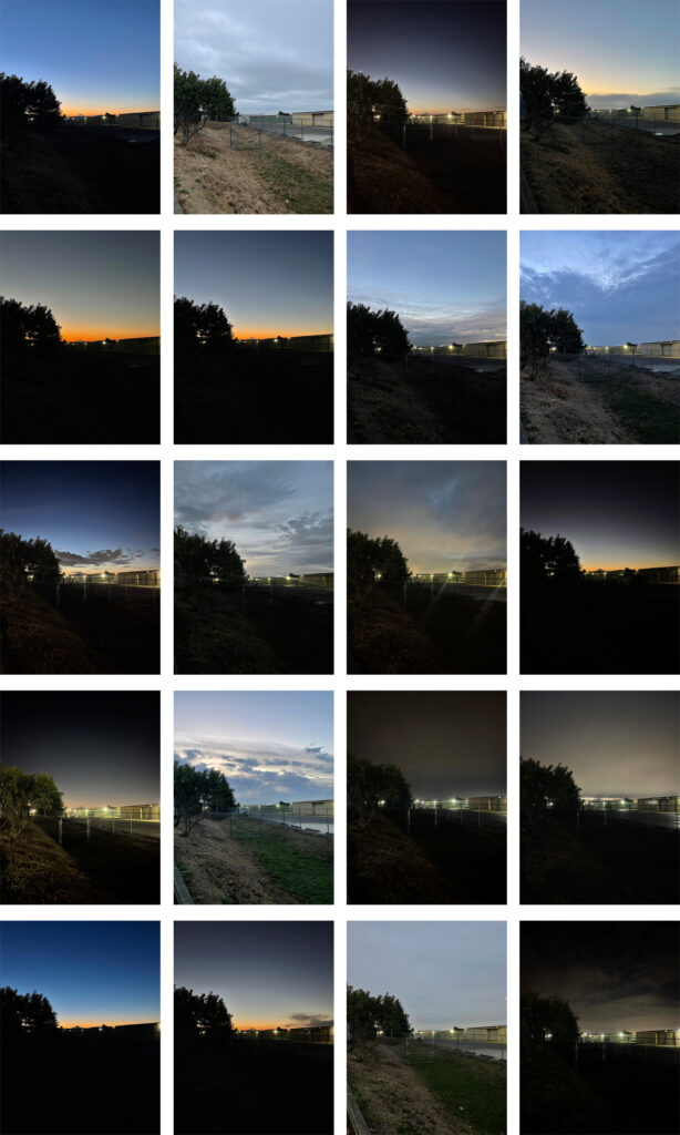
The project spans a little more than a year—I began it—randomly and unplanned—on Tuesday, December 3, 2024, and took the final photo Thursday, December 31, 2025. The practice: each day that I went to the gym, I took a photo of the sunrise (“sunrise,” in some cases) over Mount Hood while standing in the same spot in the gym’s parking lot.
October 21, 2025, through November 25, 2025.
During the summer months, when the run rises here absurdly early, I’d interrupt my workout to run outside and take that day’s photo (the earliest photo in the series: 4:59 am on June 10). During the rest of the year, the sunrise happened later in the morning, closer to or right at the end of my workout, requiring much less planning and remembering to photograph (eventually, I set a reminder in my phone, adjusting it throughout the year so it popped up about 10 minutes before projected sunrise, to ensure I could work to a good interruption point in my workout to run out and take that day’s photo.)
One bummer about this project: Because I have a standing commitment on Monday mornings that requires me to leave the gym well before sunrise most of the year, I missed a fair number of beautiful Monday morning sunrises. I still took photos those mornings, they’re just not as stunning as the sunrise actually ended up being many of those days.
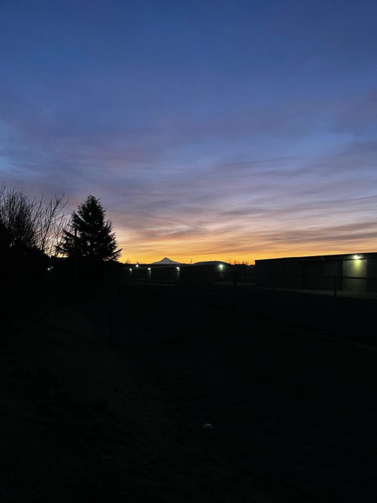
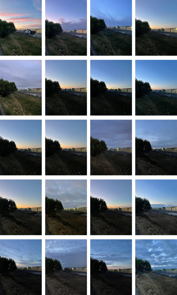
November 26, 2025, through December 29, 2025.
And the final two:
Below are larger photos of some of my favorite sunrises.
The three that started it all:
7:02 am, Tuesday, December 3, 20247:18 am, Thursday, December 5, 2024. 7:19 am, Friday, December 6, 2024.
A solid set of January 2025 sunrises:
6:51 am, Tuesday, January 7, 2025.7:11 am, Monday, January 20, 2025.7:27 am, Tuesday, January 21, 2025.7:10 am, Thursday, January 23, 2025.7:10 am, Monday, January 27, 2025.7:12 am, Tuesday, January 28, 2025.
That purpley, pink-ish-orange!
6:34 am, Tuesday, March 4, 2025.
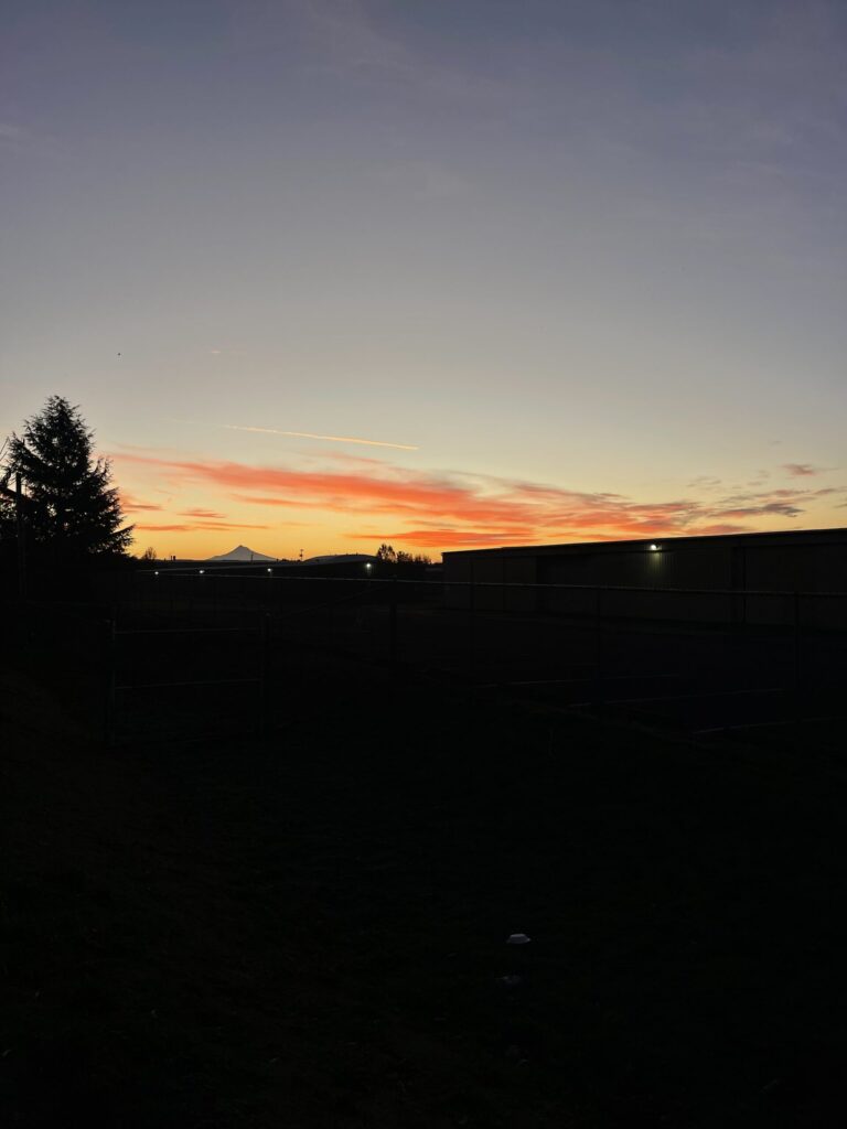
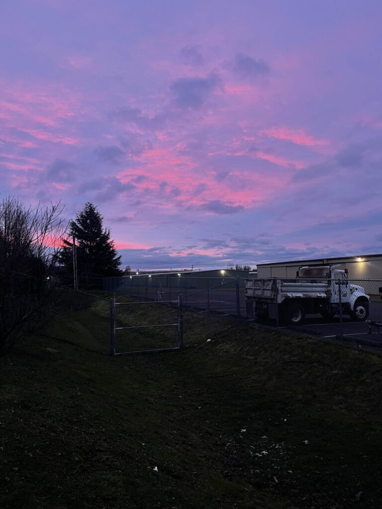
I shared in the last batch of photos that I was surprised the most dramatic sunrises happened during fall and winter. Because our summer days feature more clear skies than do our days during there rest of the year, I’d assumed the summer sunrises would be the most dramatic. Nope! Most summer sunrises were lackluster. After a few in the spring, consistently pretty sunrises didn’t return till fall.
6:29 am, Thursday, September 25, 2025.6:56 am, Tuesday, October 14, 2025.
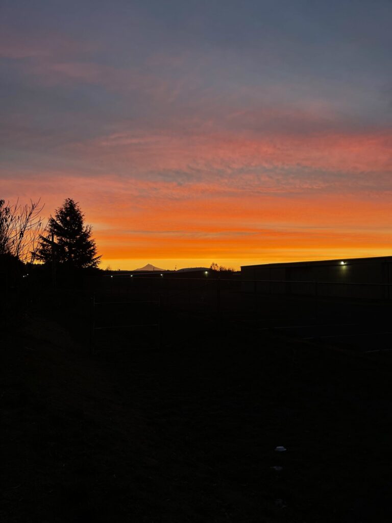
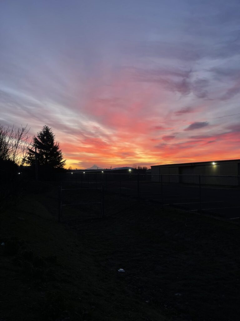
The sunrise on Halloween Eve is my favorite of the bunch.
7:32 am, Thursday, October 30, 2025.
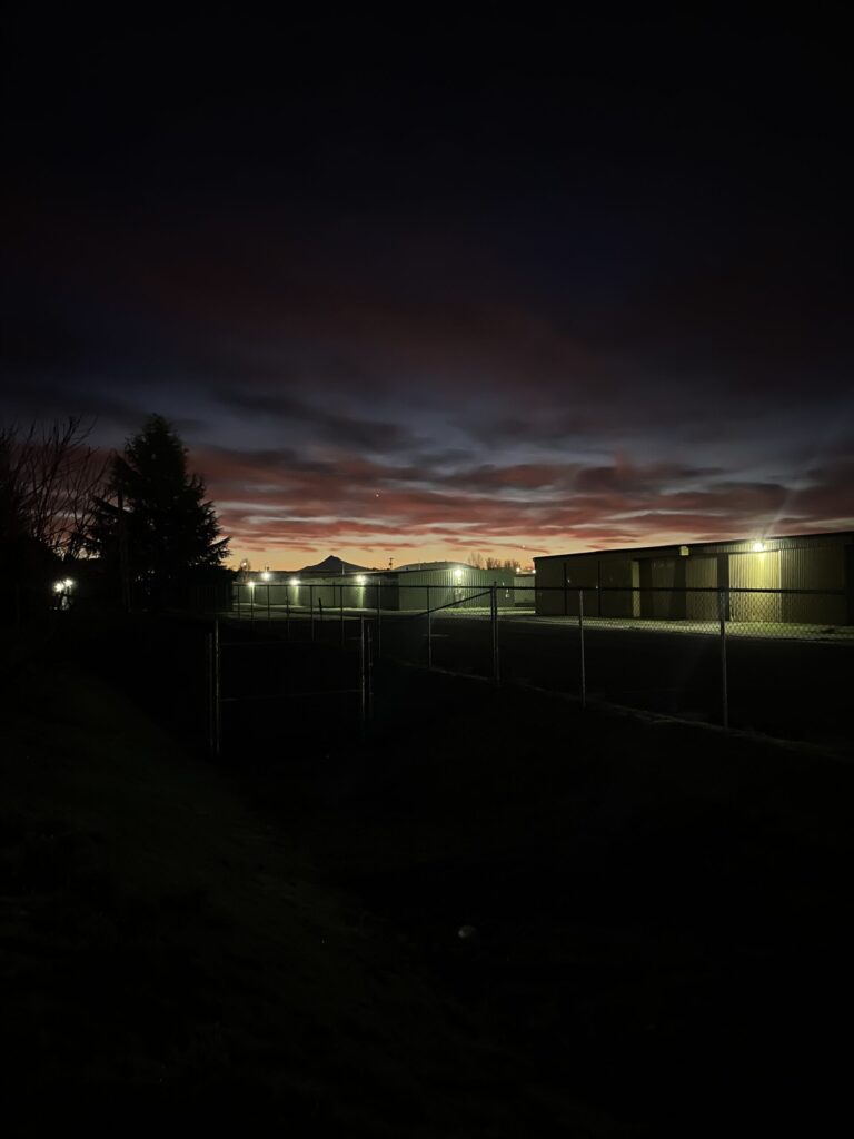
The clouds on Halloween morning were so fucking cool. I wish my iPhone camera could capture just how incredible they were.
7:48 am, Friday, October 31, 2025.
I wish, too, that my iPhone camera was able to capture what the sunrise the following week felt like. The way the sky was illuminated made it look and feel like it was glowing. It felt like standing in a dream. Very surreal.
7:06 am, Friday, November 7, 2025.7:06 am, Tuesday, November 18, 2025.7:07 am, Tuesday, December 30, 2025. 7:14 am, Wednesday, December 31, 2025.
Last but not least, a photo of the earliest sunrise of the year, mentioned above: 4:59 am, Tuesday, June 10, 2025. Absurdly early to be so light out.
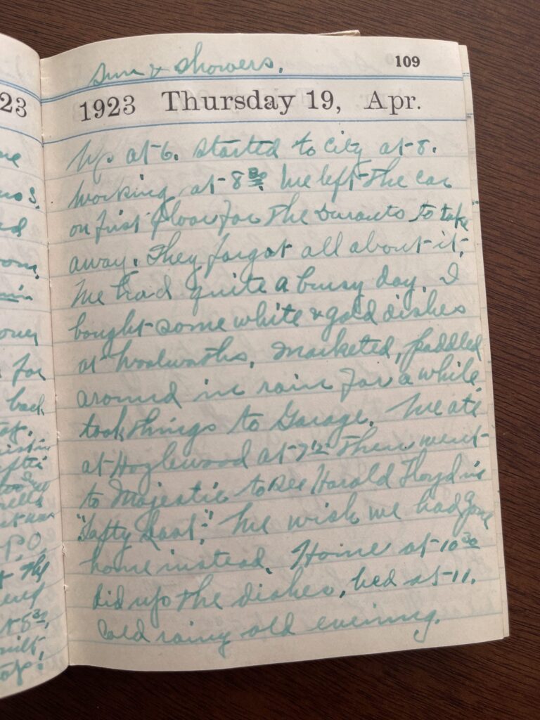
Last November, I, a person who is not at all a movie person, not even in the slightest, decided that over the next year-ish, I’d watch one movie in each of Portland’s historic or independently owned movie theaters. The idea was inspired by the hundred-year-old diary I found at an antique market a few years ago. In it, the diarist recorded her daily life, including the movies she and her husband went to see. She recorded 18 movies in the diary and included a very short review for nine of them, sometimes as short as a single word (“Fine.”), never longer than a sentence (“We wished we had gone home instead.”).
Movie review from the bottom portion of the page reads, “We ate at Hazlewood [sic] at 7:15 [pm] then went to Majestic to see Harold Floyd in “Safety Last!” We wish we had gone home instead.”
My original plan was to watch each of the 18 movies recorded in the diary. I thought it could be a fun way to connect to and learn about both the past in general and the diarist’s life specifically, and a low-stakes attempt to do something outside of my usual creative box. I looked up each title on IMDB and Wikipedia and very quickly learned that all of the movies the diarist and her husband watched in 1923 were silent films (the first movie with synchronized sound didn’t release until three years later), which: no thank you!!! I’m not a regular, modern-day movie person. I’m absolutely not a silent movie person. Nevertheless.
In the process of trying to figure out how I’d approach this project, I poked around the Oregon Theater Project website to see if any of the theaters the diarist and her husband visited were still standing and/or operational (no), and I walked over to my neighborhood video rental store to see if they (1) had any of the titles for rent (yes), (2) had DVD or VCR players for rent so I could actually watch any of the titles I might rent (I forgot to ask), and (3) had any information or advice about how to watch a silent movie (no)—or where to find the music that would have accompanied each title when it was screened for live audiences (no) so that I could play the same soundtrack while watching the movies at home; or whether any local movie theaters screened silent films with live musical performances (not to their knowledge).
Pretty quickly I knew that following through with this approach was more effort than I was willing to put forth. The juice, as they say, would not be worth the squeeze. So I decided instead to watch a movie at each of Portland’s historic or independently owned movie theaters, and I gave myself until the end of 2025 to do so. Close enough in spirit, and a much more manageable endeavor.
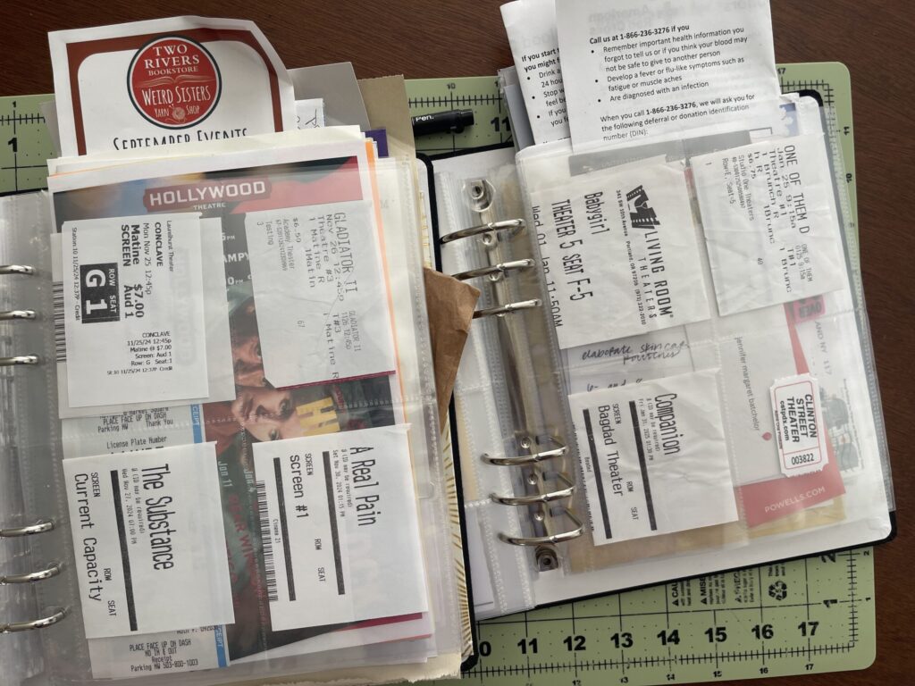
I ended up with 16 theaters on my list. (Some people will not consider some of these theaters to be independently owned. I wasn’t super strict with my definition—basically, any movie theater that (1) isn’t a big-box, brand name theater (AMC, Cinemark, Regal, etc.) and (2) is in the city went on my list.). To date, I’ve visited 11 of them, in the following order:
There are five theaters I definitely won’t be visiting, as they cater to an audience that I’m not part of and/or their earliest showtimes are too late in the day for me (my hyperactive autistic brain has a very early bedtime):
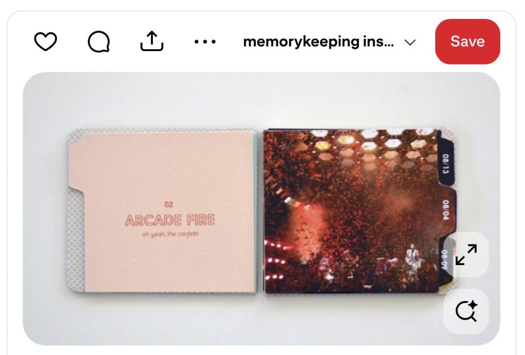
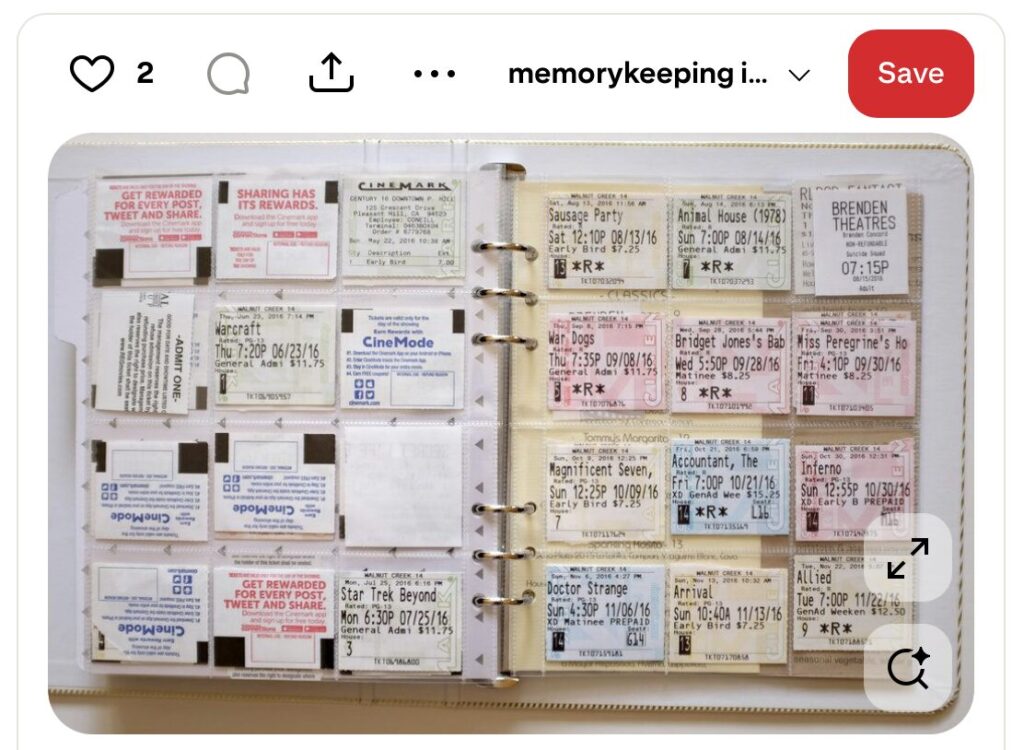
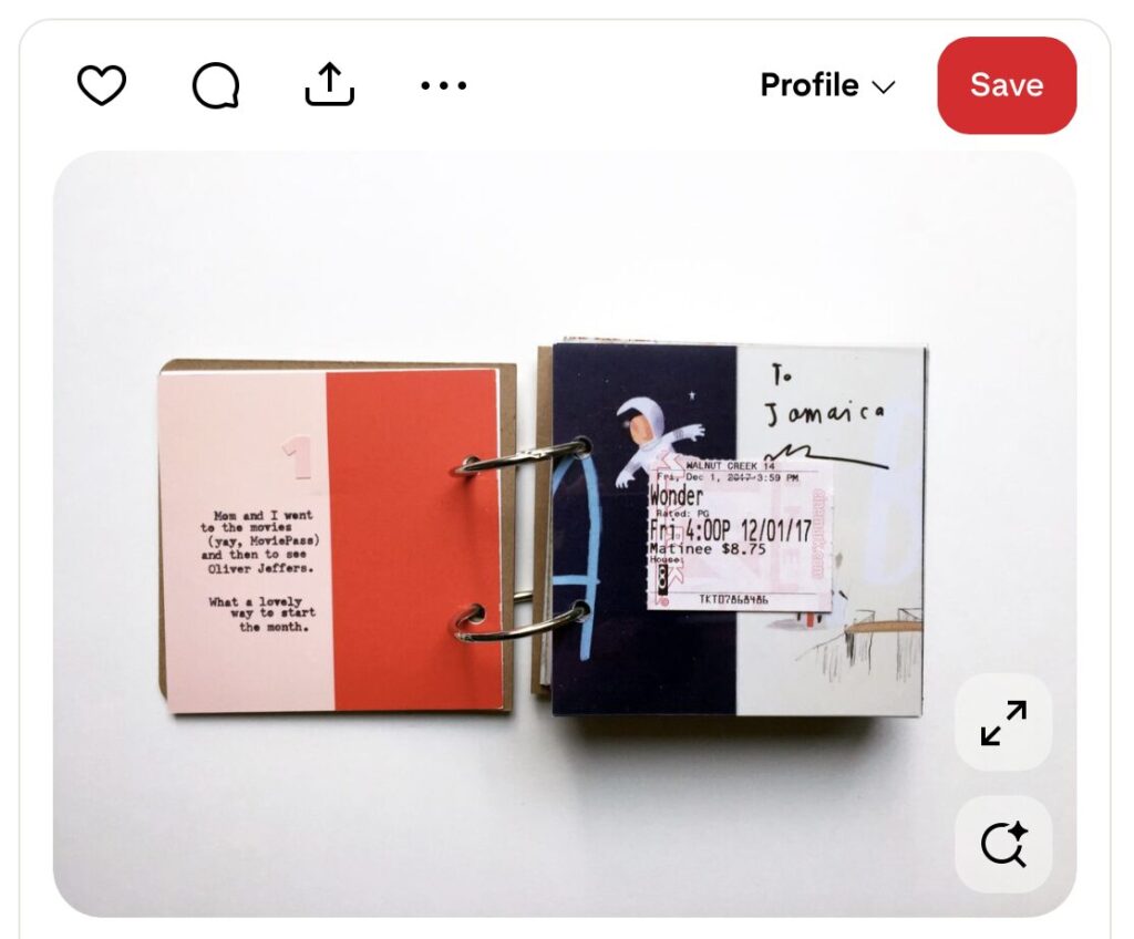
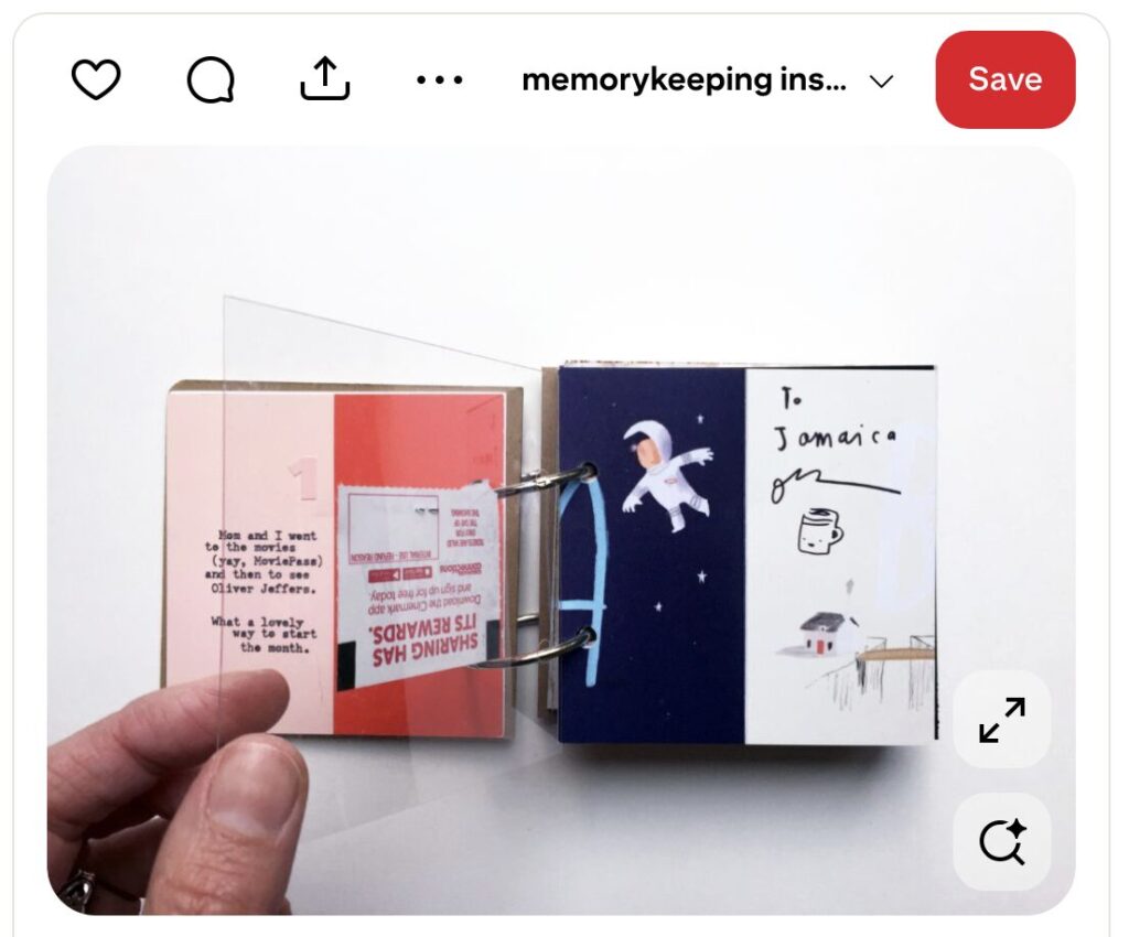
I envisioned including a full-bleed photo of each movie’s title screen (or, alternately, each theater’s marquee) on one side of a spread and colored or patterned paper and the movie ticket stub on the other—or, like Jamaica did here, affixing the ticket stub to a sheet of transparency over the photo of the movie’s title screen (or the theater’s marquee).
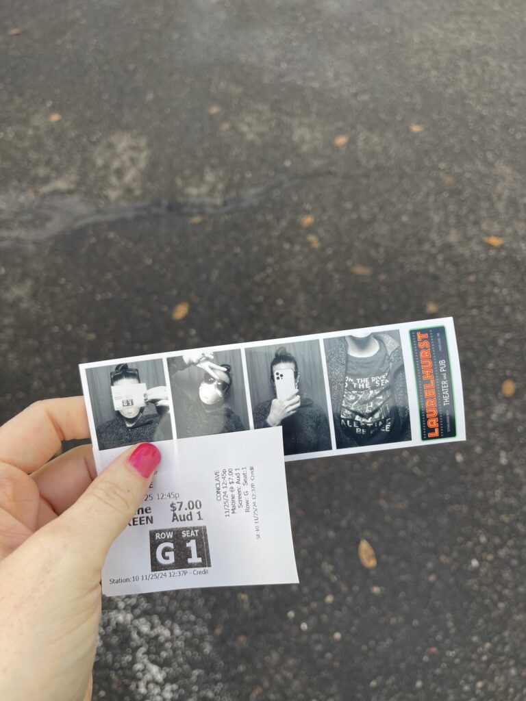
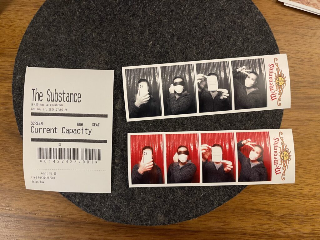
Going into this project, I was also hopeful that more theaters would have photo booths, and that I’d be able to incorporate the photo strips into a potential mini album. Alas, only two of the theaters I visited have photo booths—Laurelhurst Theater and Kennedy School Theater—and neither of them are film, neither of them produce strips in the traditional/expected orientation, and they’re both branded. Sad! (I do appreciate that both photo booths are reasonably priced ($6.00 card, $5.00 cash) and both give you two strips with the same frames, though I don’t like that one strip is color.)
At this point, I don’t plan to make a mini album documenting this project. Uniformity is important to me in a memorykeeping project like this. If I were to make a mini album documenting this endeavor, I’d want for every spread to follow the same formula. That’s not possible here because I don’t have a title screen photo for each movie, I don’t have a photo of each theater’s marquee (some theaters don’t even have a marquee), I don’t want to use a movie poster for each movie, and the movie ticket stubs (“ticket stubs”) are, frankly, pathetic (I will never shut up about the decline and disappearance of well-designed, quality-crafted physical ephemera). Also—I’m sorry!—movies just aren’t that important to me. I don’t feel compelled to document this project beyond this blog post, and I don’t want to spend more time or other resources on it.
My primary takeaway from this project: more than not being a movie person, I’m not a going-to-the-movies person.
At the movies, there’s too much simultaneous sensory stimuli for my brain to handle. Things that other people can ignore, or that other people don’t even notice, command all of my attention (autistic brains don’t habituate to sensory input the way that non-autistic brains do; we are constantly taking in everything around us, which is why we become so overstimulated so easily and so often). Things like temperature; the volume and complexity of on- and off-screen noises; off-screen movement, which is especially disruptive in theaters that have seat-side food/drink service during the movie; smells—of food, of people, of the facility; and, as in one theater I visited (not pictured), visual clutter (T.G.I. Friday’s-style flair all over the walls, including above and on either side of the screen).
All of these things make it very difficult for me to actually take in the movie: my brain is too overwhelmed by all of the other sensory input it’s inundated with, and I’m too focused on not having an autistic meltdown in public. And that’s before factoring in the whole host of other health issues I have that make existing in public inconvenient, uncomfortable, stressful, etc.!
Do I regret doing this project? Do I feel like it was a waste of time or money? No. I got in a lot of good walks, I saw some parts of Portland I don’t spend much time in, I learned about two photo booths that weren’t previously on my radar (always a win, even when they’re not film), and I learned something important about myself—I learned why I don’t enjoy going to the movies. Having clarity about any aspect of yourself is always helpful.
Will this new knowledge about myself stop me from going to see the Michael Jackson biopic in a theater on release day? Absolutely not. Michael was my first-ever autistic hyperfocus, which developed instantly upon my mom playing for me one evening the first record she ever owned—the Jackson 5’s ABC. I was nine years old, the same age she’d been when the record was released. I will use all of my spoons and every last drop of my sensory and social batteries to experience this movie in person, among like-minded fans.
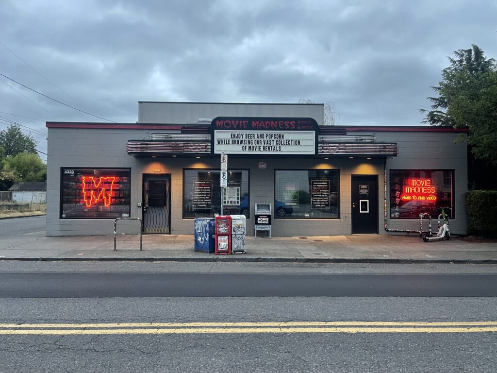
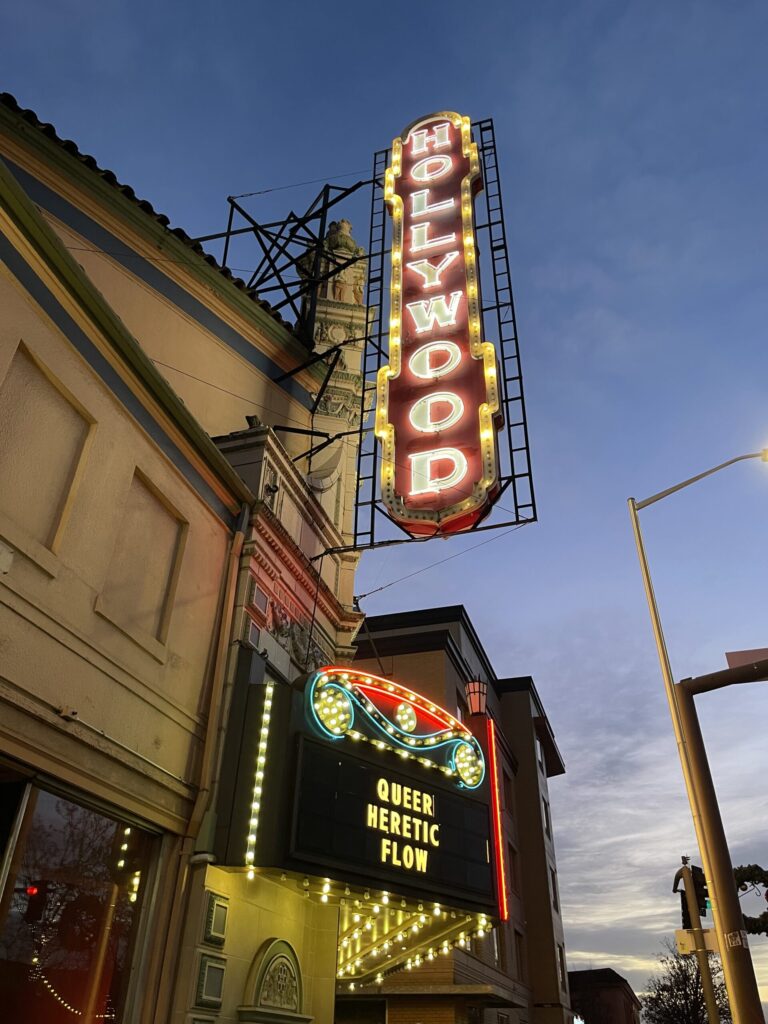
Best marquee: Hollywood Theater. For sure the most iconic movie theater marquee in Portland, and one of the most well-known alongside that of the Arlene Schnitzer Concert Hall.
Coolest campus: Kennedy School Theater. I wish I’d had more time to explore this place when I was there. (I haven’t gone back to explore it because I have no reason to return other than to explore it and returning only to explore it isn’t worth the spoons for me right now.)
Favorite title sequence: Gladiator II. My relief when it was confirmed it wasn’t made by AI.
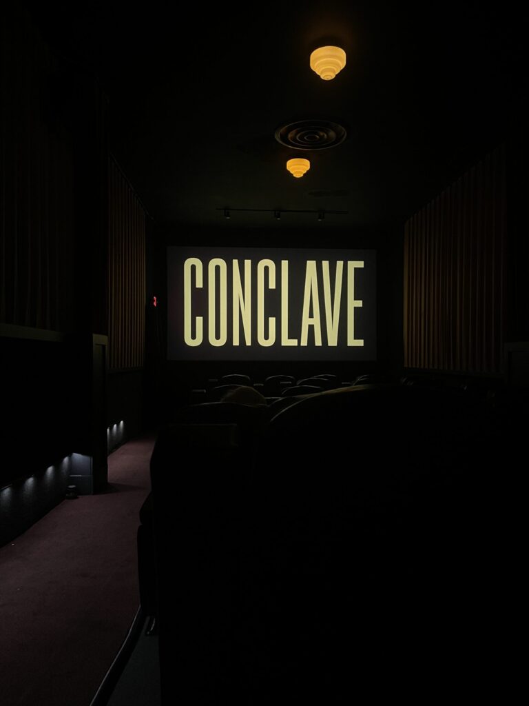
Movie I most enjoyed watching:Conclave. Visually stunning.
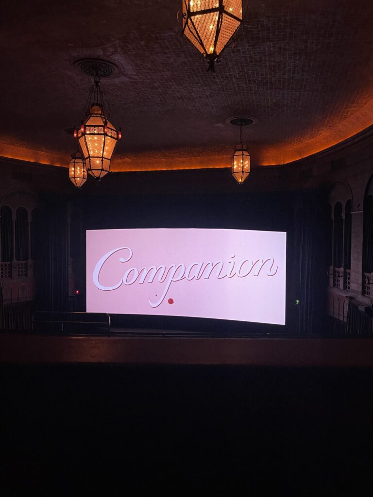
Theaters I’m most likely to watch another movie at (if I continue to go to the movies after this project): Bagdad Theater (below) or Laurelhurst Theater. Bagdad is enormous, which means it’s very unlikely I’d ever be seated near anyone else; I like that it has balcony seating; overall it’s just a vibe; and it’s close enough to my apartment. Laurelhurst is the closest of the two theaters with a photo booth, and also I love their light fixtures (see two photos above).
Total cost of the project: $91.50, which is less than I thought I’d spend. To be fair, 10 of the 11 movies I went to were matinees; I didn’t buy any concessions at any movie; I purchased 10 of my 11 tickets in person, which was at least $1.00 cheaper per ticket than buying online; and I either walked to or parked in free zones for 10 of the 11 movies.
*
For the curious, here are the movies the diarist recorded in her diary in 1923, listed in the order she and her husband saw them. Titles are linked to their IMDB page. A review, if offered, is in parentheses.
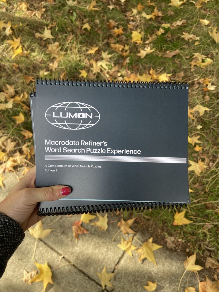
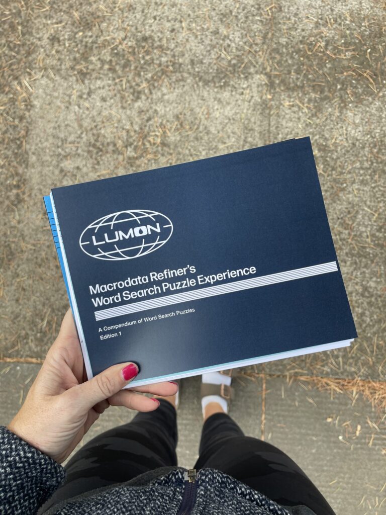
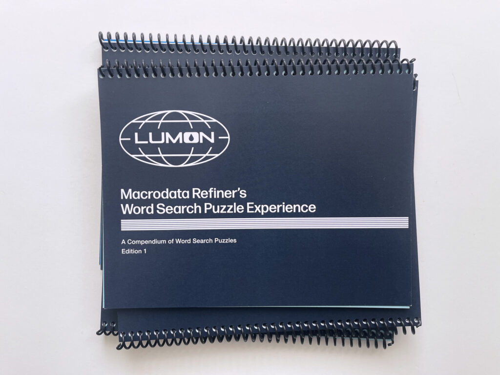
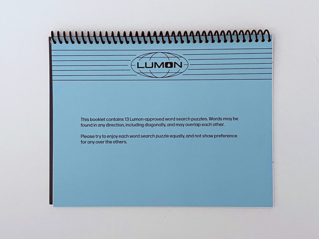
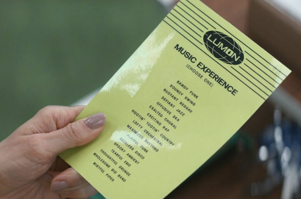
The mysterious and important project I’ve been working on since May is finally finished and I’m so (SO! (!)) excited about and proud of it. Behold: the Macrodata Refiner’s Word Search Puzzle Experience, a compendium of Lumon-approved word search puzzles/a Severance fan art project created and designed by yours truly.
I’m planning to share many more details about this project in the next week or two. For now, a mini photo dump, because I’m too exited about and proud of it to wait any longer to share!! (!)
I’m so thrilled with how it turned out and can’t wait to share how I, someone who had never even opened InDesign before, took this idea from my brain to the page.
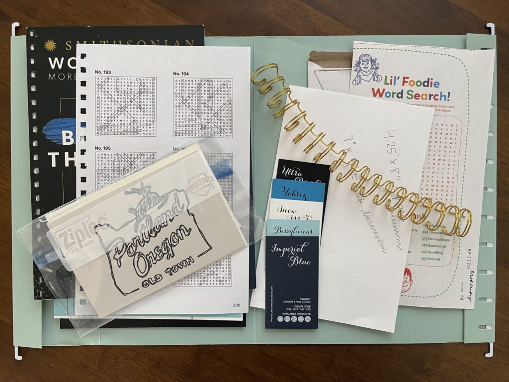
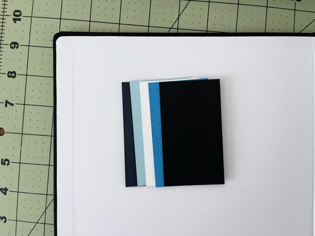
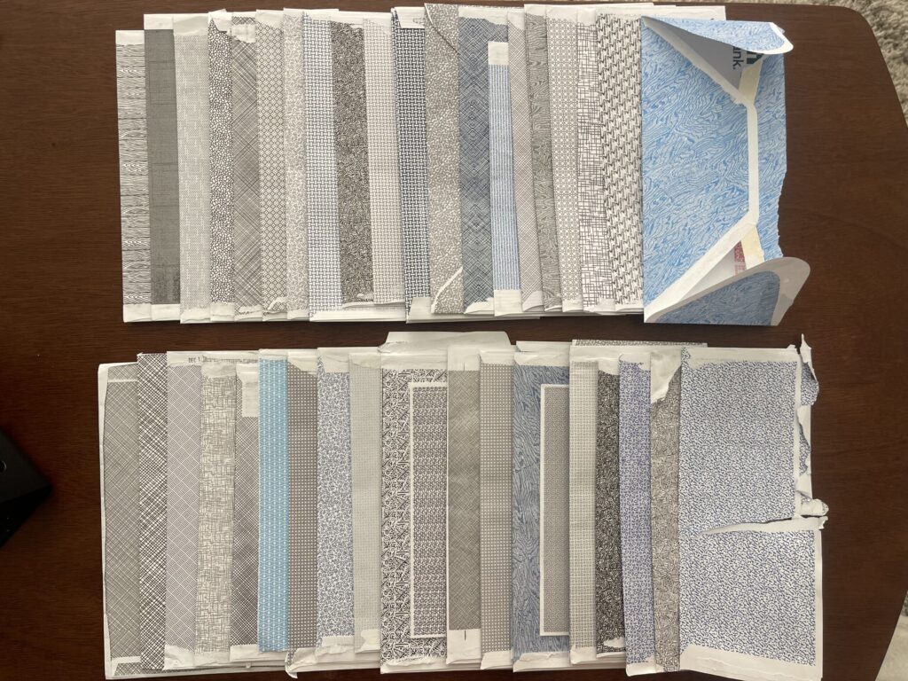
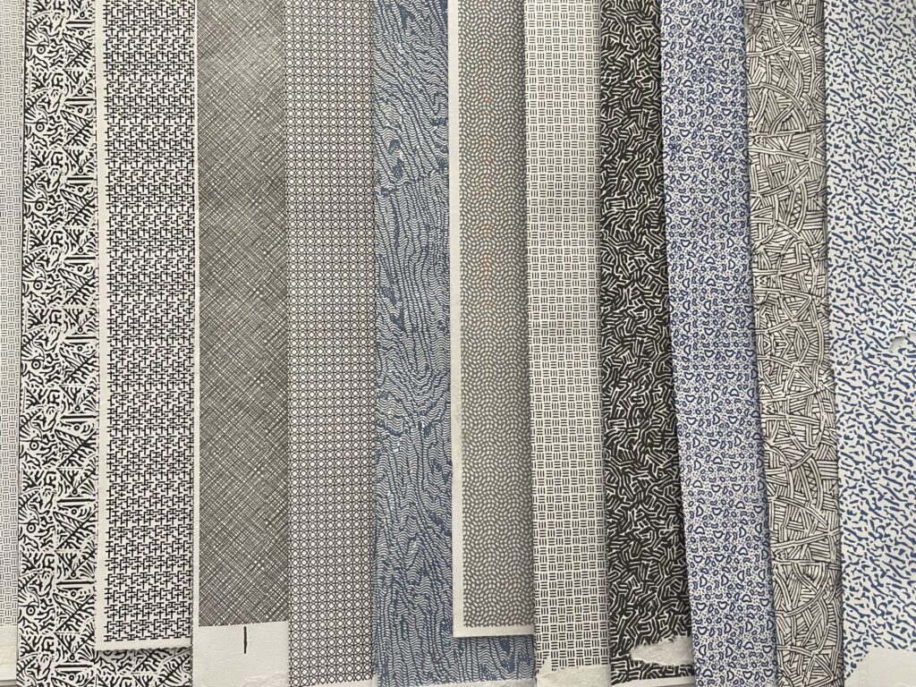
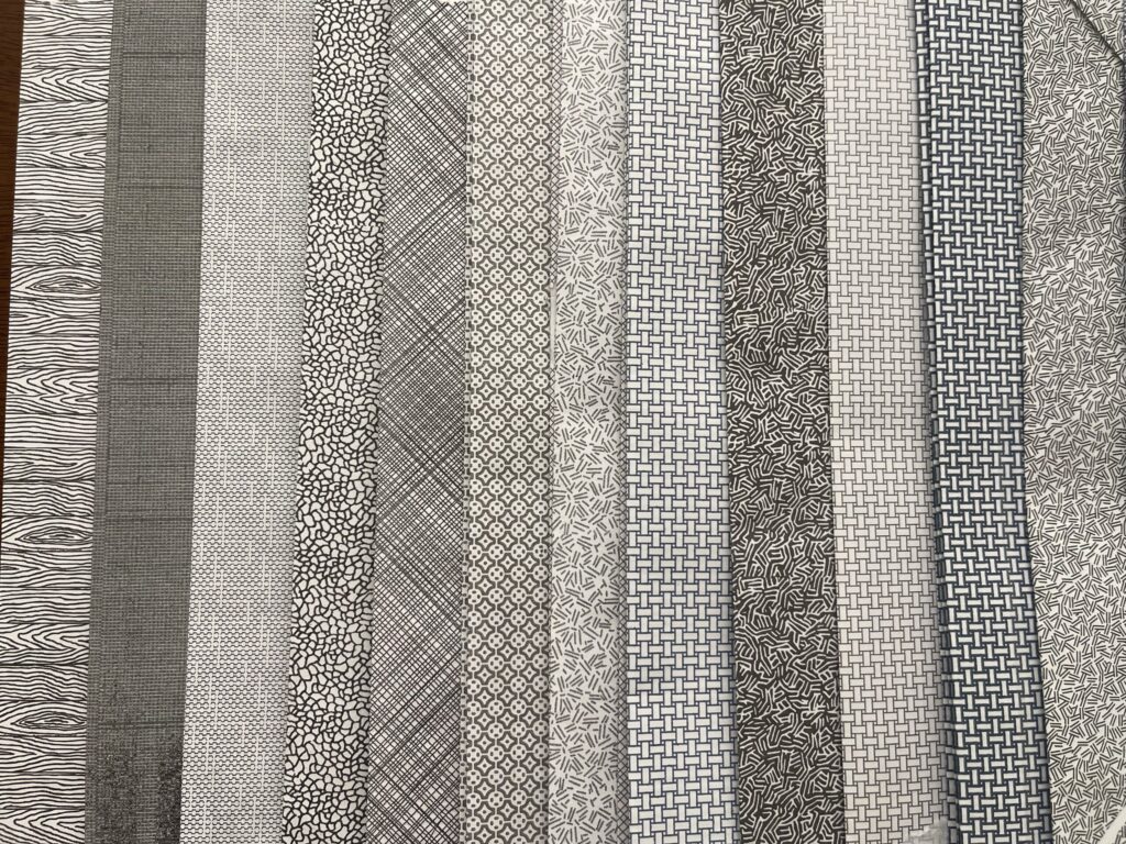
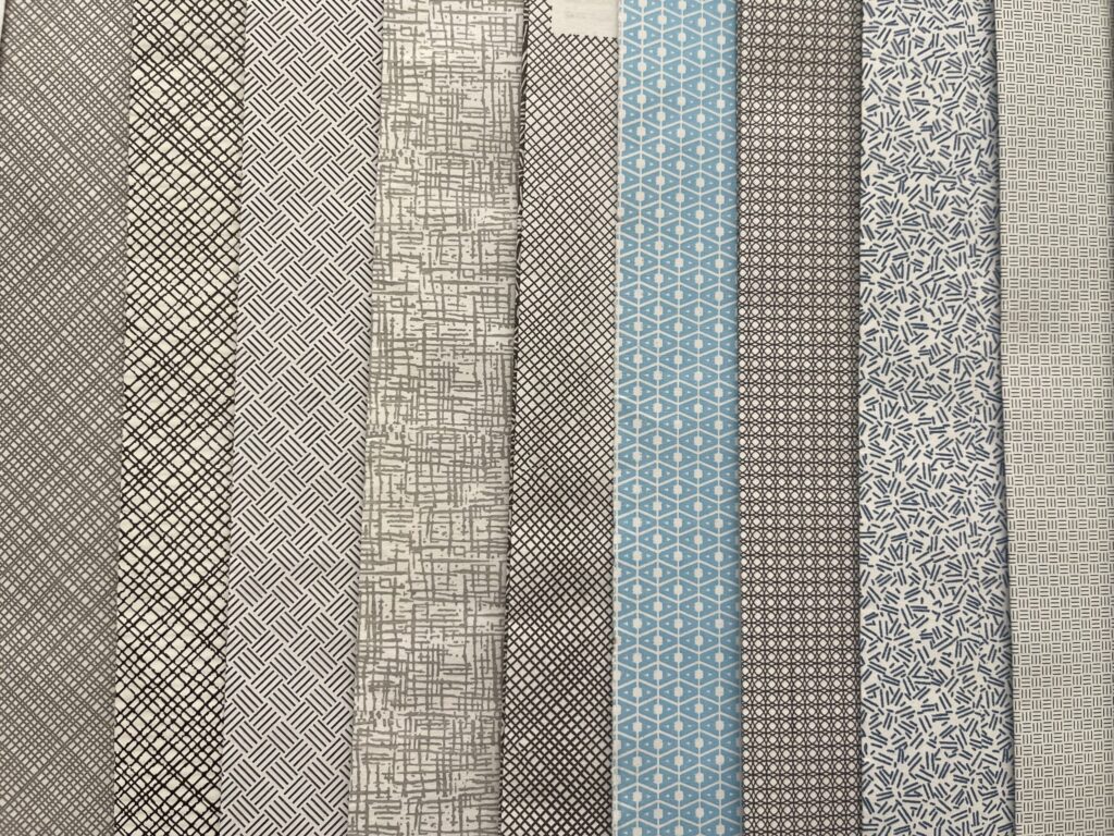
Do y’all wanna see one of the most autistic things about me? Behold, my collection of security envelope patterns.
About two years ago, I saw a photo from a fellow memorykeeper who’d used a security envelope pattern as the cover page for a mini album (I can’t find any photos of the project to link to, sorry) and thought, What a creative idea! With the unfulfilled intention of using them in my own memorykeeping projects, I’ve been collecting security envelopes ever since.
It’s a slow-going process. I don’t receive much mail that arrives in a security envelope, and the mail that I do is mostly from the same few places, which use mostly the same few patterns. Two years in, I have only about 40 patterns in my collection.
(This number is lower if you don’t count different colors, scales, and weights of the same pattern as distinct patterns. For example, I count the three “brick” patterns in the photo below (second, third, and fifth from the right) as three distinct patterns; while the scale of each is the same, the color and weight are not. Similarly, I count the fourth pattern from the right in the photo above and the fourth pattern from the right in the photo below as two distinct patterns; while the scale and color of both are the same, the weight is not.)
Most of the envelopes in my collection are from mail I’ve received directly. Some of them are from mail other people have received and then—knowing I collect them—mailed to me. Two of them, I found on the ground while out walking.
Ever the amateur archivist, in an effort to build a record of circulation for each pattern (or to contribute to an existing one that I don’t know about), I keep track of when I receive or find each envelope and, when known, who sent it.
Slow-going as it is, the passive collecting of these envelopes has been one of my all-time favorite projects. Every time mail arrives, I’m excited to see if I’ve been blessed with a new pattern; when I am, it feels like Christmas morning.
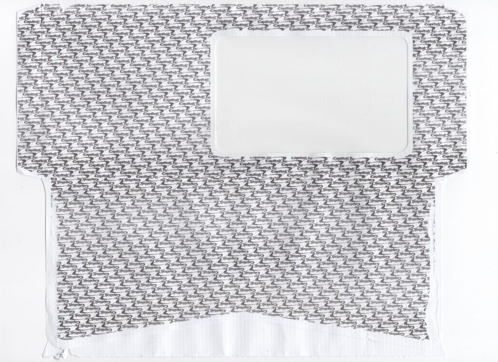
Two years in, I have two main takeaways: (1) many of the patterns in my collection that I find most interesting are printed on envelopes sent by state or federal government entities, and (2) there is a serious and worrisome decline in the appreciation and prioritization of ephemeral art and design that is very obvious when looking through larger collections that include envelopes from earlier decades. You just don’t see branded (or colorful) patterns very often anymore. When I tell you I almost completely lost my shit when this branded Capital One security envelope arrived a few weeks ago. You would’ve thought I was an actual child on actual Christmas morning pulling a rare Pokemon card.
Despite my original intention, I’ve not yet done a damn thing with these envelopes. I do have a handful of project ideas. Before I attempt any of those ideas, I’m going to scan each deconstructed envelope.
Want to donate your security envelopes to my collection? Who am I to refuse. Please get in touch (kelseyetcetera @ gmail dot com).
This project is still going strong and also I’m looking forward to ending—or, some might say, sunsetting (heh)—it at the end of the year.
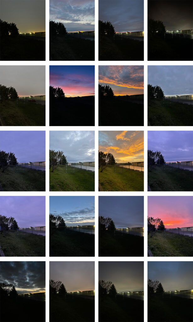
May 27, 2025, through June 30, 2025.
The sun rises about an hour and a half later these days than it did during the height of summer. Most mornings, this time doesn’t overlap with a natural stopping/breaking point in my workout. There have been more times during this stretch of photos than I’d like to admit that I’ve completely forgotten to take a photo until my workout’s over and I’m walking to my car. One morning, I’d already gotten in my car and was about to drive away before I remembered to take a photo. Oops. The good news is, there are no rules for this project. Forgetting to take a photo (or multiple photos) wouldn’t have been the end of the world. Or the project.
July 1, 2025, through August 7, 2025.
Surprisingly, winter offered more dramatic sunrises than did spring or summer. I thought for sure the sunnier months would’ve offered more stunning sunrises, in terms of both frequency and intensity. Maybe I just missed them. Or maybe not? Given how cloudy many spring and summers mornings were, I’m not convinced I did.
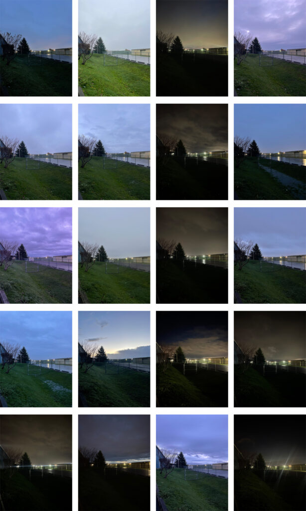
August 11, 2025, through September 15, 2025.
If everything goes as planned, there will be 56 more gym parking lot sunrises between now and the end of the year.
My year of crafting has come to a premature end. In April, my financial situation changed unexpectedly, which moved all of the crafty things I have even a modicum of interest in trying very firmly outside my new budget. Also, I wasn’t enjoying the project. I like the idea of being a crafty person. I do not enjoy doing crafts.
I did take on two creative endeavors over the summer: a letterpress workshop and a mysterious and important project that I’ll share more about later.
The letterpress workshop was a two-day workshop that I was able to afford only because I received an unexpected check for my birthday and rationalized I was “allowed” to spend it on something “frivolous” instead of putting it toward something “worthwhile.” I wish I hadn’t. Or at least, I wish I hadn’t spent it on the workshop. It wasn’t what I expected or wanted.
After the workshop ended, I went back and re-read the description for it. It accurately described what the weekend would entail. The problem was, I understood that only in retrospect. Going into it, I didn’t know enough about letterpress to understand that I actually didn’t understand the workshop description and that the things I want to letterpress print (Project Life cards, gift tags) require polymer plates, which weren’t part of the curriculum. The entire two-day workshop was dedicated to typesetting and printing a single line of text. I didn’t enjoy it and, unfortunately, I do feel it was a poor use of money, time, and spoons. You live and you learn.
I’m extremely excited about my other summertime creative endeavor. I’m not sure it’ll turn out quite like I envision (I can’t afford the options I prefer). Still, I’m very proud of it and excited to share it once I can afford to finish bringing it to life (soon, I hope!).
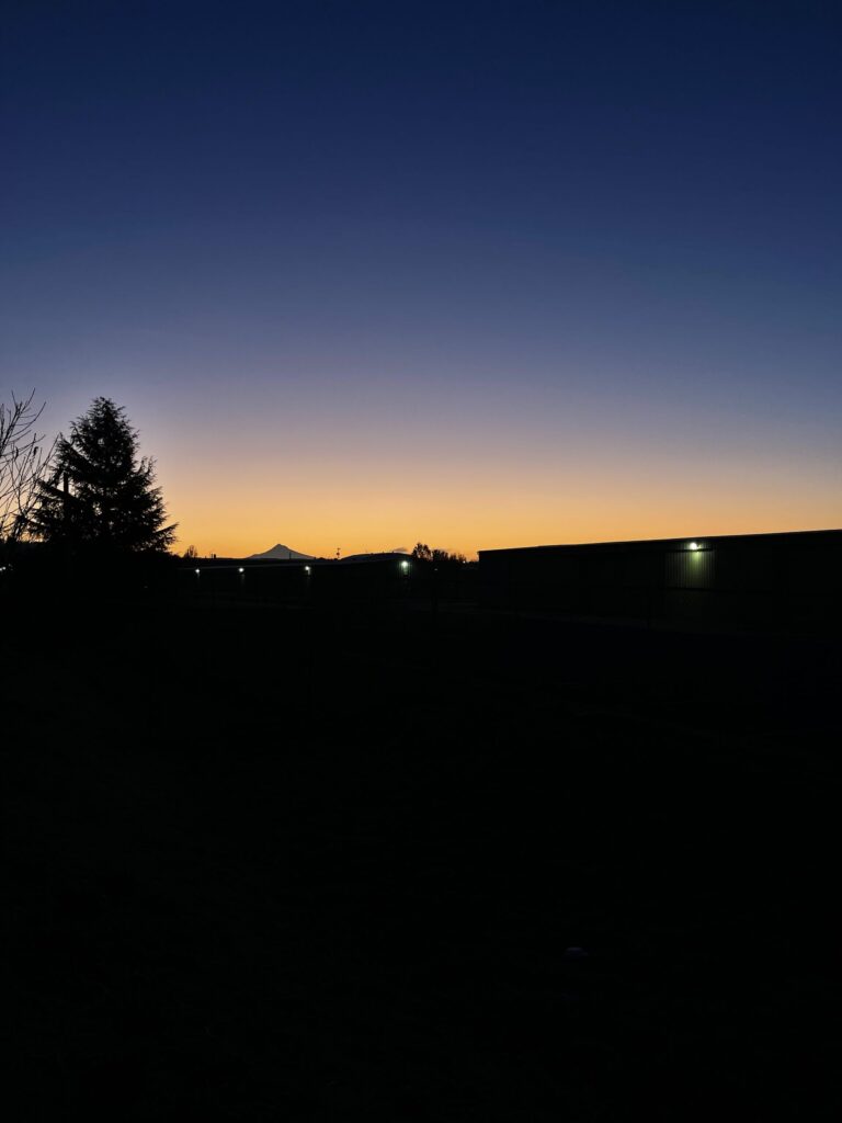
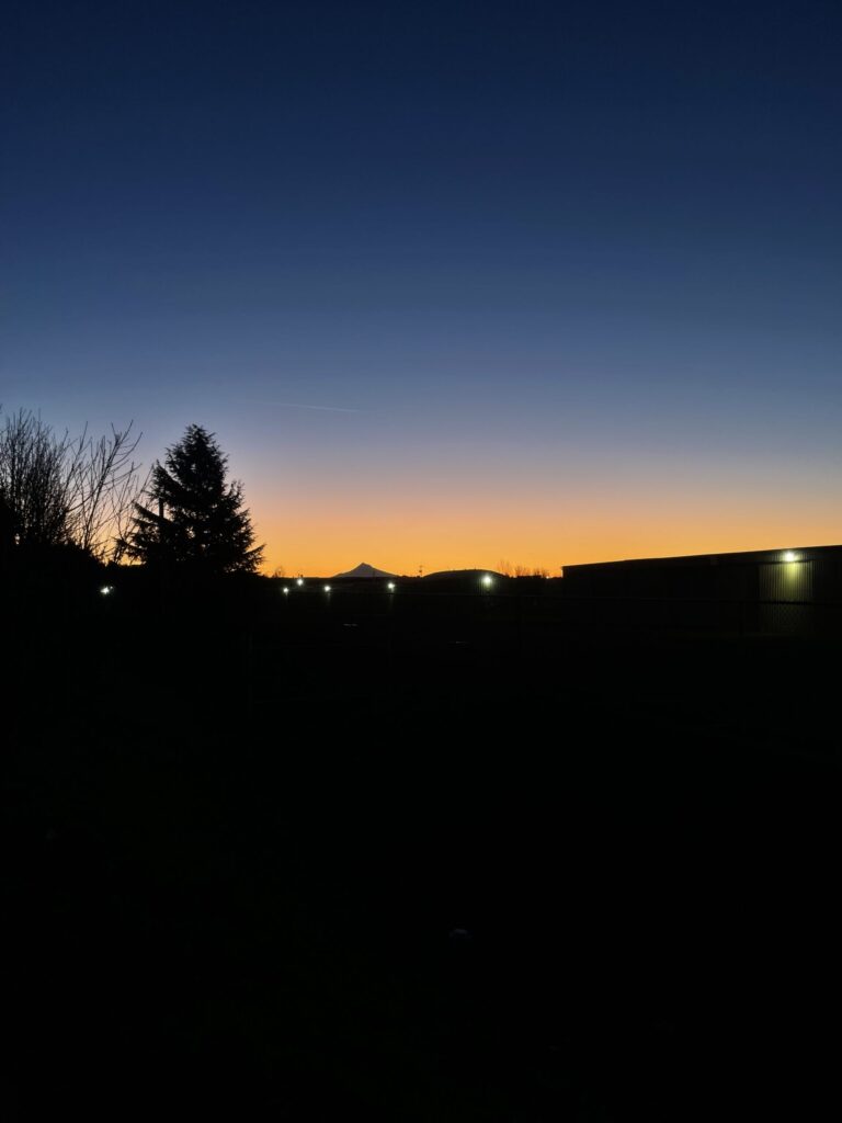
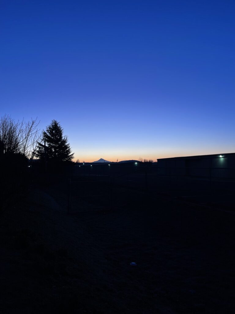
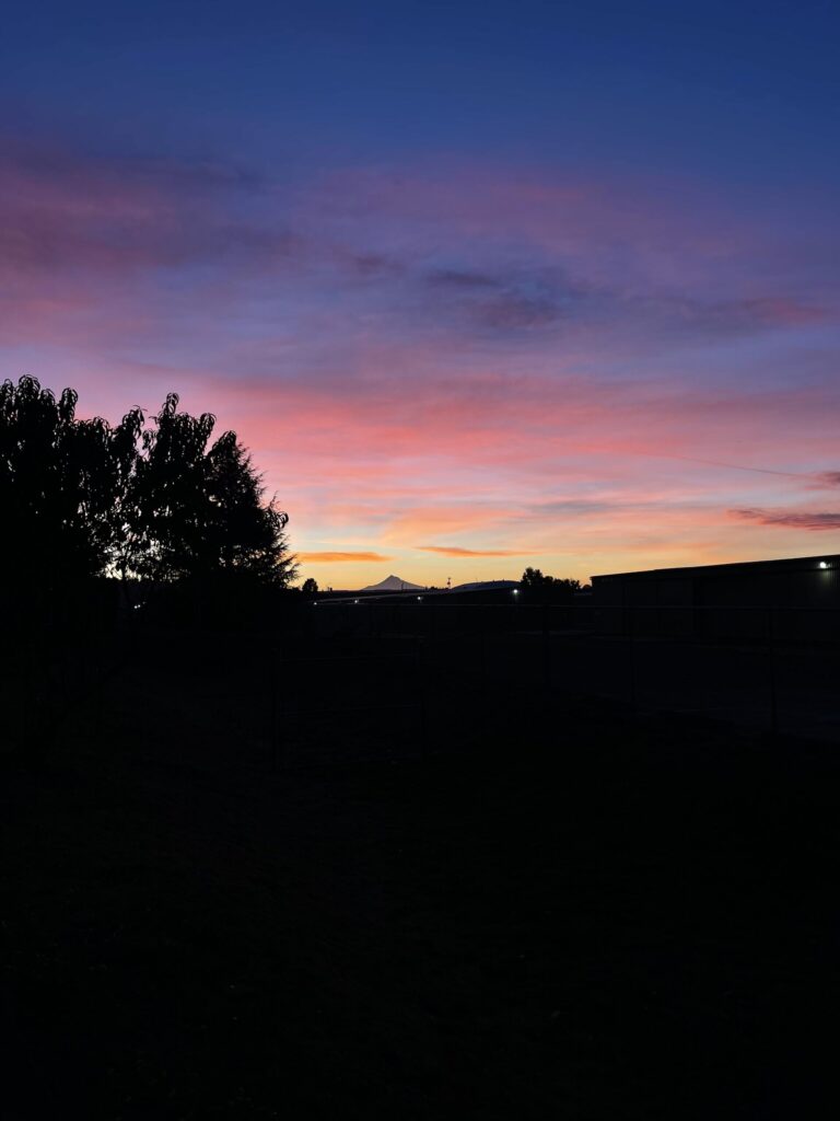
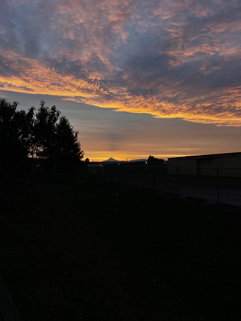
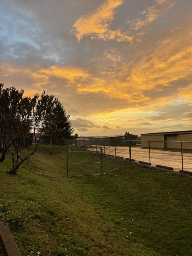
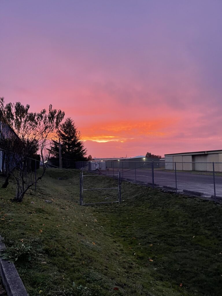
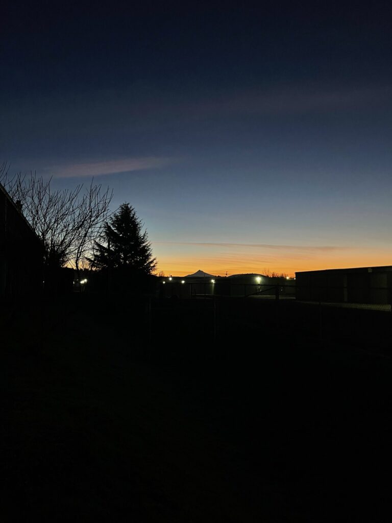
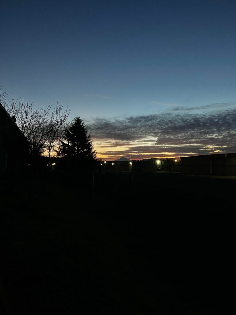
On Tuesday, December 3, 2024, I took a photo of the sunrise while standing in the parking lot of my gym before getting in my car and driving home. It was the clearest and most colorful sky I’d seen in a long time, and the silhouette of Mt. Hood in the distance (which is very difficult to see in these tiny photos) was breathtaking. I did it again on Thursday, the next day I was at the gym, and then again on Friday. And then I kept doing it every day that I went to the gym, regardless of how clear and colorful the sky was or wasn’t.
December 3, 2024 – January 2, 2025.
By Friday, just three days in, I’d decided to keep taking one of these photos for a full year. Or until I forget. Or until I don’t want to anymore.
January 3, 2025 – February 4, 2025.
This morning, I took the 100th (!) gym parking lot sunrise photo. When I started taking these photos, the sunrise coincided with the time I was leaving the gym, around 7:20 am. Now, the sun is rising right around the time I finish the first exercise of the day’s programming, around 5:20 am. Soon, for a stretch, it’ll be even earlier than that.
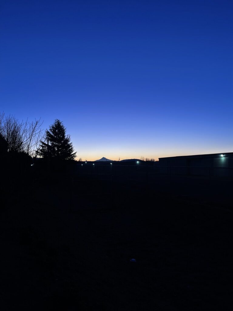
February 6, 2025 – March 14, 2025.
So far, I’ve not missed one. If I eventually do, that’s okay. Despite what my brain keeps insisting, the project doesn’t have to end because of it.
March 17, 2025 – April 18, 2025.
This project was completely unplanned and I’m still not sure if something physical will come from it (a photo album? a poster? a secret third thing that hasn’t revealed itself to me yet?), or how long it’ll last. That’s okay. I don’t need to know right now.
April 21, 2025 – May 23, 2025.
I’ve enjoyed taking these photos, even on the cloudy and foggy and dark and dreary and rainy mornings, and I enjoy having them, even if nothing more than this post comes from them. It’s been such a fun way to track the Pacific Northwest morning sky over the last several months.
In early January, I decided I wanted to try one new crafty thing each month this year. Here’s how the first four months of this endeavor went.
January
Starting off strong with no new crafty thing this month! Look. When I got the idea to do this year-long project, I immediately began making a list of crafty ideas. I couldn’t get past five ideas. My brain had manufactured too much pressure to think beyond those five things because it couldn’t let go of the belief that I needed to have every single crafty thing for every single month very clearly and thoroughly planned out in advance. Intellectually, I knew that wasn’t true. It took till mid-February for me to accept it on an emotional level, and to just start and focus on the craft at hand without worrying (too much) about what would come next. If only it were as simple for me to apply this to other areas of my life.
* * *
February
In February, I crocheted a basket. I followed this very detailed and beginner-friendly tutorial, adding an extra row each of black and white because I had enough yarn to do so and figured I could use the practice. I used the same brand and colors of yarn used in the video: Lion Brand Hue + Me in salt, werewolf, and saffron. I ordered two skeins of the white/salt and one skein each of the black/werewolf and saffron; this was the perfect amount. I also ordered this 8mm/L crochet hook.
I ordered the yarn directly from the brand’s website because it was on sale there and it wasn’t on sale anywhere else. And then it took FOREVER to ship—well beyond the timeframe stated in the order confirmation—and all of my emails asking for confirmation my order was actually received and being processed and would eventually ship went unacknowledged. Not a great start!
Not a great finish, either, sadly. The basket itself turned out fine, especially for a first-ever attempt at crochet, and wasn’t difficult to make (the most difficult part was remembering to not count the first stitch of each round—I ended up unraveling and restarting the bottom of the basket probably 12 times). The thing is, try as I might, I just don’t enjoy using my hands this way. On the plus side, this craft taught me that I do!!! not!!! like the look or feel of yarn when it’s actually in front of my eyes or in my hands v. something I’m looking at on a screen—a great thing to know about myself going forward.
As much as I didn’t care for the process of this project and don’t like the result of it, I did really enjoy the tutorial I followed. It was well-organized and well-paced, and everything was explained and shown very clearly. Because my brain has a hard time flipping images around, I deeply appreciate a true POV camera angle, which is what you get with this tutorial. If you’re new to crocheting, I recommend checking out The Turtle Trunk channel on YouTube.
I also appreciate how few supplies were needed for this project, how affordable they were, and how little of my time it took.
Total cost: $32.91.
Total time: about 8 hours between two sittings over two consecutive days.
Would I do it again: maybe. In the very distant future. For now, I have no interest in crocheting again.
* * *
March
Technically, my March craft is neither a craft, strictly speaking, nor a new endeavor for me. I’m counting it—a 500-piece puzzle printed from a photo I took of a mural a few years ago—anyway. I’ve done a lot of puzzles. I’ve never done one made from a photo I took. That’s new enough to count for this project.
I had the puzzle printed locally by Portland Puzzle Company. They’re not the most affordable option for having a custom puzzle made, and they don’t have a 1,000-piece option (my preference). I was impatient and wanted the puzzle RIGHT NOW so I went with them. I was impressed by the quick turnaround time (I placed the order on a Sunday evening and it was ready for pick up Wednesday around lunch) and how vibrant the colors turned out.
I was less impressed with the quality of the pieces and packaging. The pieces don’t fit together very snugly (the tiniest movement to the board undoes a fair amount of work, and you can’t move a little chunk of connected pieces without the whole thing falling apart), the base of the box isn’t very sturdy, and the box design is not attractive. I also don’t like the color of the backs of the pieces (which shouldn’t bother me as much as it does given they’re the backs of the pieces). I’ve never done a puzzle by this brand before so I’m not sure if the backs of the pieces are always this color, of if they’re color-“matched” to complement the colors on the fronts of the pieces.
Gripes aside, of the three crafty things on this list, this is the one I most enjoyed doing, and I really like how my cropped photo turned out as a puzzle. I wasn’t sure that it would translate. I’m happy that it did.
Total cost: $36.99 (barely two months later, a 500-piece custom puzzle from Portland Puzzle Company now costs $46.99, yikes!!).
Total time: a few hours. Probably around three? I wasn’t keeping track! After picking it up, I was too excited to just get started.
Would I do it again: absolutely, yes. I’ve already spent way too much time scrolling through my photos, trying to find another that would make a good puzzle.
* * *
April
April’s craft was the Desert Daydream paint-by-numbers for grown-ups from Pink Picasso, which will be a housewarming gift for my 20-something and her boyfriend, who live in a place that looks a lot like this (El Paso).
Of the three crafts I’ve done so far this year, I was most excited about this one. I was also the most frustrated by this one. I checked the measurements of the piece before ordering it and even pulled out a measuring tape to better visualize its size and still I was surprised when it arrived by how small it is overall and I was intimidated and annoyed by how teeny tiny so many of the spaces are.
I was also annoyed that despite what they say on their website, the four brushes that come with the kit are not suitablefor completing this project. You will need to buy better brushes, especially for the smaller spaces. This is frustrating because a huge part of the appeal of buying a kit is that you pay once for everything you need (and you get everything you need at one time).
I started by painting the sky and the sun, then moved onto the desert floor before attempting smaller spaces. After one sitting I gave up on the brushes that came with the kit, put the project away for nearly two weeks, then pulled it back out and took it to a local art supply store to find better brushes. The ones that come with the kit are way too soft and fan out too much when trying to paint the narrow spaces.
I brought the brushes that came with the kit with me to the art supply store—taped to the canvas with painter’s tape—so that I could better explain to (show) the customer service rep, who I knew would be more knowledgable about paint brushes than I am, the problem I was experiencing. And it worked! When I showed them the issue I was having by “painting” on the canvas with the kit brushes, they immediately understood what I was looking for and pointed me to the various sections of brushes that held better options. I tested about 30 different brushes directly on the canvas to find ones that were stiff enough to paint the narrow spaces. Three Princeton Select brushes were the winners (from left to right in the photo below): Spotter Petite 20/0, Lunar Blender 1/8″, and Spotter 5/0.
These three new brushes made several worlds of difference; the project became much, much less frustrating. I wish I’d bought them sooner, ideally before I ever began painting. I think that if I’d started with these brushes rather than the ones that came with the kit, the project would’ve turned out better—more enjoyable and with more even paint coverage, especially on the desert floor. How would I have known if I hadn’t first tried? You live and you learn.
I’m mostly happy with how this craft turned out. The one thing I’m still stuck on is the streakiness of one of the greens. I feel like it’s not supposed to look the way it does, and I also could not figure out how to get it to look less streaky and more like the color on the reference card (two photos up), which is a very solid green. Oh well. I’ve decided it’s part of what gives the finished piece its charm.
Even with the better brushes, this craft is a challenge. If you’re a perfectionist with unreliable fine motor skills and/or have a difficult time intently focusing your eyes without going cross-eyed or your vision blurring, I would not bank on this being an enjoyable or relaxing or rewarding activity.
Total cost: $58.30, including $40.30 for the kit (canvas, paints, four terrible brushes, a page of instructions and tips, and a postcard-sized reference image) and $18.00 for the three Princeton Select brushes.
Total time: about 23 hours between eight sessions over three and a half weeks, plus the hour it took to drive to the art supply store, test a bunch of different brushes, stand in line to pay, and drive home with the winning brushes.
Would I do it again: probably—just not with the kit brushes.
* * *
What’s on deck for the next four months? Don’t know! We’re already halfway through May and thanks to some sudden and unforeseen financial stress, I don’t have a clue what this month’s (or any other month’s) project will be. All of the things I had on my list are now firmly out of my budget. Which: annoying. And also: a chance to think more creatively. We’ll see how things shake out for the next four crafts come late August or September.