Last week, to the very genuine surprise of everyone who knows me, including me, I decided that this year, we’re doing Christmas. And not just doing. Capital “d” Doing. I also decided last week that I’m open to documenting the holiday season in its own album, separate from my regular yearly pocket pages (Project Life) album. To that end, I’ve been scouring Pinterest and Instagram and old memorykeeping blogs that are miraculously still up for inspiration.
Currently, my main source of inspiration is CJ over at @ink.paper.photo). I love how simplified, clean, and well-designed all of her memorykeeping projects are, and her December Daily projects are no different. I find myself returning to her past pages for inspiration often. As of this post, you need an account to view her blog; her Instagram is public.
Love the idea of including a year-in-review layout. Love that this one folds out and flips up, and LOVE the mismatched stamped letters. Very old school letterpress.
The process video OP linked in her caption goes here. Unfortunately, she doesn’t talk in the video about how she made this spread. You can see a clip of it in action in this video.
You can never go wrong with a bold print or pattern paired with journaling on white.
If I do indeed keep a separate holiday album, I don’t plan to purchase any official December Daily supplies, workshops, or classes. Nor do I plan to do the “daily” part of December Daily. If I go this route, I’m not dead-set on the album being strictly chronological, and I plan to continue adding to my regular yearly pocket pages album, which means there will be some overlap between the two albums.
In mid-August, I decided to prioritize doing, buying, and supporting things and people and causes I see advertised on street flyers around town over habitually googling “things to do in Portland this week/end” every few days while couchrotting in my living room. Naturally, I’m making a little project of it. Because I love when people share a peek behind the curtain, I’ve decided to document the process here on the blog.
My first idea was to commemorate all of these side quests by publishing a series of blog posts in which I’d share about the doing and buying and supporting of the things and people and causes I see on street flyers, along with a photo of each flyer. The thing is, as always, I want something that I can hold in my hands. The solution: a mini album.
For this project, there are five main decisions to make:
Album format
Album size and dimensions
Cover page and front matter
Main spread layout and design
Back cover
So far, I’ve made the first four decisions.
Album format
This was not a difficult decision. In fact, it wasn’t really a decision at all: I went into this project certain I wanted to use one of the acrylic albums I have in my stash. It didn’t even occur to me until I sat down to write this post there are other formats I could use for this project, like making a pocket pages mini album, or having a photo book professionally printed.
The acyclic albums appeal to me for four main reasons:
I can add to the album over time, unlike with a professionally printed photo book
they’re forgivable and I can easily remove or replace or otherwise edit or change something I don’t like, unlike with a professionally printed album
there are minimal supplies involved—even fewer than are needed for a pocket pages album!
they feel limiting in a way that pocket page albums and professionally printed photo books don’t. Sometimes I need tight boundaries on a project so that I don’t get bogged down in the details, which, on account of the autism, I’m hardwired to do
Album size and dimensions
Of the acrylic albums in my stash, I considered three for this project: a transparent 5×7 album, a frosted purple 4×5.5 album, and a frosted black 3×8 album (the others are too small (they’re this size) and don’t make sense for this project).
The black 3×8 album was my first choice. It always is. I’ve been dying to use it for a project since I bought it several years ago. So far, nothing’s felt right, including this project (the dimensions don’t work well). Sad!
I decided to go with the 5×7 album. While the dimensions of both the 5×7 and 4×5.5 albums work well for what I’m envisioning, the 5×7 album offers more room to work with, which is important to me when it comes to the right-side page of each spread, where I plan to include handwritten journaling to accompany the photo on the facing page (more below). The larger size makes the most sense: I’m wordy, and handwriting takes up more space than does typed text.
Cover page and front matter
I knew I wanted to use a full-page photo for the cover, and I knew exactly which photo I wanted to use. I also knew I wanted at least one spread of front matter, to both set the scene and ease the viewer’s experience into the album.
Right now, I plan to have three spreads of front matter: The first will have a blank page, likely of textured white card stock, on the left and a short write-up about the project on the right. The second will have a full-bleed map of my and adjacent neighborhoods, which is where I see all these flyers. The third will have a blank page on the left and a section title page on the right. I’ve not yet mocked up any of these spreads.
Right now, I plan to section the album by month and year. This could change. Maybe it becomes seasonal. Or annual. Maybe I decide to arrange the album by category (events, products, causes, etc.). Who knows. The ability to change how the album is organized is one of the reasons I chose to use a set of acrylic covers, held together by adjustable binder rings.
Main spread layout and design
I had the most ideas for this section of the album, and the toughest time making a decision.
As is often the case, I wanted each spread to follow a template. I like a cohesive look, and I also like having a set formula to follow. Once the initial decisions are made about the template layout and design, there are few, if any, decisions to make along the way—it’s plug and play.
I brainstormed several possible spread layouts. In each scenario, the left-hand page of the spread includes a photo and the right-hand page is home to journaling that accompanies said photo. Below, I outline my ideas for only the left-hand page layout and design.
Option 1: A 3×4 photo of the flyer in question in the wild (affixed to a utility pole), centered on a 5×7 sheet of patterned scrapbook paper or solid-colored, textured card stock. I pulled some paper and card stock from my stash that I thought might work well (pictured), and also made some mock-ups in Photoshop Elements using digital scrapbooking papers (not pictured).
Option 1
Option 2: Same as option 1 above, with the photo centered on a 5×7 photo of scraps of flyers on a utility pole.
Option 2
Option 3: Same as option 2 above, with a 5×7 sheet of vellum between the 5×7 photo of scraps of flyers on a utility pole and the 3×4 photo of the flyer in question.
Option 3
Option 4: Same as option 2 above, with a scan or tightly cropped photo of the flyer in question.
Option 4
Option 5: Same as option 3 above (vellum), with a scan of the flyer in question. I didn’t take any photos of this option.
Option 6: A full-page, 5×7 photo of the flyer in question in the wild (affixed to a utility pole).
Option 6
Option 6 is the winner. It’s also the last option I thought of, days (days!!) after all the others. It seems so obvious this would be the top contender, I’m still baffled I didn’t think of it sooner.
A note: From the moment the idea for this project popped into my head, I began taking photos of any and every street flyer that advertises something I’m even remotely interested in attending or buying or otherwise supporting. So that I can quickly and easily reference them, I add all of those photos to an album on my phone (“I saw it on a street flyer”). For visual continuity, I take a vertical photo from about the same distance. Sometimes this is challenging because of where flyers are affixed to the poles, or surrounding objects that obstruct access. In these instances, I try to get a wider shot, which I can crop. When I can’t, I take the photo I can get and move on. It doesn’t have to be perfect, and I don’t spend a ton of time framing a shot, only a few seconds at most.
Back cover
I’m not yet sure what I want to do here. If I had to make a decision today, I would go with another full-page photo of a utility pole covered in flyers, just like with the front cover. I don’t have to make a decision today, though, so this is still up for grabs.
* * *
To get an idea for how the ideas in my head will translate onto the page, I printed out some of the photos I plan to use on the card stock and photo paper I use in my Project Life albums. In keeping with tradition, I’ll have the photos I end up using in the album printed by Persnickety Prints, which means the color will be more vibrant and the pages will be studier.
The grid paper is from one of my Mnemosyne notebooks. For these mock-ups, I removed a sheet from one of my A5 grid notebooks and trimmed it to size. The grid is printed on only one side and the paper is buttery soft. For the project, I plan to use sheets from my A4 grid notebook, which will give me two 5×7 pages per sheet.
To round the corners of my pages so that they match the acrylic album covers, I used this corner rounder punch (the 4mm option).
My next steps are to order my first set of photos from Persnickety, gather supplies for and create the front matter, and begin the journaling that will accompany each flyer photo. I’ll be back with an update when I’ve completed at least two of those three tasks.
Who else remembers last June when I shared a little bit about my family’s most enduring holiday tradition along with a peak inside the mini album I’ve slowly, surely been making to document it and also a little bit about my process for the project and then ended the post basically promising that I’d be back in November with an update?
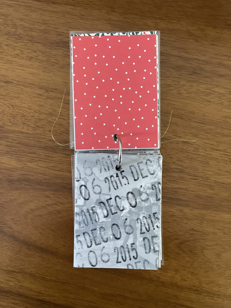
The update: There are still two small things that need to be done. (1) I still haven’t figured out the title page. My idea—which I outlined in the first post about this project—is to type up a brief blurb about the tradition on white textured cardstock. I’ve sat down to draft said blurb a billion times and haven’t yet found the arrangement of words I’m looking for that all fit on the page. (2) I’ve also yet to decide what I’m going to do about the date stamp issue for the first two years/photos. Aside from those two things, I’m caught up with this project.
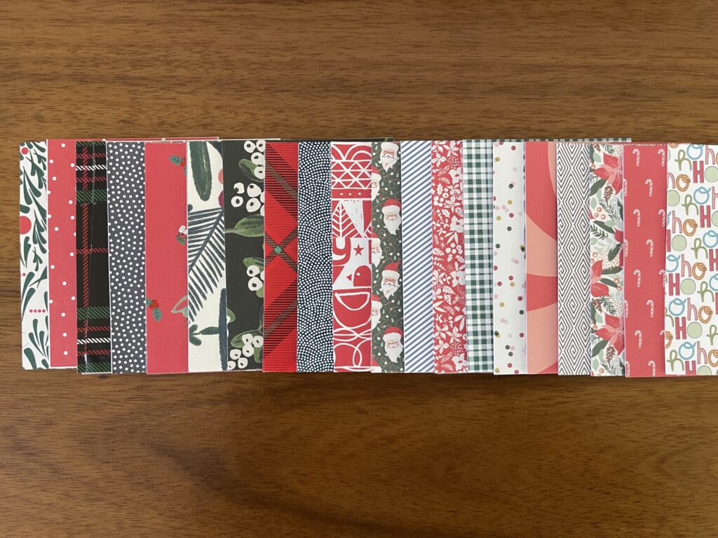
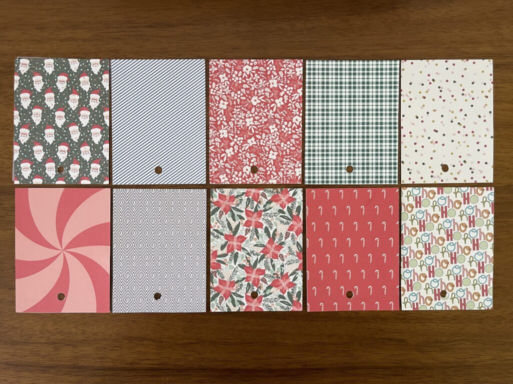
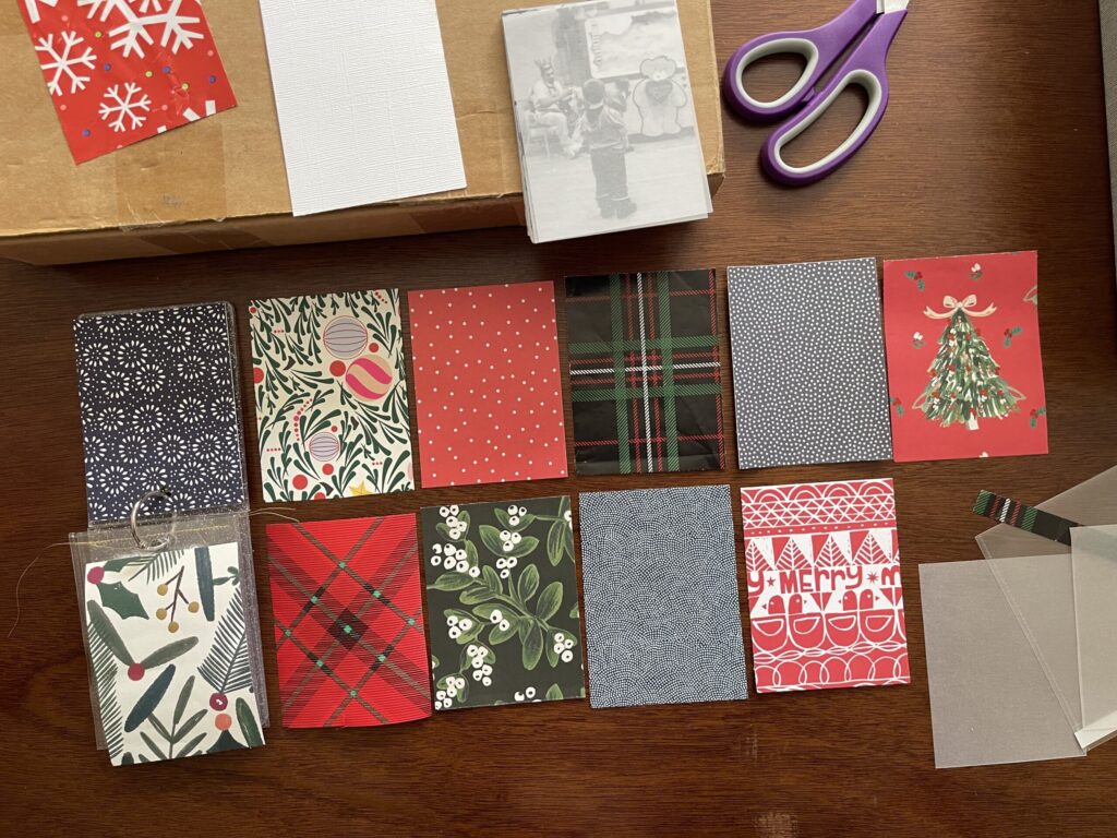
The delay: Despite it being obvious from the outset that I didn’t have enough to do so, I was dead set—and I mean inflexibly, stubbornly dead set—on using only scraps of gift wrap from Christmases past as backing for every photo. I went through the first four stages of grief several times before finally progressing to stage five and letting that idea go. Then, I became dead set on using only holiday-themed gift wrap. I figured I’d just buy enough individual sheets and/or rolls of wrapping papers that I liked during the 2025 holiday season to use as backing for the 10 photos that still needed it. Turns out, I either didn’t like the options at any of the stores I went to, or the scale of the patterns wouldn’t work well when sized down to 3×4. In June of this year, I decided it was more important to me to make progress on this project than to let it stall out, and ended up using holiday-themed digital scrapbooking papers that I printed at home onto thin cardstock to back the remaining photos.
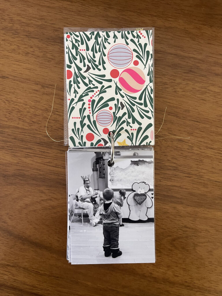
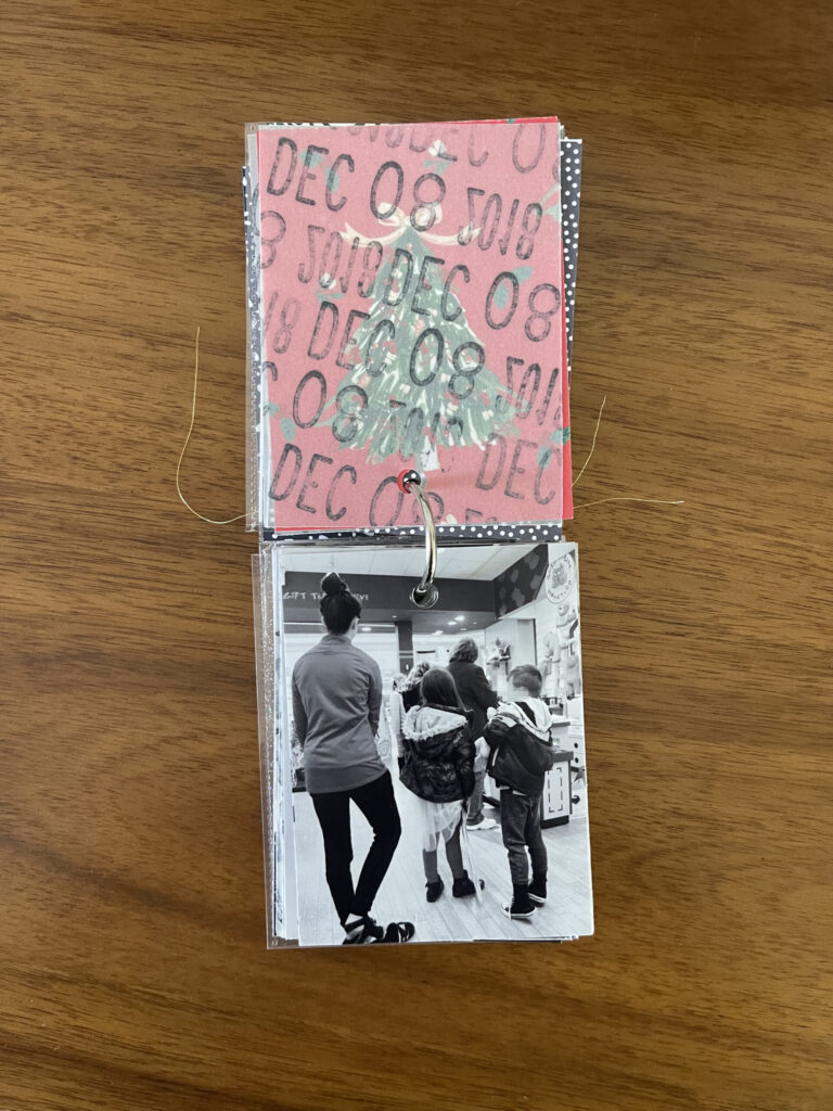
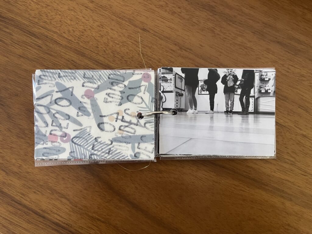
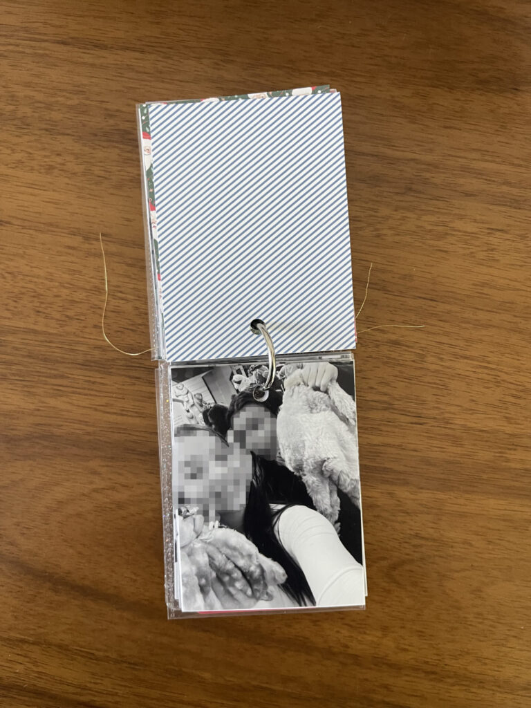
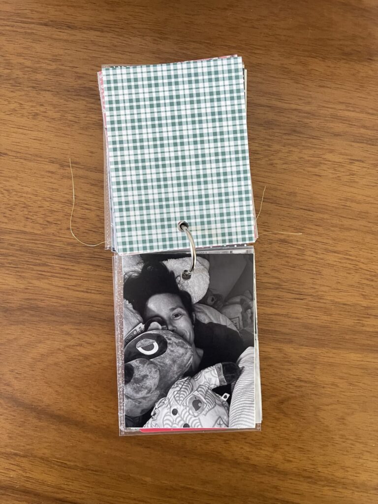
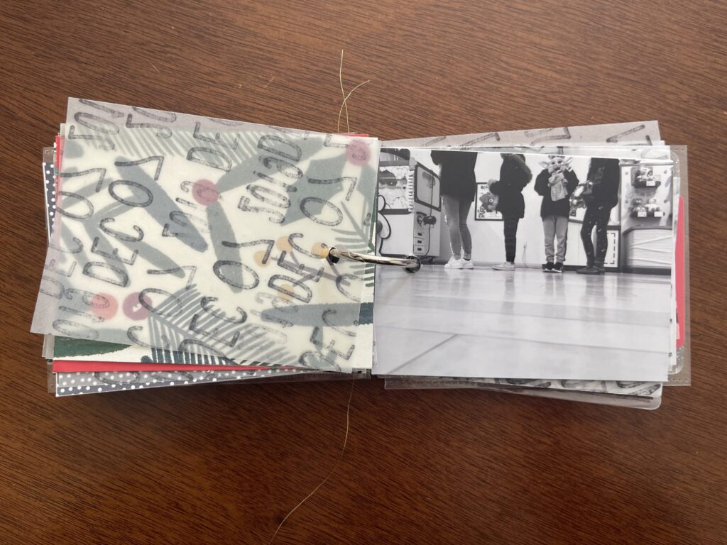
Here’s a look inside at most of the pages.
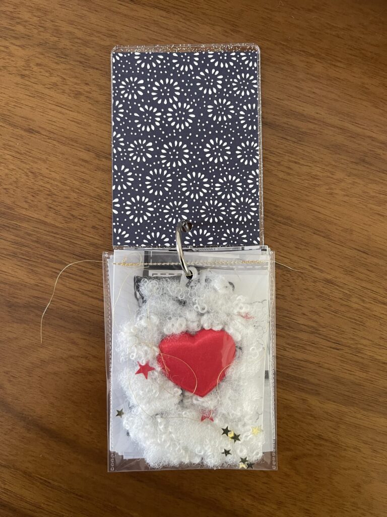
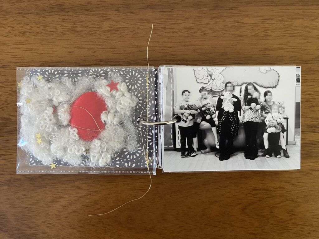
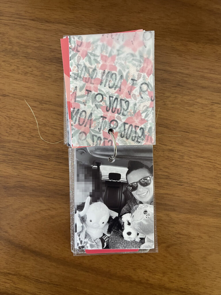
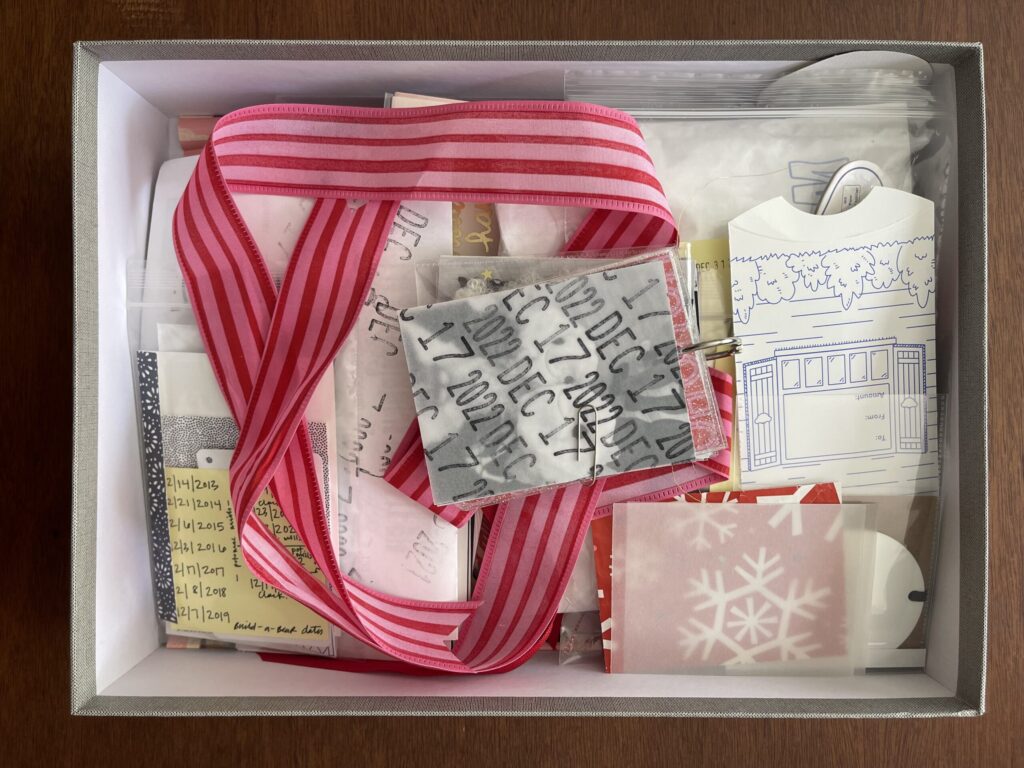
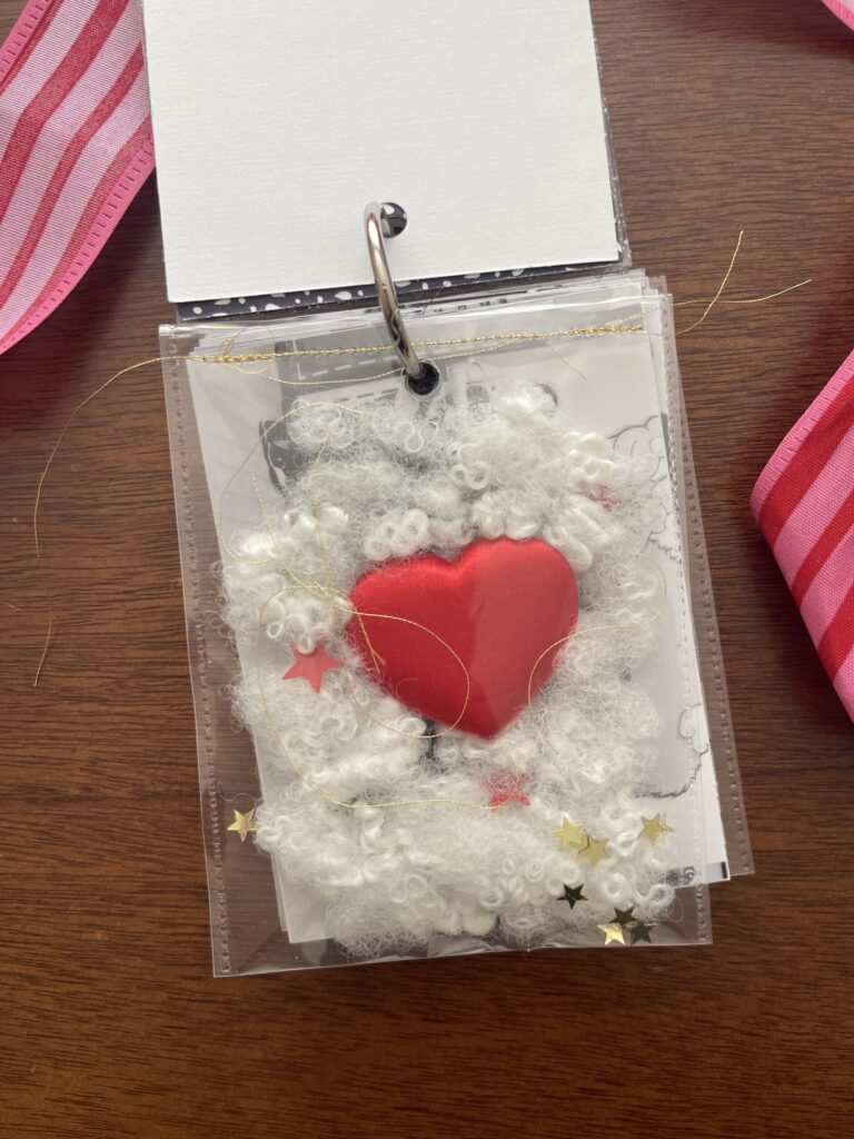
That first “page” is a Photo Flip pocket that I filled with a few pinches of Build-A-Bear stuffing, a Build-A-Bear heart, some red and gold star confetti, and some strings of gold thread. I cut off the top and sewed it shut using gold thread. I think it’s so cute, I love it so much. The patterned paper is a letterpress greeting card that I cut to size. I’m genuinely sorry to report that in the course of writing this post I learned the Photo Flips have been discontinued.
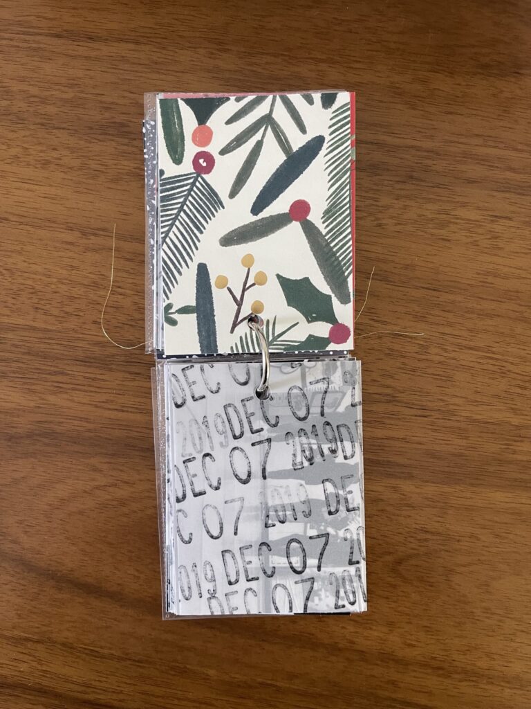
In 2019, our group grew by one with the addition of my kids’ step-sister.
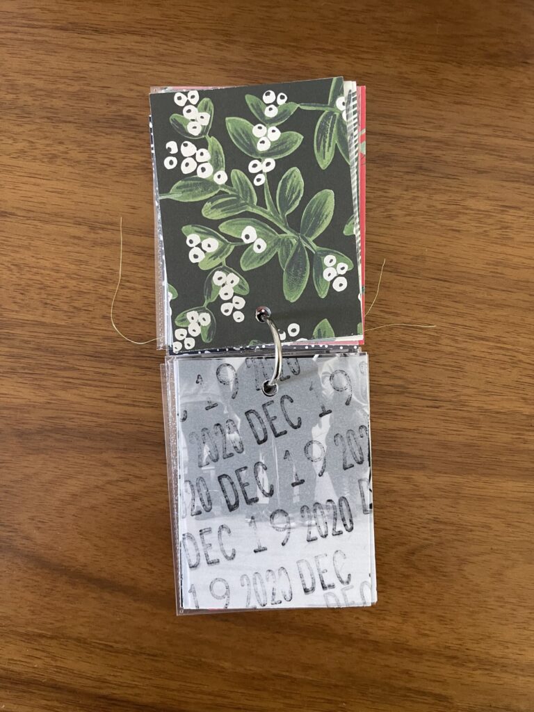
2020—the last year we were all in the same place for the holidays, unbeknownst to us at the time. In the years since, we’ve spread across the U.S. and the five of us (my three kids, their step-sister, and myself) are now in three different states.
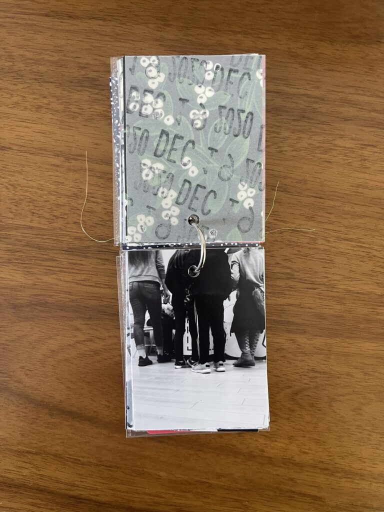
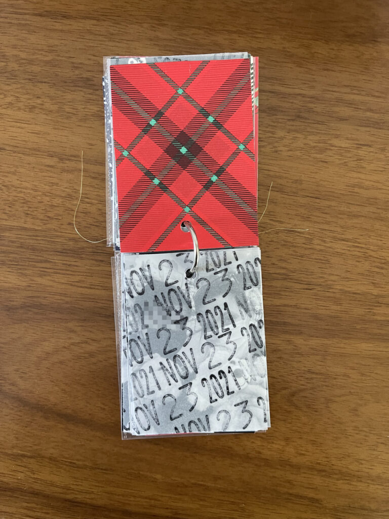
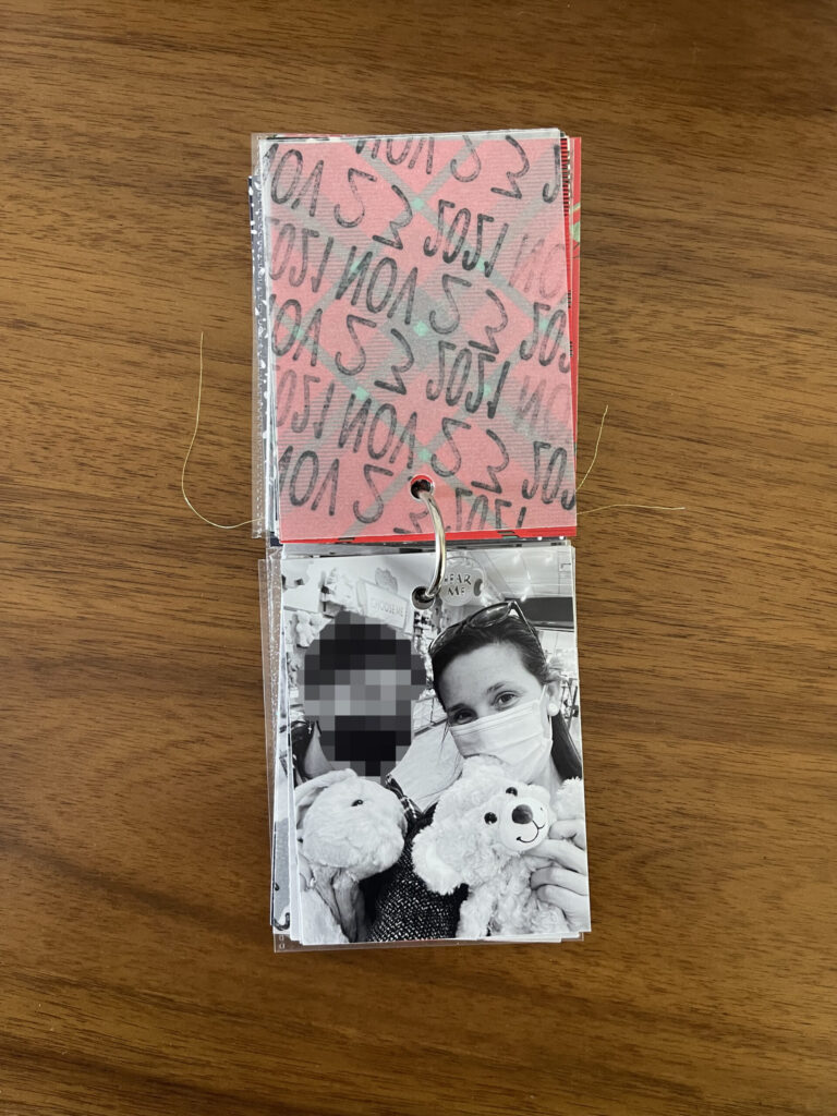
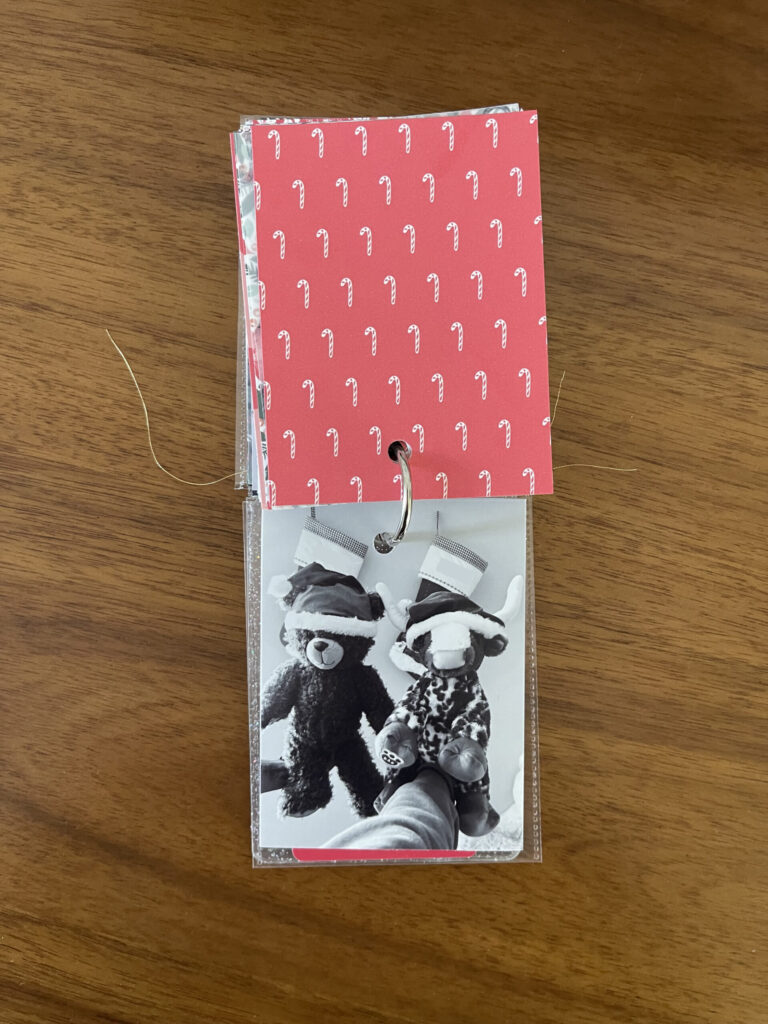
In 2021, my oldest came to visit me in Portland for Thanksgiving. Because it was our only chance to do so together that year, we went to Build-A-Bear during her visit.
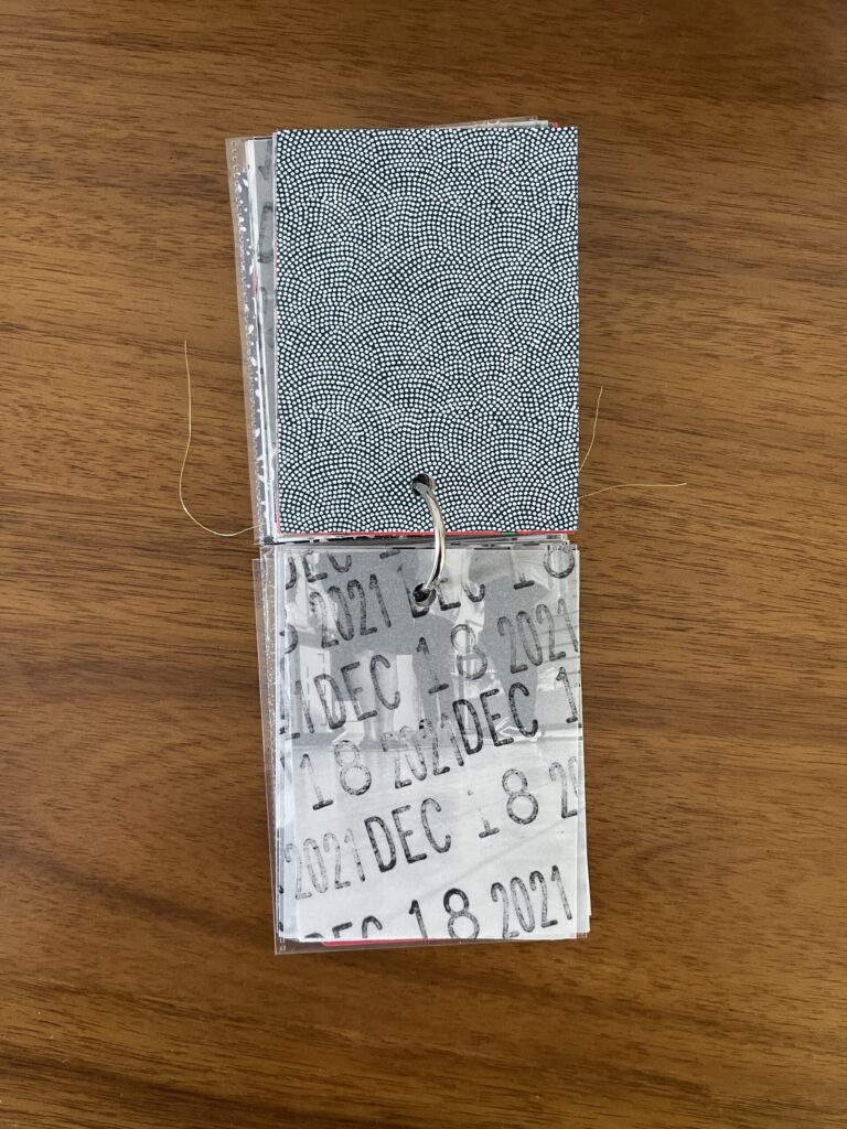
The following month, I flew back to D.C.-ish to spend Christmas with my two youngest and their step-sister and we did Build-A-Bear while I was there. It felt weird to split it up, and I’m so grateful we found a way to keep the tradition alive.
In 2022, spread amongst three states over the holidays for the first time, we all went to our local Build-A-Bear on the same day and shared photos with each other afterward. This was the first year I didn’t get my standard from-behind shot of any of the kids, and the first year that my oldest began bringing a friend. It felt even weirder this year than it did the year before, and also I’m very grateful we again found a way to keep the tradition going.
In early 2022, my youngest and his step-sister (and my co-parents) moved to a place without a Build-A-Bear (sad!). Since then, every year I FaceTime during our visit here so they can pick out what they want, and then I ship them their stuffed animals and whatever accessories, if any, they choose. My oldest (and whichever friend she brings that year) continues to go to her local Build-A-Bear on the same day that my middle child and I go here, and we share photos with each other afterward. The tradition continues to evolve.
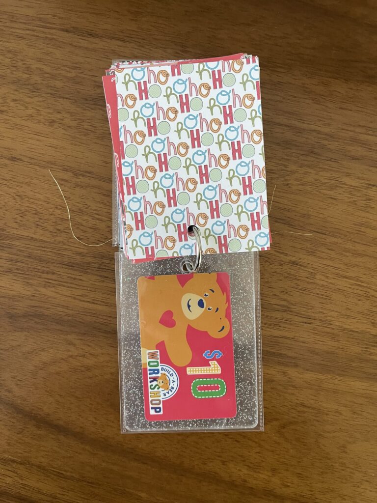
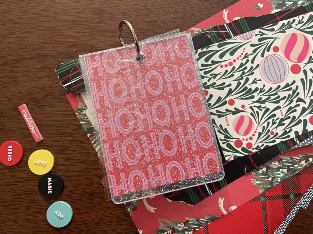
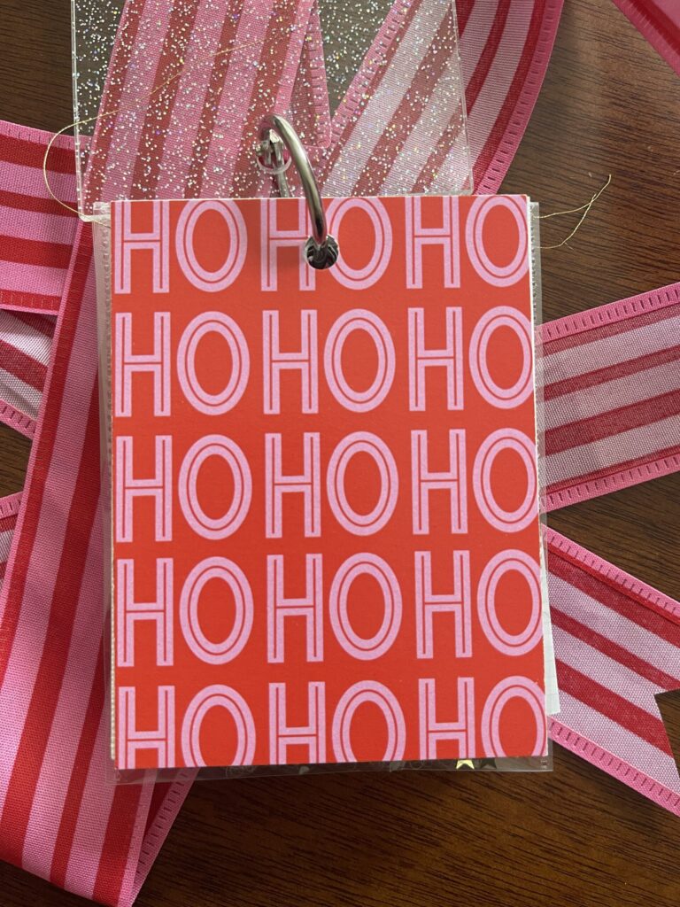
This year’s photos will begin here. Fingers crossed that whichever one is first pairs well with the “ho ho ho” paper.
The final “page” you see here is one of the many gift cards we’ve purchased at half price over the years, slipped into a 3×4 Photo Flips (RIP) with the top cut off.
(For every $25 you spend during any given Build-A-Bear purchase, you can buy a $10 gift card for $5 (I think this applies only to in-person purchases). We usually spend around $100 each year, sometimes a little more, so each year we walk away with $40 or $50 of gift cards for $20 or $25. I use the gift cards to fund basically half of the following year’s purchase. For the first years of this tradition, Costco sold $100 worth of Build-A-Bear gift cards for, depending whether they were on sale, $70 or $80. I’d also buy these, for a little extra savings.)
* * *
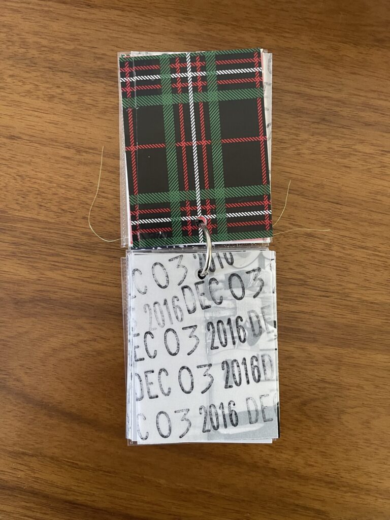
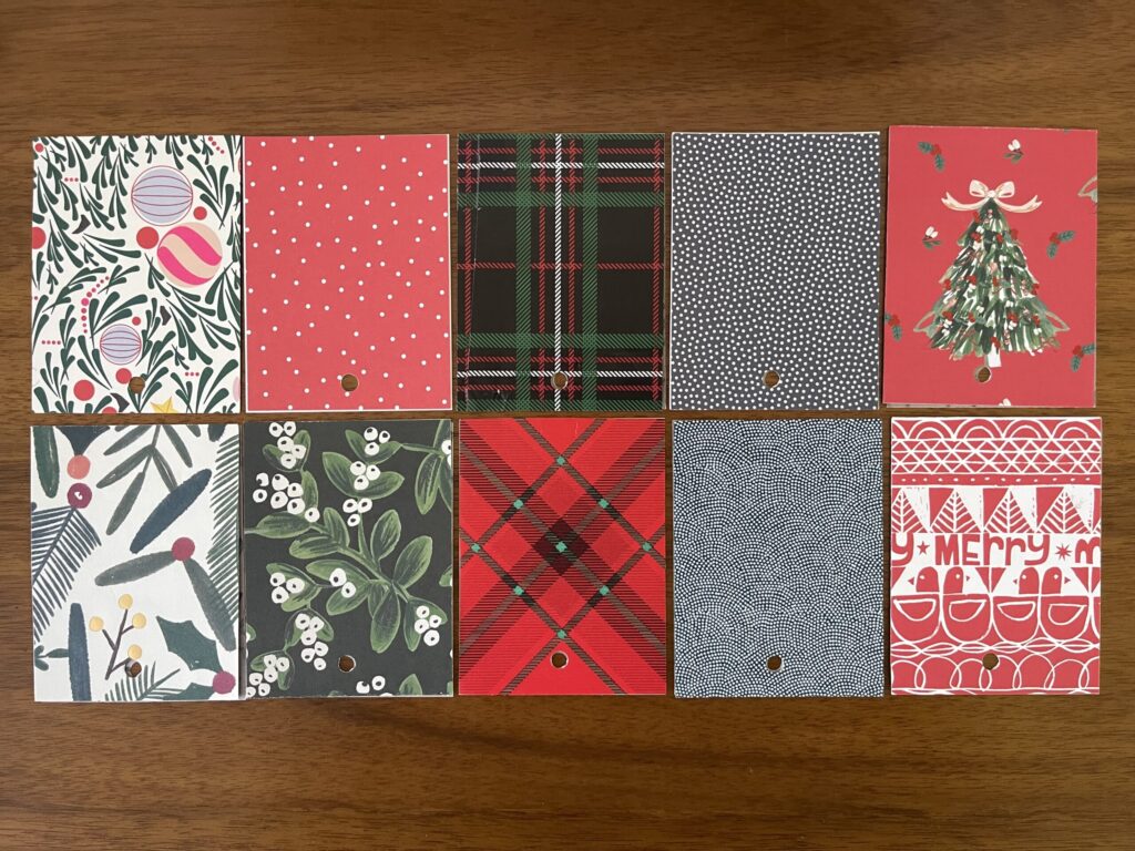
The backs of the first 10 photos are mostly wrapping paper from Christmases past. A few are scrapbooking papers from my stash (both digital and physical) that are no longer available.
The next 10 papers are all digital scrapbooking papers that I printed at home. Most of them are still available.
*Papers with an asterisk are part of the same paper pack. If you’re new to digital scrapbooking supplies, that means you pay a flat price ($5 in this case) for multiple .jpgs of various different patterned and/or solid papers. The two paper packs linked above that are sold by Hey Scrapper offer variants with different colors for some of the patterned papers included in the pack; these color variants are not shown in the product photos on the website (for example, the red and white floral pattern (third option in the top row in the photo above) is included in the linked pack but is not shown in the product photo).
If you print your digital scrapbooking papers at home, a benefit is you can play with the scale of the pattern to suit your preferences and the project’s dimensions. You also have infinite access to digital papers you purchase—you can print them over and over, for use in as many projects as you want, forever. A drawback is that, unless you have a professional printing setup, the paper quality and color vibrancy won’t be on par with professionally printed gift wrap or scrapbooking paper. You can see this in the two photos above: in the first, every paper is professionally printed and the patterns look brighter and sharper; in the second, every paper was printed at home onto cheap cardstock by a basic inkjet photo printer and look a bit muted and less crisp.
* * *
Where to find physical holiday-themed scrapbooking papers: Aside from your local craft supply store and Michaels (and the like), you can find a large selection of physical holiday-themed scrapbooking papers at Scrapbook.com in both individual sheets and paper packs. Often, their individual sheets are double-sided, with a different print/pattern/color on each side.
Where to find digital holiday-themed scrapbooking papers: I think your best bet for digital holiday-themed papers are Hey Scrapper, The Lilypad, and, of course, Ali Edwards’ December Daily product line, which offers both physical and digital options.
A few ways to adapt this project concept: If Christmas isn’t your thing, you might instead use this project concept to document Halloween costumes. Or first-day-of-school outfits. Or birthdays. There are plenty of Halloween-themed and birthday-themed scrapbooking papers out there, and you can pair first-day-of-school outfit photos with so, so many different paper colors, prints, and patterns.
I’m pleased to announce that I’m finally making some progress on this project. Slowly. Surely.
Build-A-Bear is my family’s most-enduring holiday tradition. Others we’ve done many years—Santa pancakes on Christmas morning, Elf, Krispy Kreme right when they open (6 am) in our pajamas. Build-A-Bear is the only one we’ve done every single year since our first visit, which we didn’t know at the time would become a holiday tradition, in December 2013.
This mini album is very simple: mostly photos and holiday-themed paper, with very minimal extras and embellishments. So far, I’ve completed the cover page, a decorative insert, and the pages for 2013 through 2020. I’ve still got the intro page and the pages for 2022 through 2024 to go.
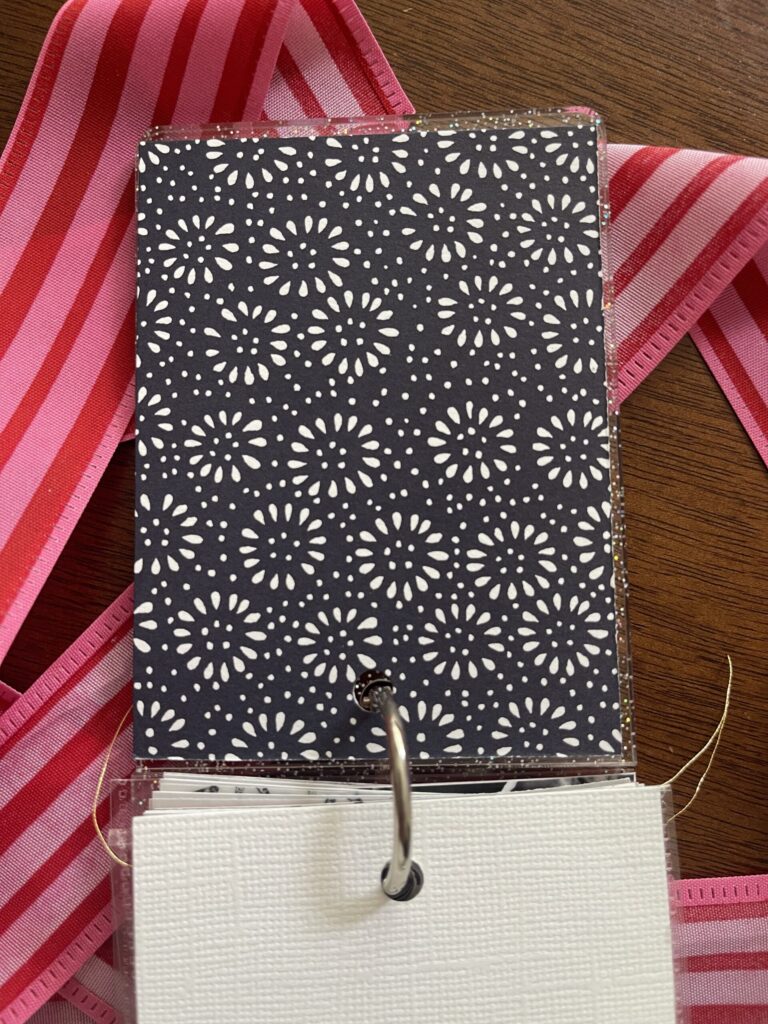
The album is clear acrylic with glitter that I ordered years and years ago from a shop that no longer exists (sorry!). The front of the cover page is the back of a Persnickety Prints coupon from almost 10 entire years ago. I’ve held onto it all this time, waiting for the perfect opportunity to use it in a project. I’m so glad I waited. It really is perfect for this project. To the back of it, I adhered a piece of a letterpress greeting card that I cut down to fit (3″ x 4″). Once I figure out what I want to say, I’ll type up a short blurb about this tradition on that piece of white card stock.
Following the currently blank intro page is a decorative insert I made using a Photo Flips pocket (I cut off the strip with the adhesive) filled with stuffing and a heart from Build-A-Bear (each year I ask to take a small handful of stuffing and a heart to keep as a memento of our family’s holiday tradition and every year (so far) they’ve allowed it), star-shaped glitter from my stash, and a few pieces of the gold thread I used to sew the pocket closed.
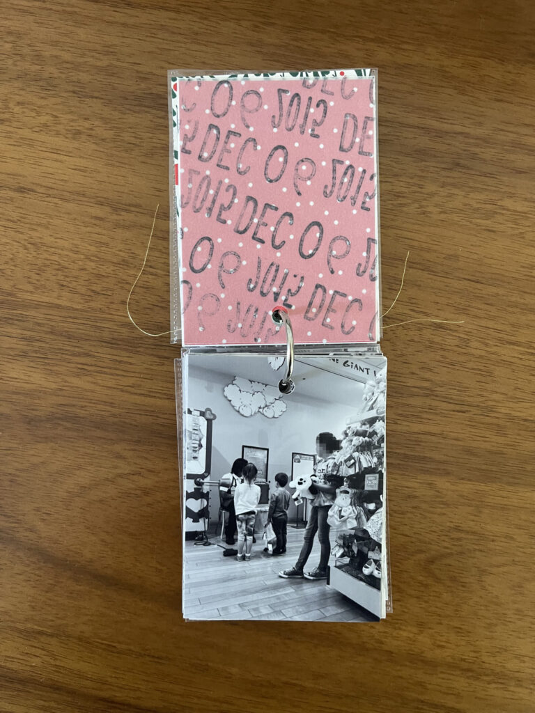
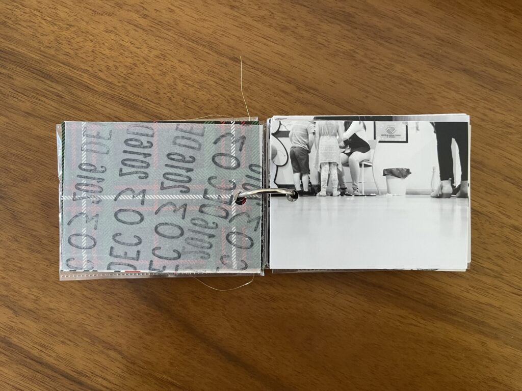
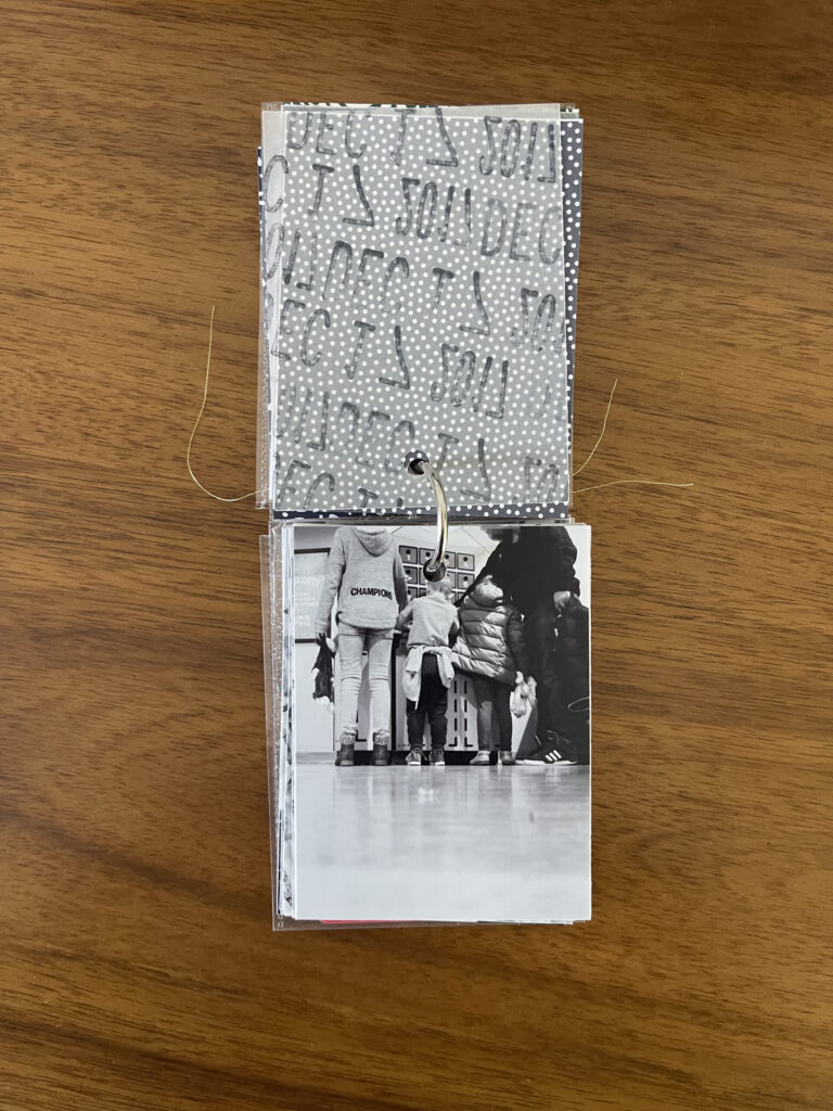
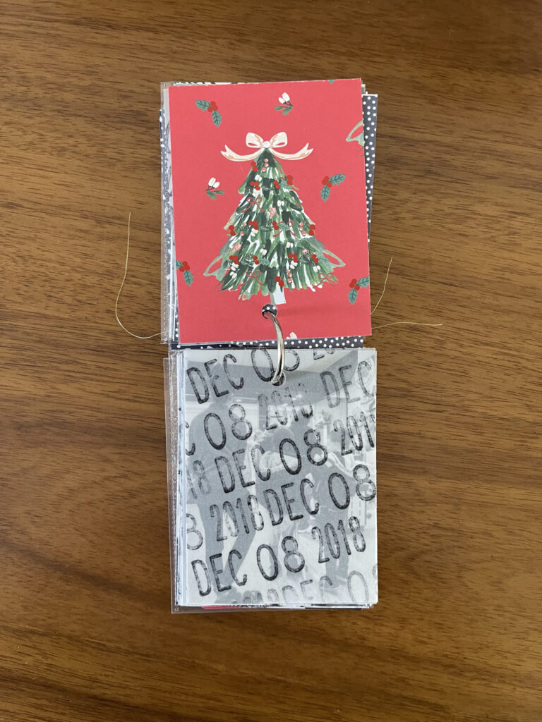
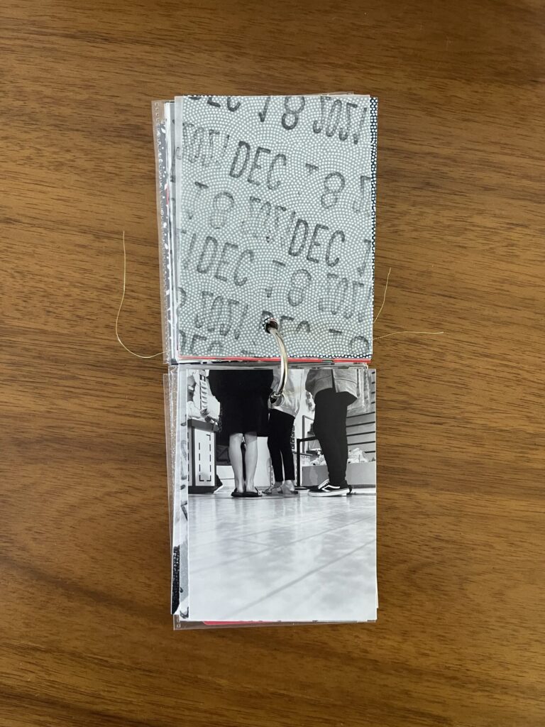
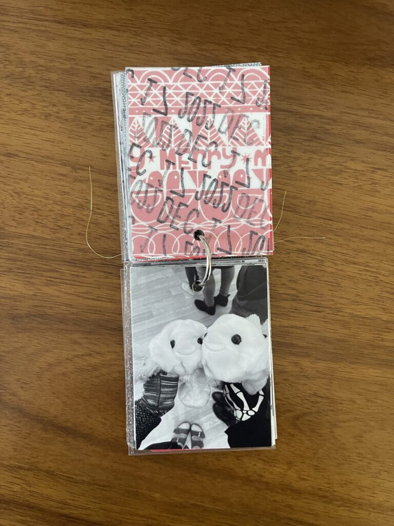
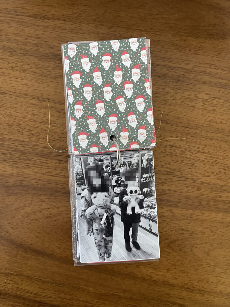
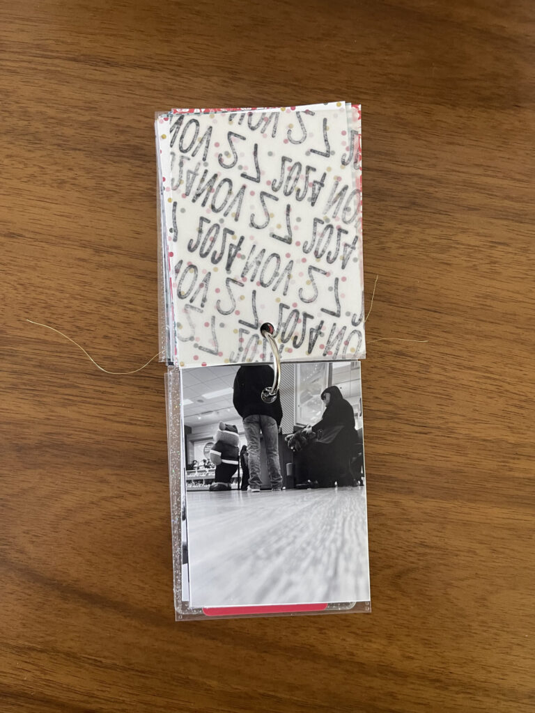
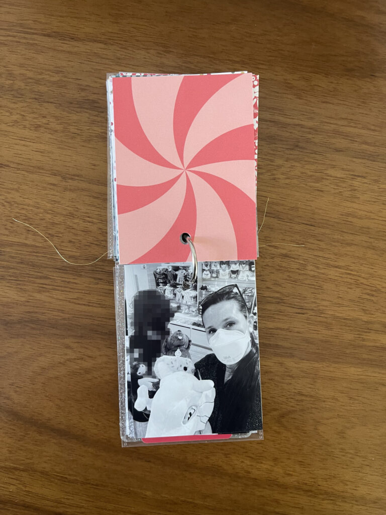
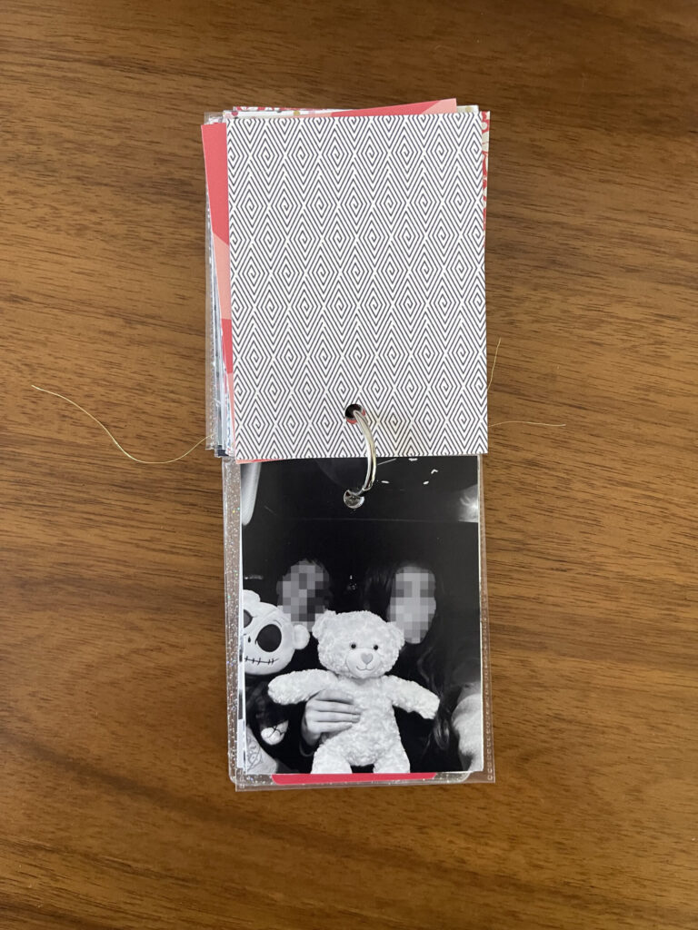
And then, the photos (and papers)! On the back of each photo, I adhered a piece of holiday-themed paper cut down to fit—gift wrap that I’ve saved from Chistmases past, old Project Life filler cards, and scrapbook paper. Before adhering, I played around with the order of these papers to ensure they flowed well with each other and with the photo they’d be opposite of (above) when flipping through the album. And then, of course, I messed up the order when adhering them. Such is life.
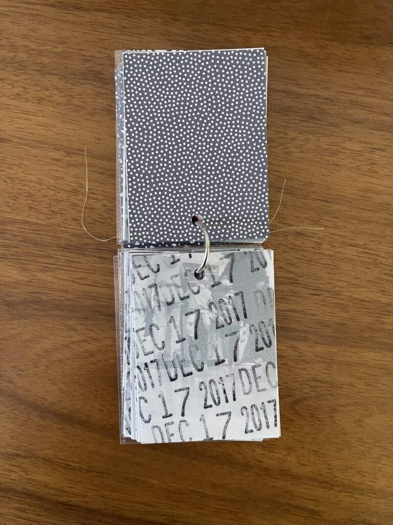
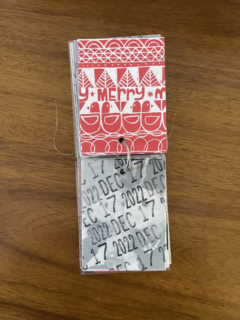
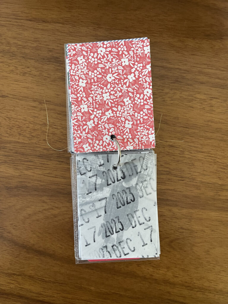
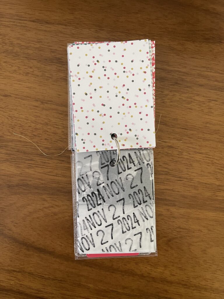
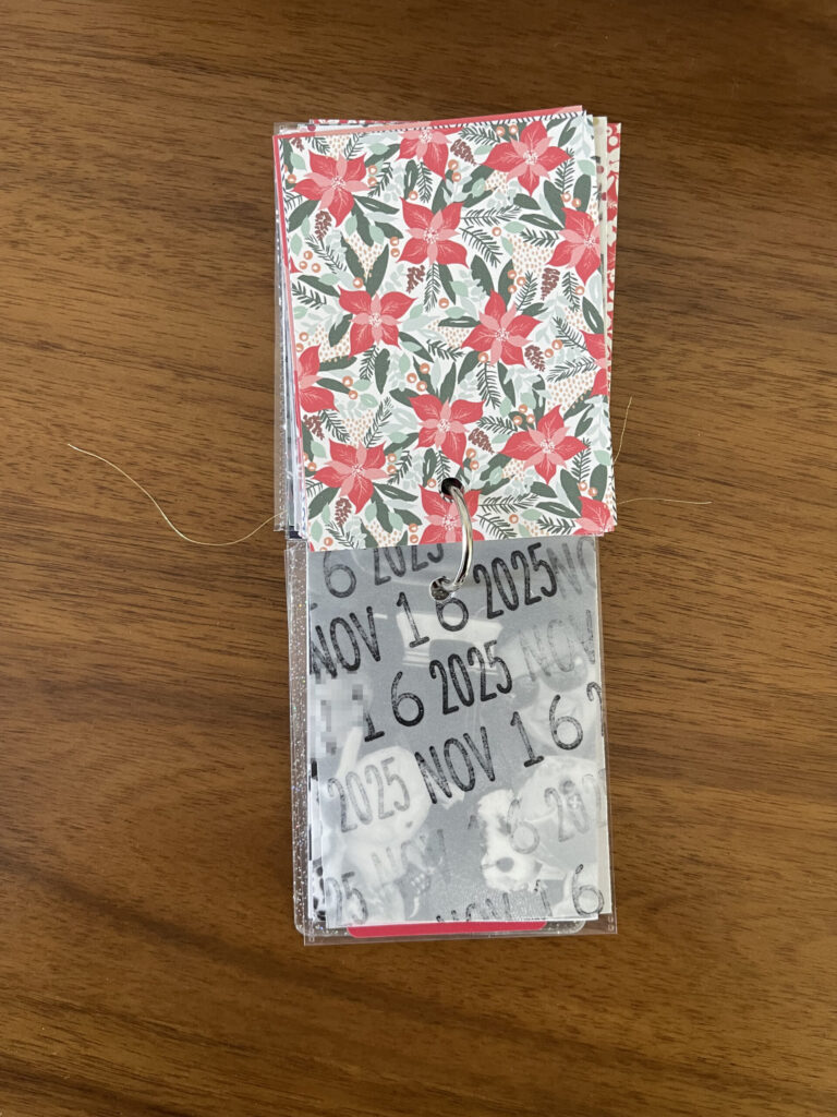
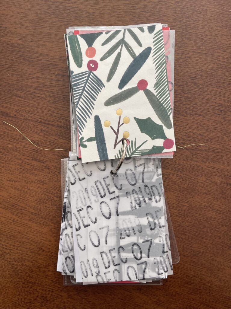
From the beginning, I knew I wanted to include the date of each year’s visit. How to do this was the question. I decided to stamp each visit’s date on vellum using my Mega Date Stamp. Because I had only enough papers to work up to 2021 and because my date stamp was already set to 2021 and it’s a bitch to change, I worked backward from there. Had I worked forward from 2013, I would’ve learned much earlier in the process that my stamp only goes back to 2015. Oops! I’m still not sure what, if anything, I’m going to do about this.
I had the photos printed by Persnickety Prints. I decided on black and white because the lighting in Build-A-Bear is atrocious (it’s giving jaundice) and I wanted the finished project to be visually appealing and consistent without having to do much (any) editing.
I’ll pick this project back up around November—it’ll be easier to find holiday-themed papers then (I’m out of holiday-themed papers, I don’t want to repeat patterns, and while I could order holiday-themed paper online at any point during the year, I prefer to shop in person for paper items so I can see and feel the quality of them before committing)—and will share more photos of the finished (well, caught-up) album closer to the end of this year/the beginning of next.
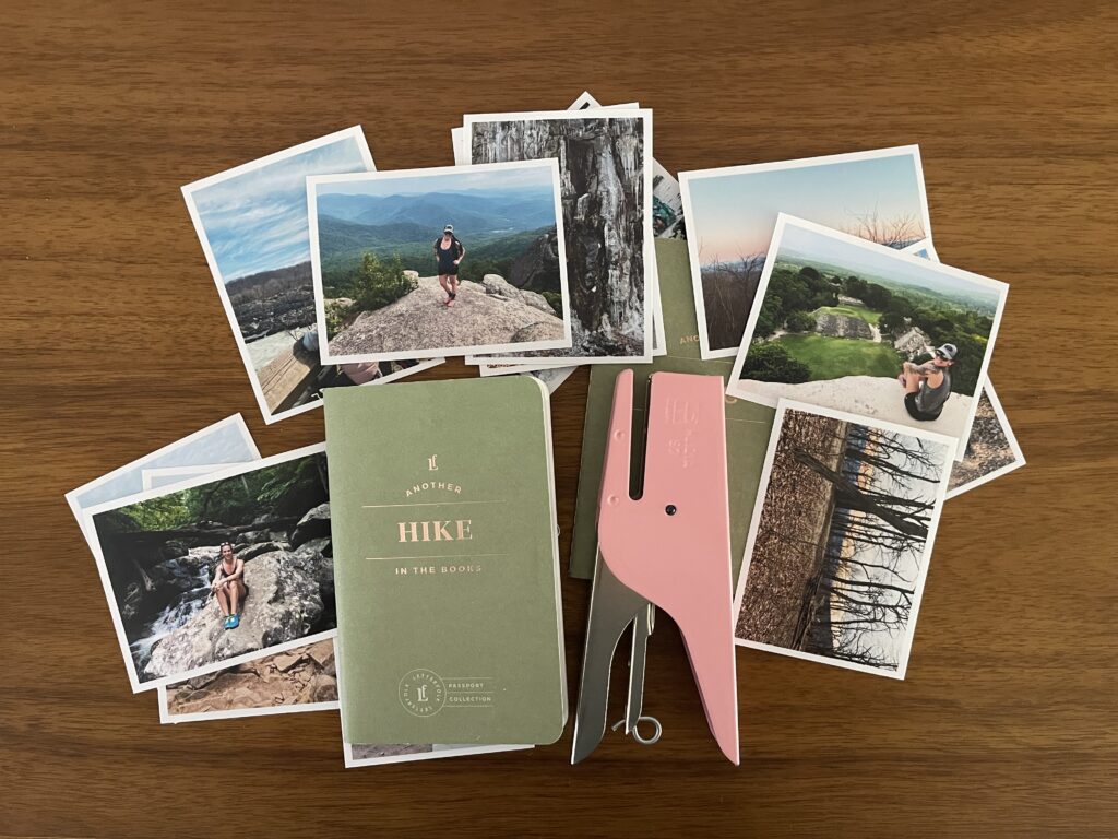
Several years after buying them and then promptly and steadfastly refusing to write in them lest I mess up and ruin them, I’m officially caught up with my Letterfolk Hike Passports. The bad news is, I did indeed mess up the first four entries/spreads in one booklet. The good news is, it didn’t actually ruin anything. I just paper-clipped those pages together and moved on.
The other bad news is, Letterfolk seems to have discontinued their entire Passport product line, which is a major bummer. Memorykeeping can be overwhelming. Because these little booklets were formulaic, simple, and affordable, they were a very accessible way to begin or restart a memorykeeping practice. I’m sad to see them go. (At the time of posting this, there are still a few varieties in stock, for 40% off.) (Maybe the product line is undergoing a redesign and relaunch, not being discontinued???)
Why share how I use this thing when it’s no longer available? I think it’s inspiring to see different approaches to memorykeeping, even when the exact materials are sold out or discontinued. Also, this approach to memorykeeping can be replicated or adapted using a Moleskine Cahier Pocket Journal or Field Notes notebook. Having a look inside my Hike Passports might help you figure out how you want to approach your own DIY version.
I’ve never used a Field Notes notebook, so I can’t attest to their quality. I have used Moleskine Cahiers and I mostly like them. My one complaint is the paper is pretty thin so you need to be careful with what writing utensil you use. Both the Moleskine Cahier Pocket Journals and the Field Notes notebooks measure the same as the Letterfolk Passports (3.5″ x 5.5″); have multiple cover options; offer plain, ruled, graph, and dot-grid paper options; and are priced at $12.95 for a set of three.
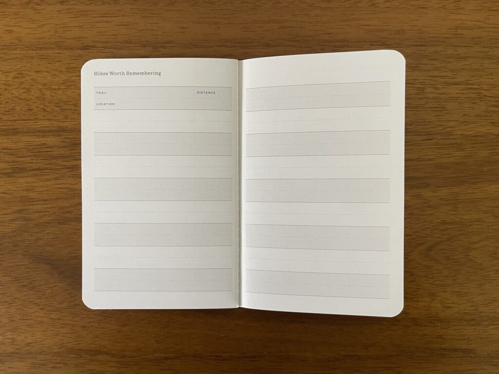
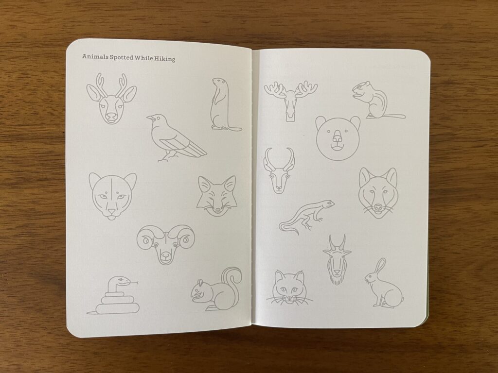
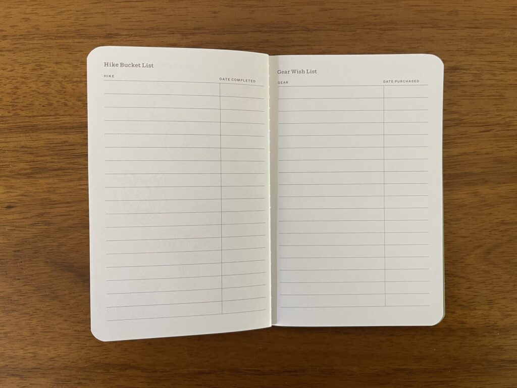
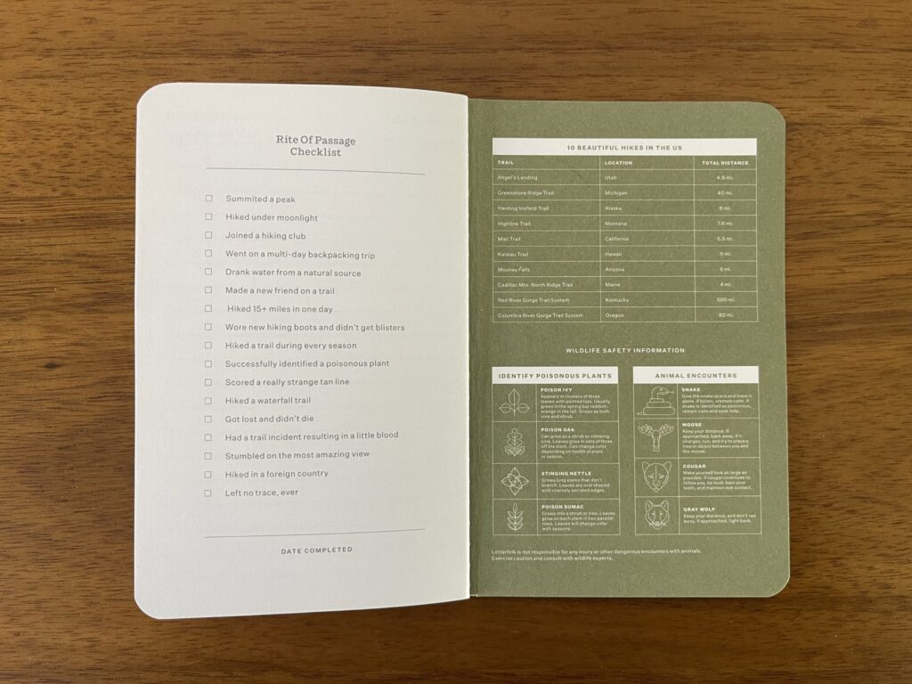
Each Hike Passport has room to document 20 hikes. There are also some extra pages in back to put a gear wish list, hike bucket list, and some other stuff.
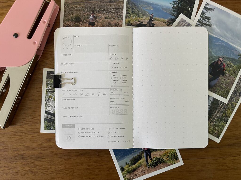
Each of the 20 documenting spreads has a templated page on the left and a dot-grid page on the right. The templated page on the left has space to document details like the date, trail, location, distance, who you hiked with, the gear you brought, the weather you encountered, types of terrain, snacks you ate, how busy the trail was, how difficult the trail was, how long it took you to complete, etc. On the right, a dot-grid page for you to put whatever you want; I chose to include a photo from each hike. Other, more fun options of things to put here: a park or parking pass, a piece of trail map, a wrapper from a snack or the tag from one piece of gear or another that you bought for the hike, or a leaf or flower from the trail (if that’s legal where you are).
If you DIY your own version of a Letterfolk Passport, you could create a template for whatever theme you choose to document (hikes, date nights, wine tasting, movies, recipes, etc.), print out however many copies you need to fill your notebook, and adhere each template to whichever side of the page you want. Or you could just write whatever you want to remember about each entry on whichever side of the page you want. On the facing page, you could include a photo, sketch a scene from your adventure, journal about whatever you did, or preserve a piece or small collection of ephemera (a movie ticket stub, a coaster, a piece of a menu, a receipt, a photo booth photo strip, etc.).
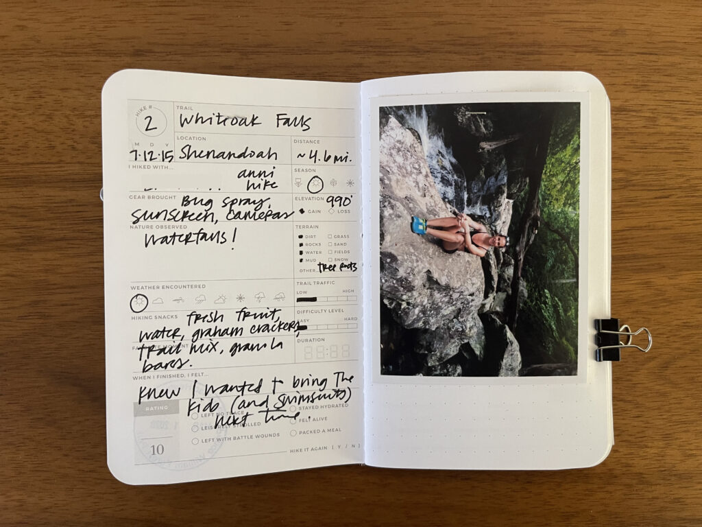
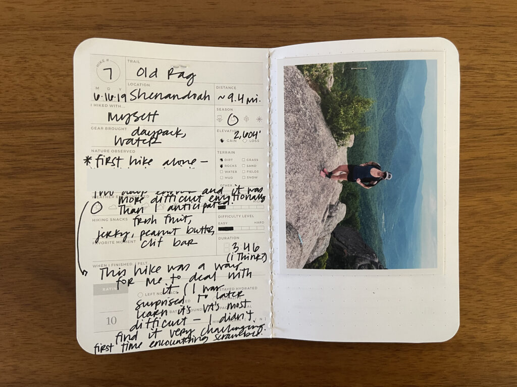
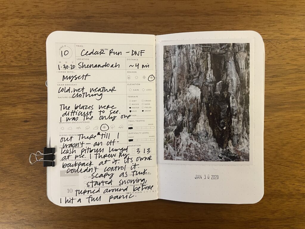
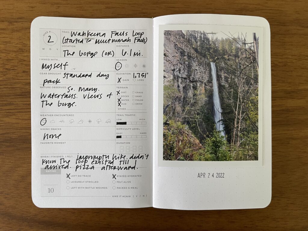
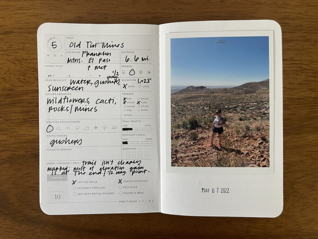
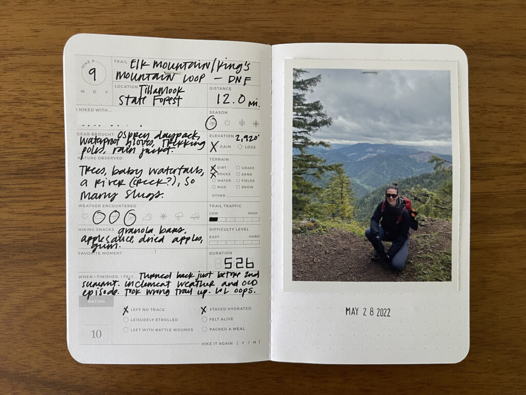
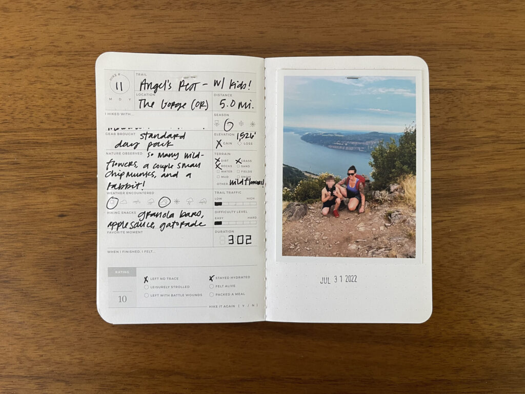
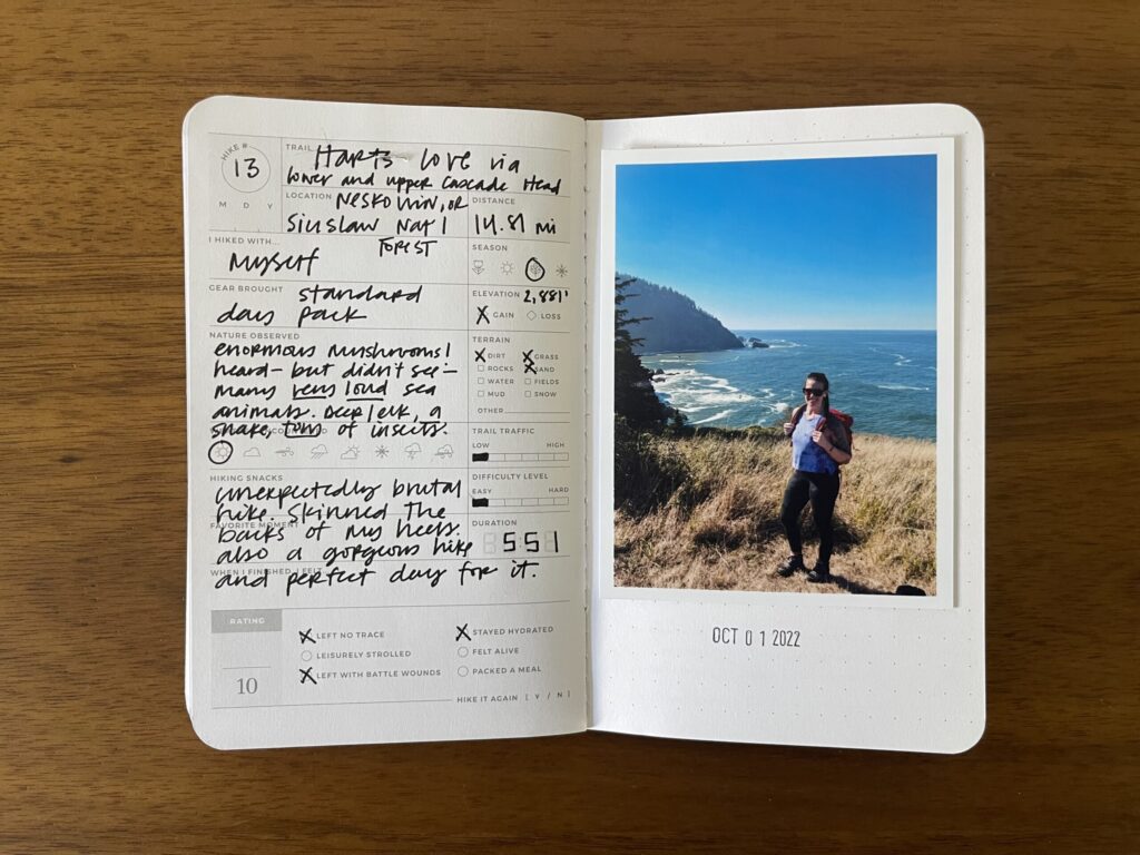
Here’s a look at a few of my completed (“completed”) pages. I don’t fill out every field for every entry, just the details that I kept track of (or, when working backward, the ones that I remember) and that feel relevant to me for that particular hike. I also don’t worry about including every detail—I save the more thorough write-ups for a private journal. These booklets are just a fun way to quickly get some of the details down. I’ve included a variety of pages below, so you can see the variance in details between entires and how informally I organize my thoughts on the page. It doesn’t have to be perfect!
Unknown trail somewhere in Shenandoah; hiked May 24, 2015. An early birthday hike with my then-partner and two of my kids. And what an adventure (derogatory) it was: I lost my phone when we drove away from the Visitor Center with it on the roof of the car. We had to drive all the way back home (about two and a half hours) to drop the kids with their dad, pull up Find My Phone on my Mac at home (my then-partner had an Android so we couldn’t pull up the app on their phone), print out a map of where it was pinging to, drive all the way back out to Shenandoah (another two-and-a-half hour drive), and carefully traverse the very narrow shoulder of a very winding, highly trafficked road until I found it in the grass, completely unscathed. An actual miracle. Then we drove the final two and a half hours back home.
Upper Whiteoak Falls; hiked July 12, 2015. An anniversary hike. This trail is a gorgeous out-and-back with multiple spots to climb out onto huge rocks in the water (we lunched on some), and an amazing waterfall you can swim beneath at the top/turnaround point. Not at all difficult, very kid- and (leashed) dog-friendly. (The weekend after we did this trail we went back out with the kids, two of whom were under five years old at the time, and they had no trouble with it.)
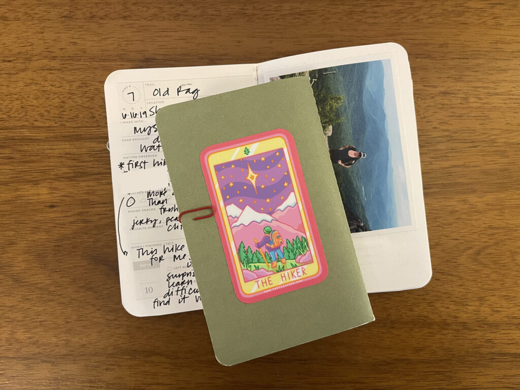
Old Rag; hiked June 16, 2019. My first “real” hike, my first solo hike, and my first time encountering scramble.
Cedar Run to White Oak Fire Road Loop; attempted January 30, 2020 (did not finish (DNF)). This was…a hike. The blazes on this trail were very poorly marked and with so many leaves on the ground it was difficult to tell if you were even on a trail. I turned back much sooner than planned because it started to snow (not forecasted!) and I was out there alone. Until I wasn’t. Shortly after I turned back, an unleashed, angry dog was running straight for me, its owner nowhere in sight. The dog was extremely aggressive and lunged at me several times, barking and growling and baring its teeth. I ended up having to throw my backpack, sticks, and branches from the ground at it to get it to back the fuck up off me. Its owner eventually caught up and spent what felt like an eternity trying to get hold of the dog’s collar and control it so I could safely keep walking away. LEASH YOUR FUCKING DOGS, PEOPLE!!!
Wahkeena Falls Loop/Multnomah Falls; hiked April 24, 2022. An impromptu hike. I went to see the falls, saw the sign for the loop, and said “fuck it” and set out.
El Paso Tin Mines Trail; hiked May 7, 2022. A hike with my oldest, to celebrate her 17th birthday. It was extremely hot this day, just like every other day in El Paso. We should’ve brought more water (there’s no water sources along the way). Climbing down into and then wandering through the mines was so fucking cool.
Dog Mountain; hiked May 20, 2022. This is a very popular (crowded) trail. If you, like me, are not a social or leisurely hiker, you will find yourself bottlenecked and annoyed many times along the way, even if you go early as fuck on a weekday. Physically, it’s great. It’s the hike equivalent of any workout on the assault or Echo bike—all lungs and legs. The ascent is immediate and unrelenting (making the way back down more of a trail run than a hike), and the views are gorgeous.
Elk Mountain/King’s Mountain Loop; attempted May 28, 2022 (DNF). This hike almost killed me. Literally. It’s the only hard-rated trail I’ve hiked that’s actually hard, and it’s the reason I haven’t been back out on the trail since the end of the 2022 season; I managed only four hikes after this one, two of which I didn’t finish. This trail/experience really fucked me up, mentally.
Angel’s Rest; hiked July 31, 2022. My second time on this trail, this time with two of my kids. Pretty short and easy, and by far the prettiest and lushest trail I’ve hiked. If you find yourself in or near Portland in July or August and looking for a hike, I highly recommend this one.
Hart’s Cove via Upper and Lower Cascade Head; hiked October 1, 2022. My last hike of the 2022 season, and the last time I hiked. I’d tried this same trail a few weeks earlier and had to turn back after about four miles because of enveloping wildfire smoke and a mentally ill brain that kept telling me to jump off the oceanside cliff. I’m glad I went back. I’m glad I got the full hike in before they closed the trail, and even though it was a mentally exhausting experience thanks to my OCD and derealization kicking in again on the most precarious portions of trail. I truly have not been the same out there since Elk’s Mountain/King’s Mountain.
I worked on this project in real time for all of my 2022 hikes so they have the most accurate and complete entries. For all of my pre-2022 hikes, I worked backward, completing each hike’s entry in December 2024. Because of this, some of these hikes don’t have as many details (some of them don’t even have a trail name listed), are missing a stamped date beneath the photo (my date stamp goes back to only 2020; I wrote the dates of my pre 2020-hikes in the space provided at the top on the left-side page), and the numbering of each hike in the top left is fucked up (I started both booklets with “1,” oops). Oh well.
I used the free/basic version of the AllTrails app to measure distance and elevation for most of my hikes beginning in 2020. Stats for hikes prior to 2020—if I listed them at all—are estimates pulled from the hike’s AllTrails page. I included all hikes, even ones I didn’t finish, regardless of the reason. Every hike received its own entry, which means the trails I’ve hiked more than once have more than one entry.
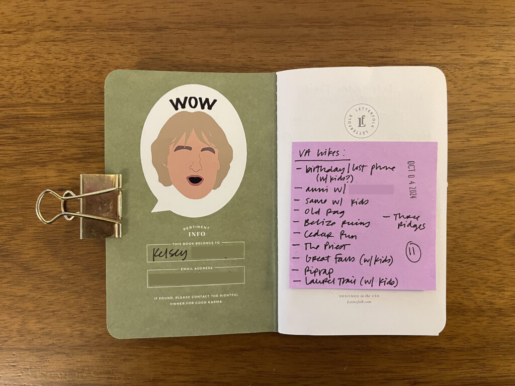
I decorated my current Hike Passport—the one that includes all my 2022 hikes and still has room for a few more—with some stickers. On the inside cover, Owen Wilson saying “WOW,” because of how often I find myself stopping to take in the views around me and, à la Owen Wilson, saying, “WOW” over and over and over. I found this sticker on Etsy. Sadly, it’s no longer available.
On the back, a “THE HIKER” sticker modeled after a tarot card, that I found at Powell’s. That red paperclip is holding additional photos for, and index cards with notes about, some of the hikes.
* * *
Supplies
Letterfolk Hike Passport: This entire product has seemingly been discontinued, sorry! A few other Passports in the collection are still available (and at 40% off!) at the time of posting.
Photos: For my regular Project Life album I print my photos at home (I use a 10-year-old Epson PM-400 that I love and recommend). For projects like this one where the photos are exposed and handled directly, I print my photos through Persnickety Prints. Their website is a little janky. Their quality and service is unmatched. They’ve been my go-to photo printing service for a decade. Unless you truly need your photos immediately, there’s no need to pay for expedited shipping. Standard shipping (their default option) is incredibly fast and, with the exception of literally one time in 10 years that the post office lost the shipment, it’s never taken anywhere near 7-10 days to arrive, not even when I lived on the other side of the country.
Stapler: Ellepi Klivia 97, $25-ish (it comes with a little sleeve of 1,000 staples). If your local paper goods shop or craft store doesn’t carry Ellepi, try Little Otsu or Porchlight, two of my favorite Portland businesses. (Fun fact: Ellepi is a four-person Italian team and they make all of their products by hand.)
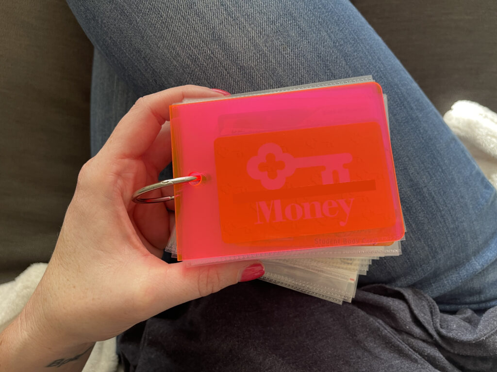
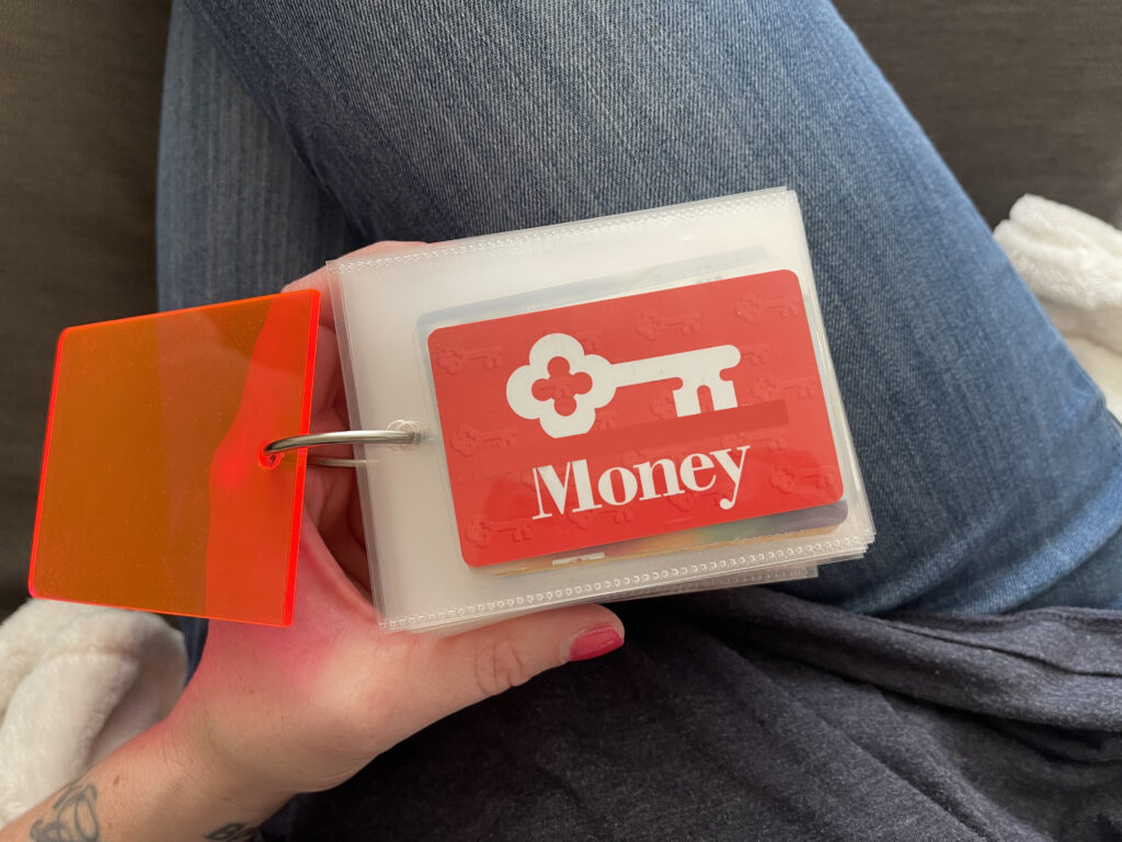
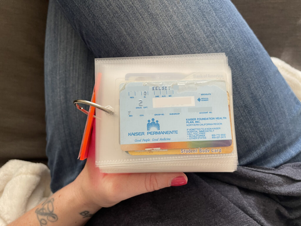
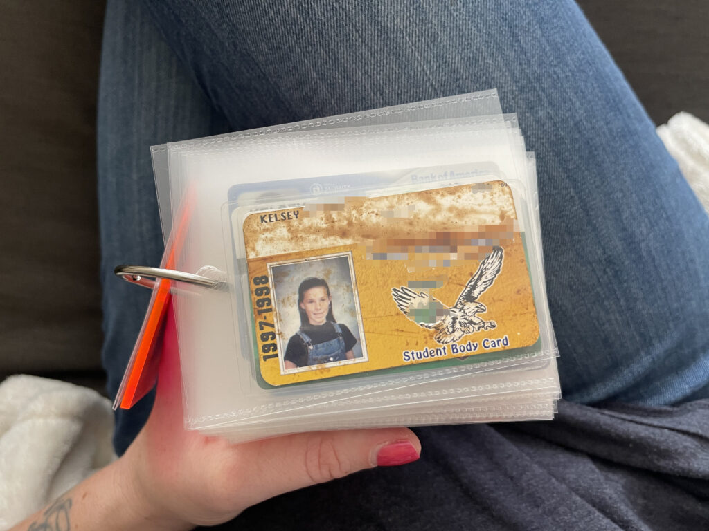
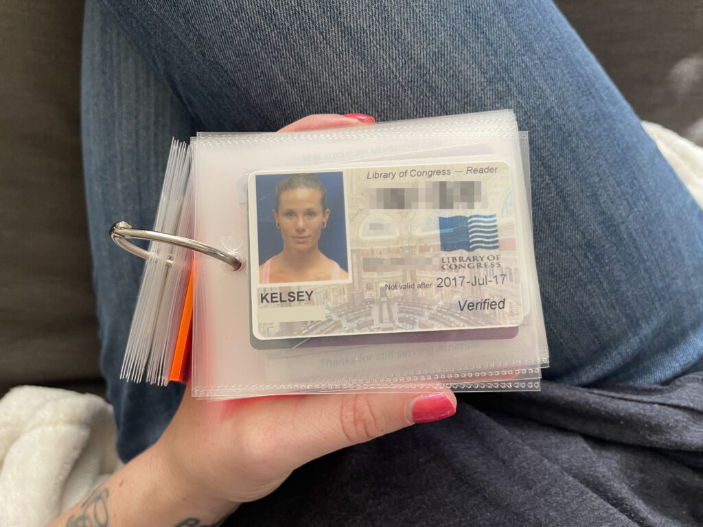
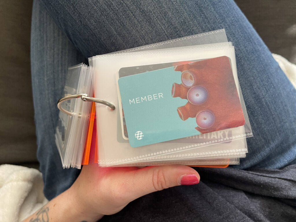
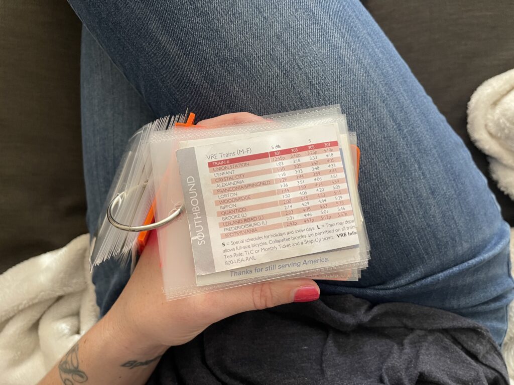
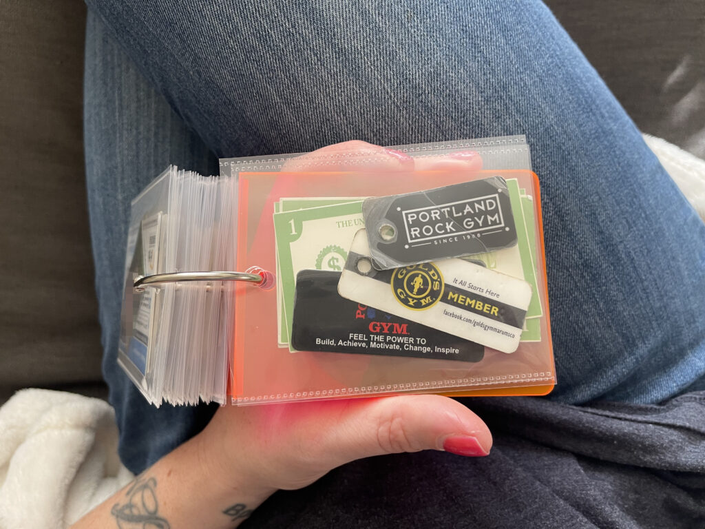
About a year ago, I was trying—again—to reestablish a regular memorykeeping practice. It just wasn’t working. I’d recently quit my job and was still in the thick of autistic burnout and passive suicidality. I didn’t have the brain space for a regular memorykeeping practice, and anyway I wasn’t doing anything aside from lying on my couch all day so there wasn’t anything to document. I wanted to do something, though. Something that took less effort and was basically impossible to fuck up. So I dug this acrylic album out of my stash and a stack of old ID (and similar) cards out of a container in my closet and made this very simple project.
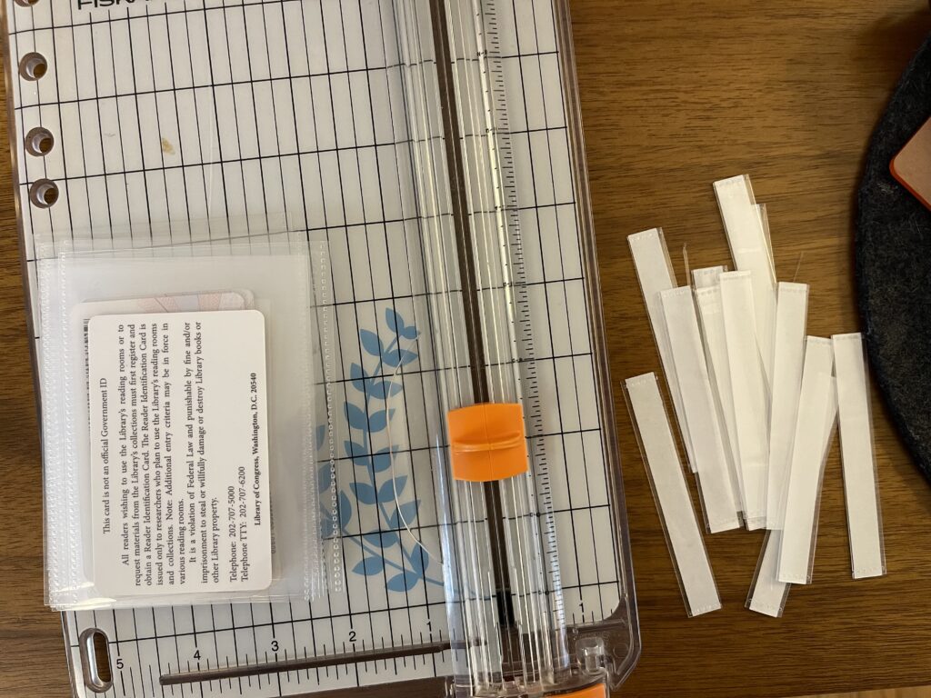
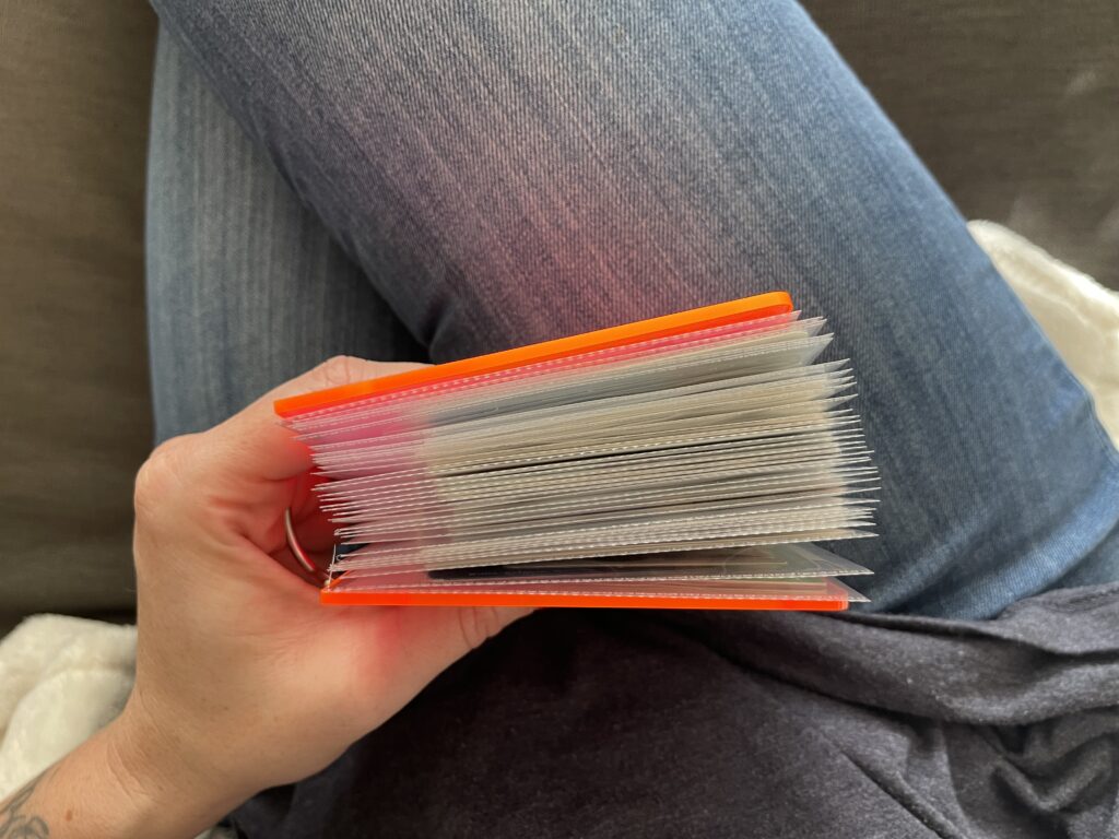
To secure the cards, I trimmed off the top part of Photo Flips and, using the album cover as a guide, punched holes in the top center of each photo flip. It’s all clipped together with a binder ring.
The whole project took maybe an hour. The most challenging and time-consuming parts were deciding which cards to include (all old school and work IDs and drivers licenses, select business cards, old membership cards, and other IDs and various cards that hold the most sentimental value) and in what order (mostly chronological).
Many of the cards in this album are old school and work IDs and drivers licenses. Aside from the one school ID shown below, none of them are included in this post. I didn’t feel like doing the work required to block out all my personal information.
In addition to old school and work IDs and drivers licenses, I also included things like bank cards, health insurance cards, library cards (mine and my kids’), membership cards, neighborhood pool passes (RIP to living on the east coast where every neighborhood has an outdoor pool), National Parks annual passes, business cards (my own and others’), SmarTrip cards, the train schedule I kept in my work bag for the days I commuted by train, and key tags for some of the gyms I’ve belonged to.
Like my pandemic puzzles mini album, because this project is clipped together with a binder ring, it’s expandable so I can keep adding to it over time, which I love.
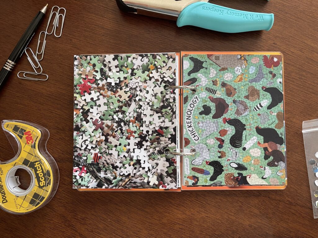
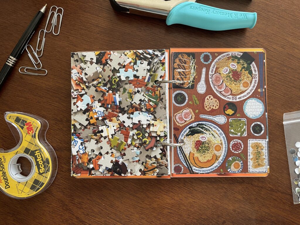
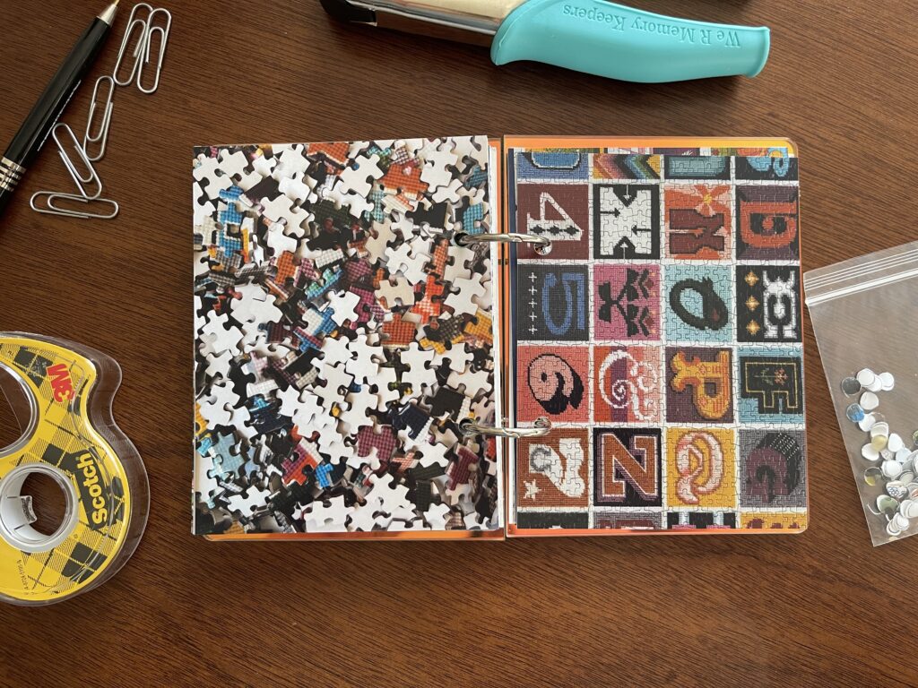
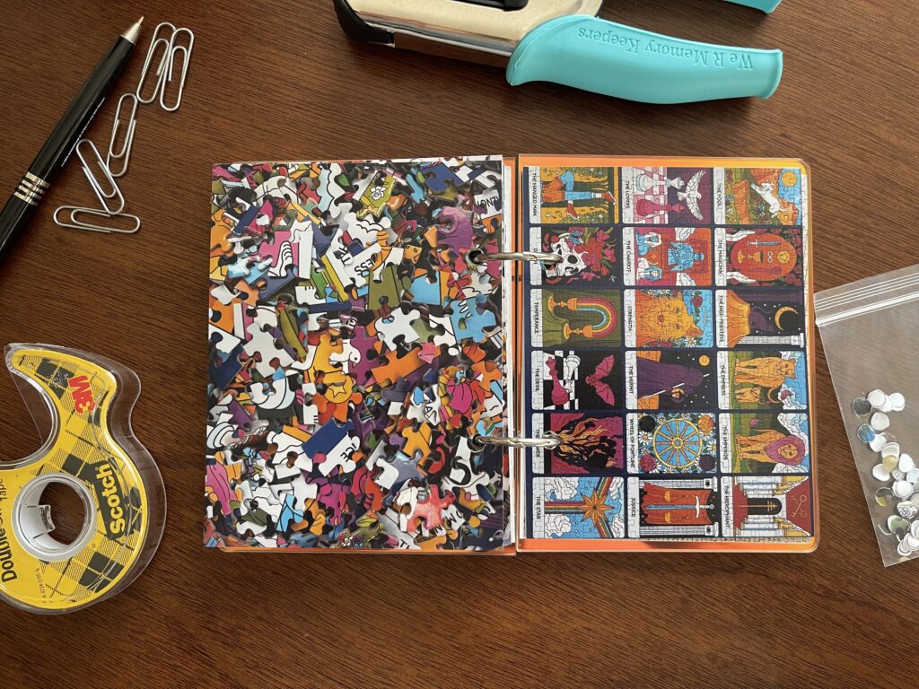
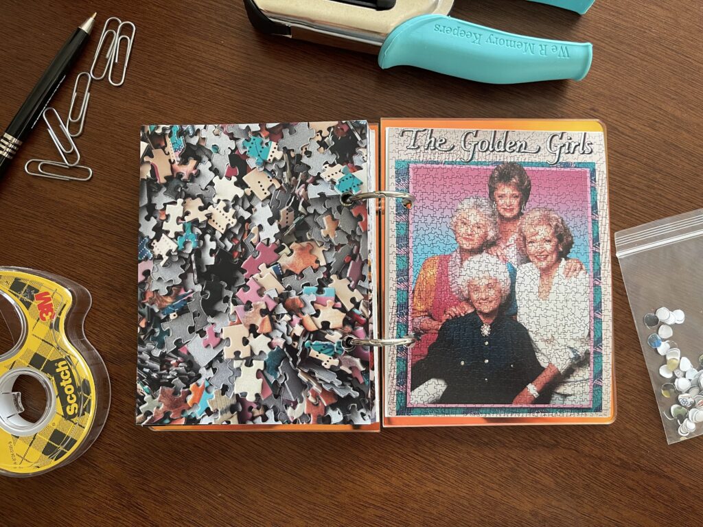
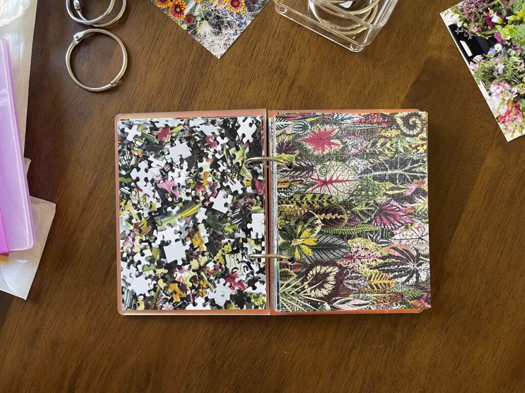
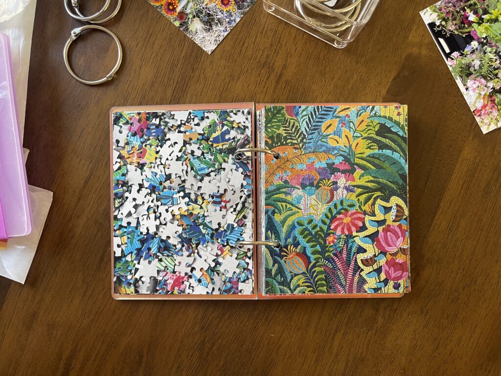
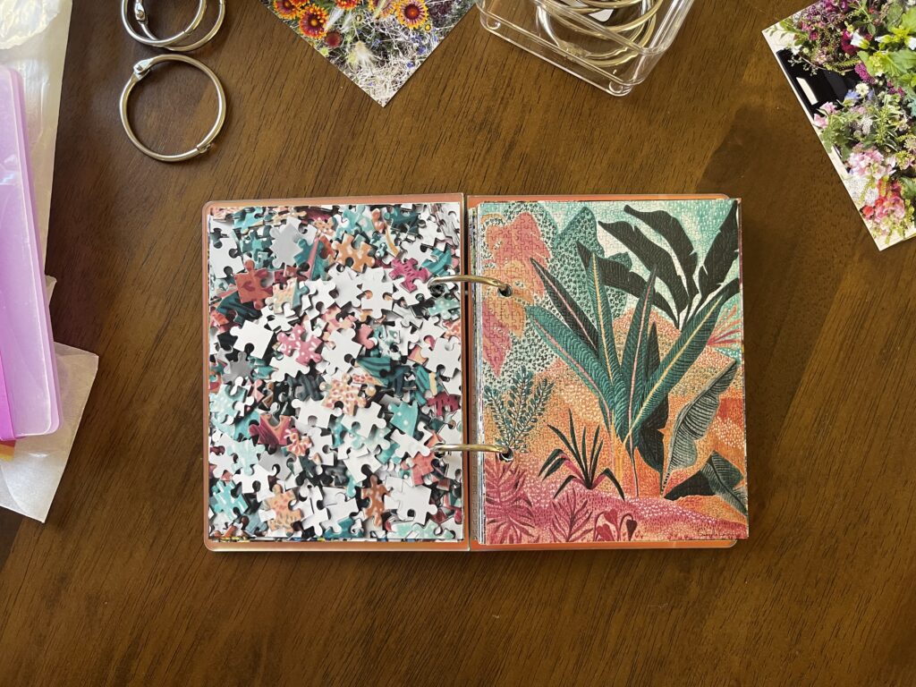
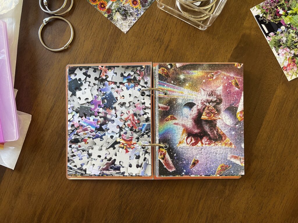
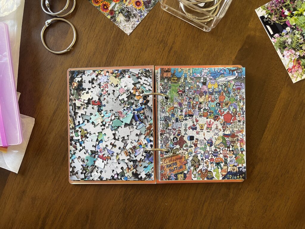
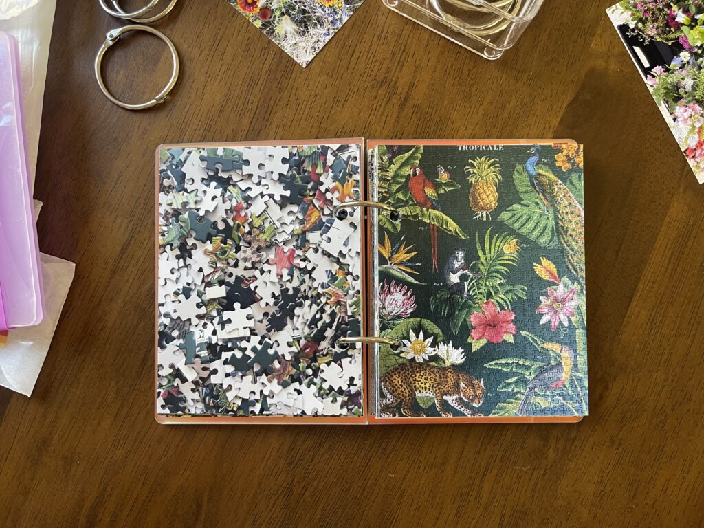
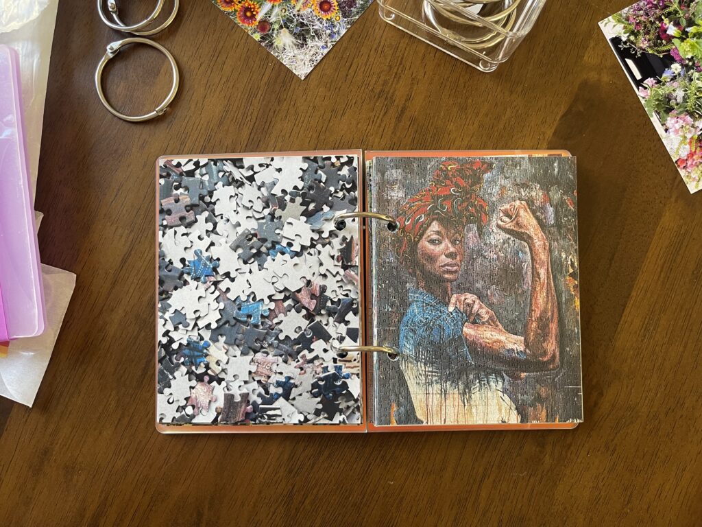
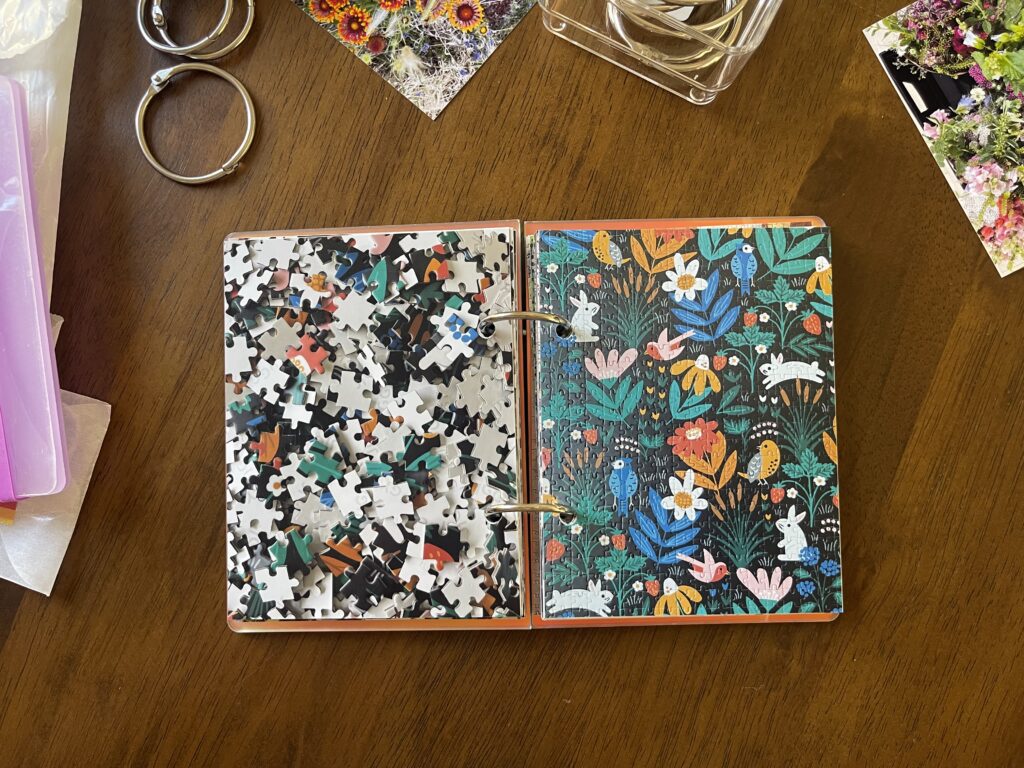
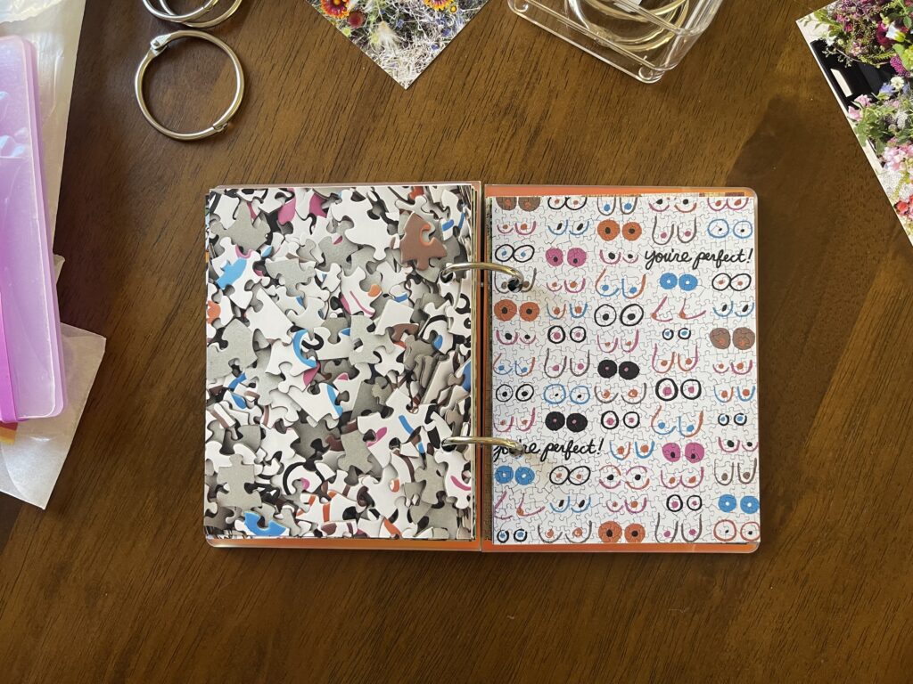
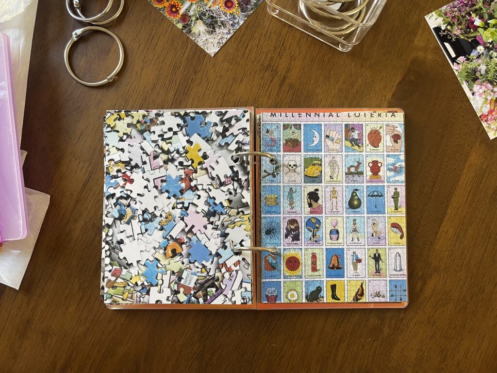
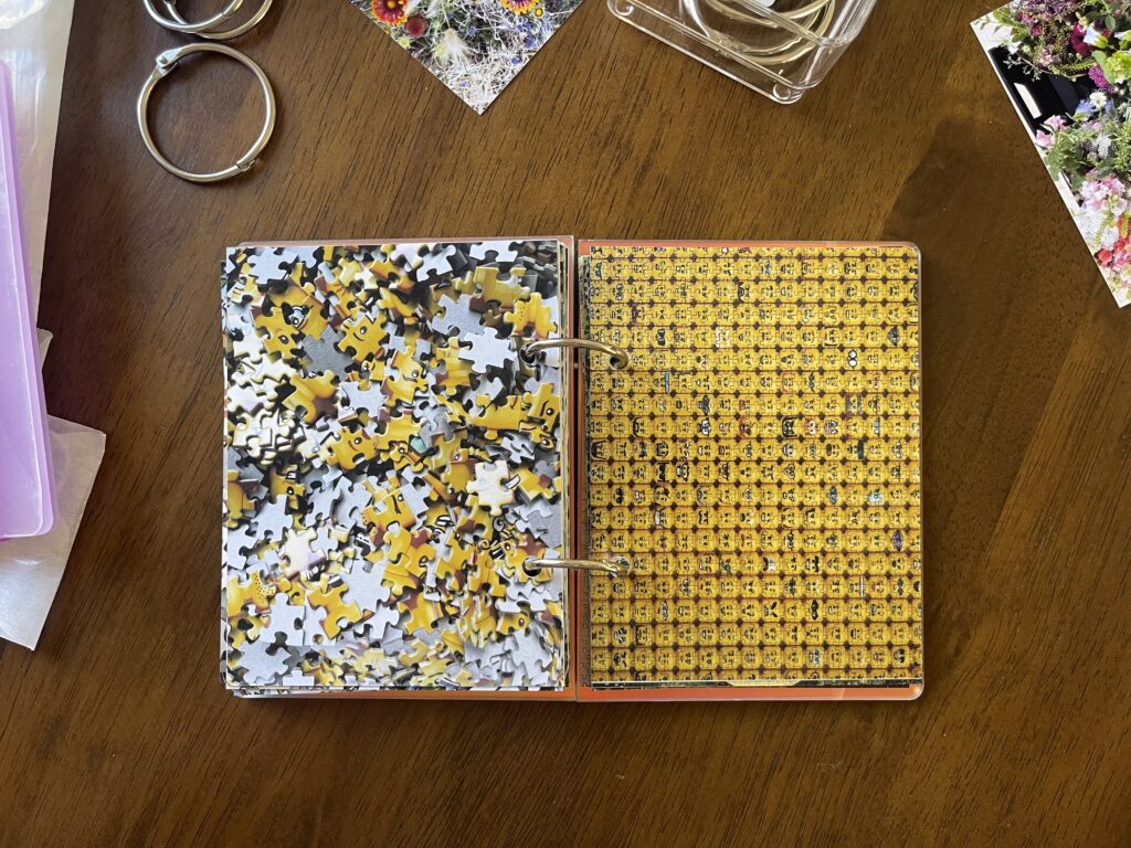
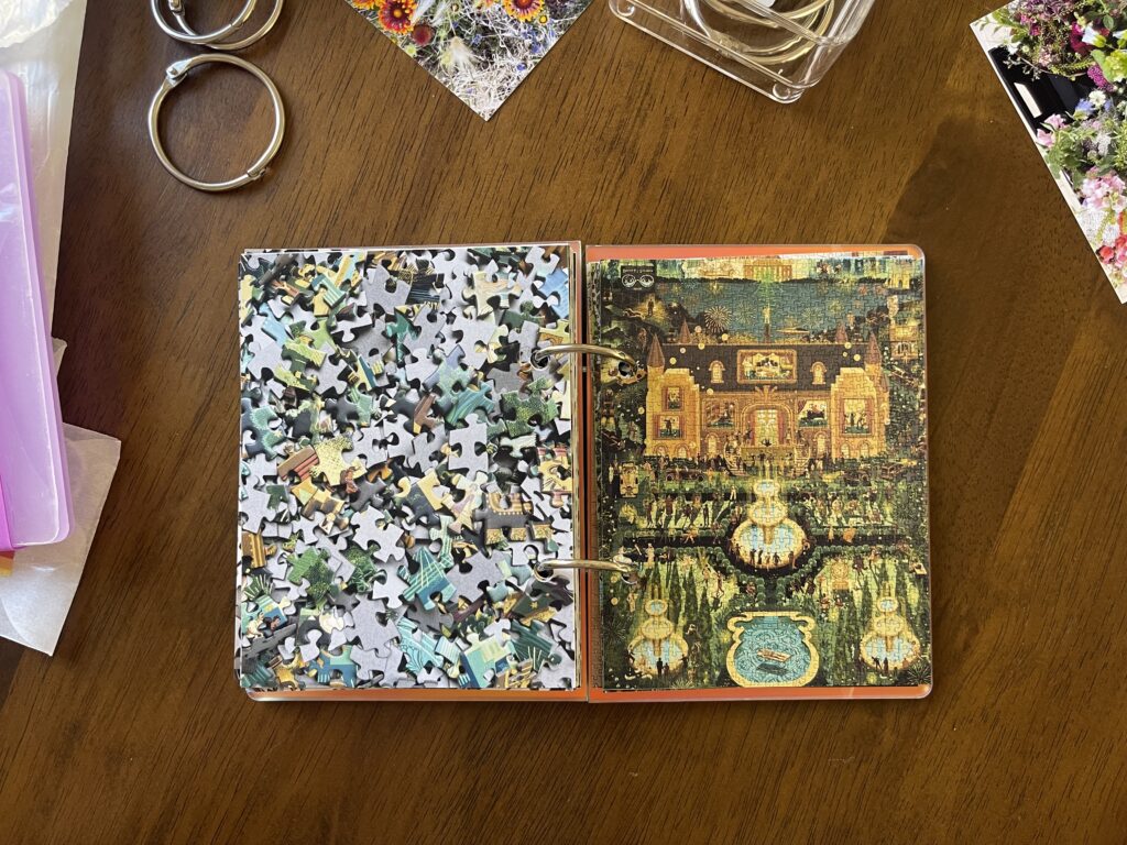
Over the weekend I added photos for five additional puzzles to my Pandemic Puzzles mini album. I messed up on the very first one 😬.
Chickenology by Princeton Architectural Press. 1,000 pieces.
Ideally, the right-side page should be flipped so that “chickenology” is on the edge, facing in. The thing is, there was…a wildlife situation happening on the roof of my apartment building when I was putting these pages together. It was extremely loud and distracting (and, at times, sounded kind of like chickens). I would’ve gone outside to get a better idea of what was happening (I was watching it as best I could via the reflection in the top-floor windows of the building across from mine) if there hadn’t also been an aggressive and likely rabid raccoon terrorizing tenants in our parking lot. It was an eventful holiday over here (and, quite frankly, the most excitement in my life all year). Anyway. I was distracted by all the chaos and I messed up. Oh well.
I bought this ramen puzzle at Two Rivers/Weird Sisters, a super cute combination book store/yarn shop in North Portland’s St. Johns neighborhood. If you’re planning a visit to Portland, I highly recommend checking this place out while here. (Hound & Hare, a vintage shop a few blocks over, should also be on your St. Johns list of places to visit.)
I picked up this needlepoint puzzle (and a holiday-themed one I haven’t started yet) in October at Portland Puzzle Exchange‘s monthly event. It was my first time attending. There was a live band, free refreshments, and a lot of people—the line was through the community center that it’s held in, out the door, and down the block. It was sensory and social overload.
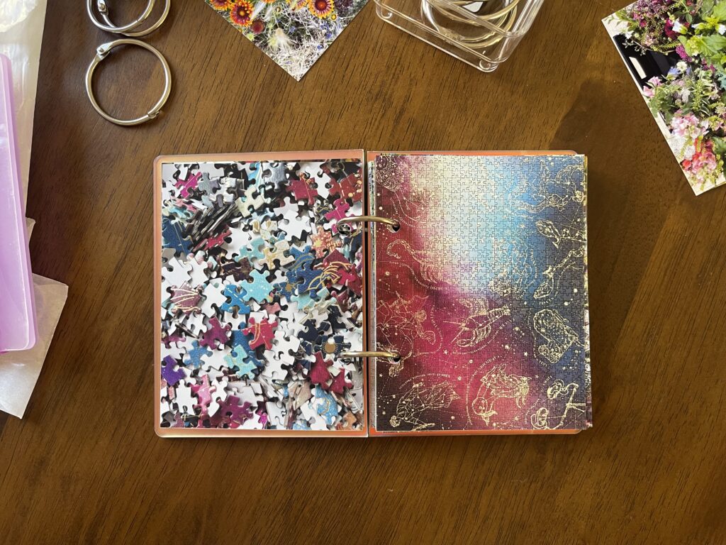
This tarot card puzzle is double-sided, which I didn’t realize until I got home and was a little annoyed about. I thought it would make doing the puzzle unenjoyably challenging. Fortunately for me, both sides of the puzzle pieces were coated differently, which made it easier to distinguish which side of any given piece was the side I needed.
Major Arcana (double-sided) by Galison, 500 pieces.
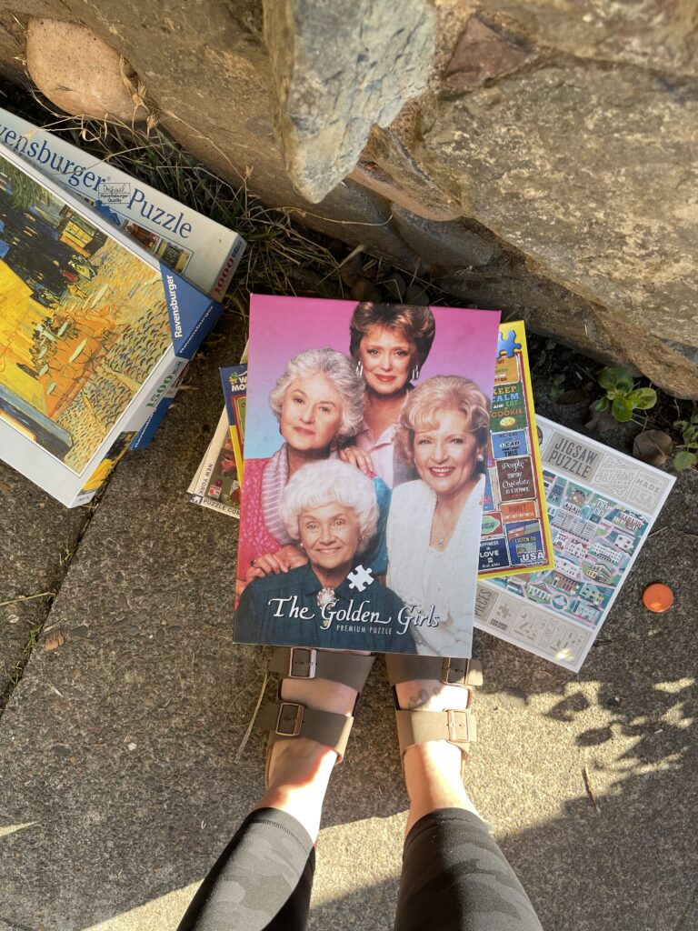
This Golden Girls puzzle was more challenging than I expected. Some of the pieces have a “normal” puzzle cut, some of them are shaped really strangely. The hair was the hardest part.
This puzzle was a very unexpected and fun find—I walked into it on the sidewalk while on my way home one afternoon. It was with a stack of other puzzles, left beneath a Little Free Library in the neighborhood. Incredibly, no pieces were missing.
It’s not uncommon to find free piles around the city. Portlanders (myself included) leave out all sorts of things—in various states of condition, and in various types of containers (or no container)—for others to take. There are almost always several free piles lining the sidewalk on my street, and I encountered a lot of free piles during my summer walks. This was the first time I came across puzzles. The Golden Girls puzzle is the only one I took and it’s for sure my favorite free pile find so far.
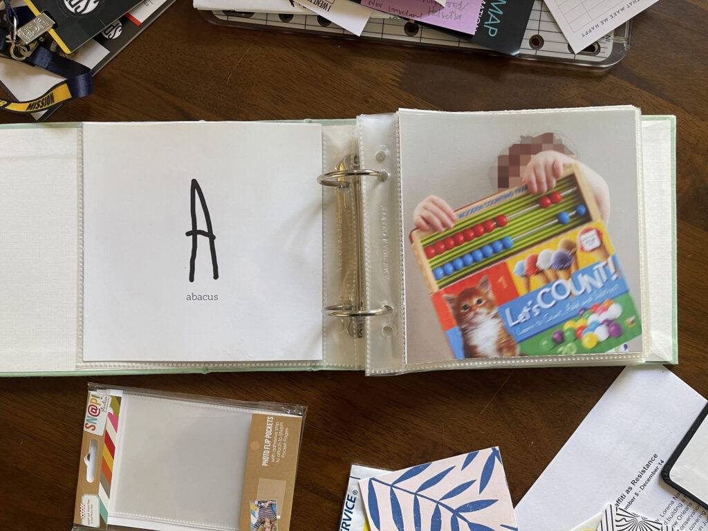
Back when my now-high schooler was still in daycare, the daycare they went to did an alphabetically themed show and tell each week. Week 1 of the year the kids brought something that started with the letter A, week 2 of the year they brought something that started with the letter B, etc. At the time, I was at the heyday of my memorykeeping practice and I decided to make a mini album to document what my kiddo brought for show and tell each week/letter.
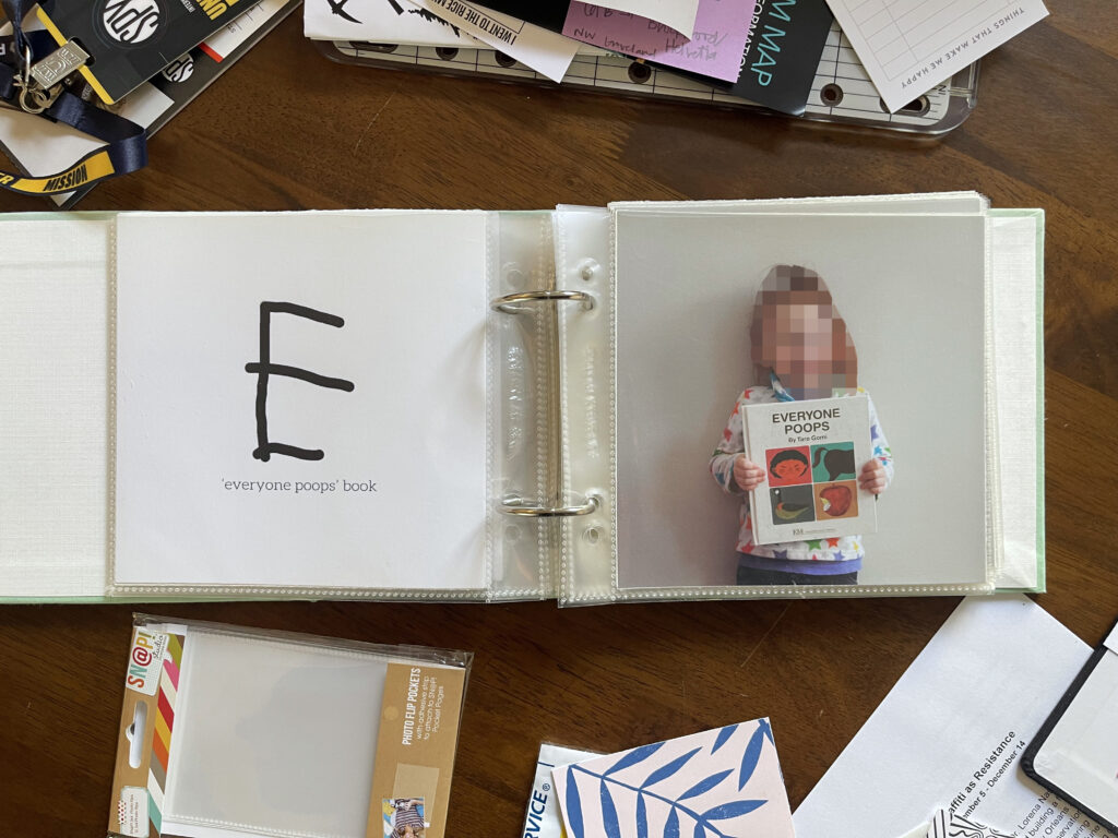
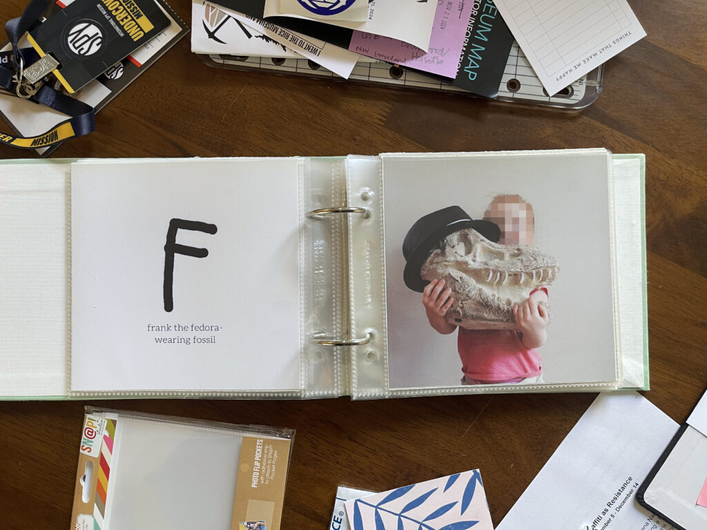
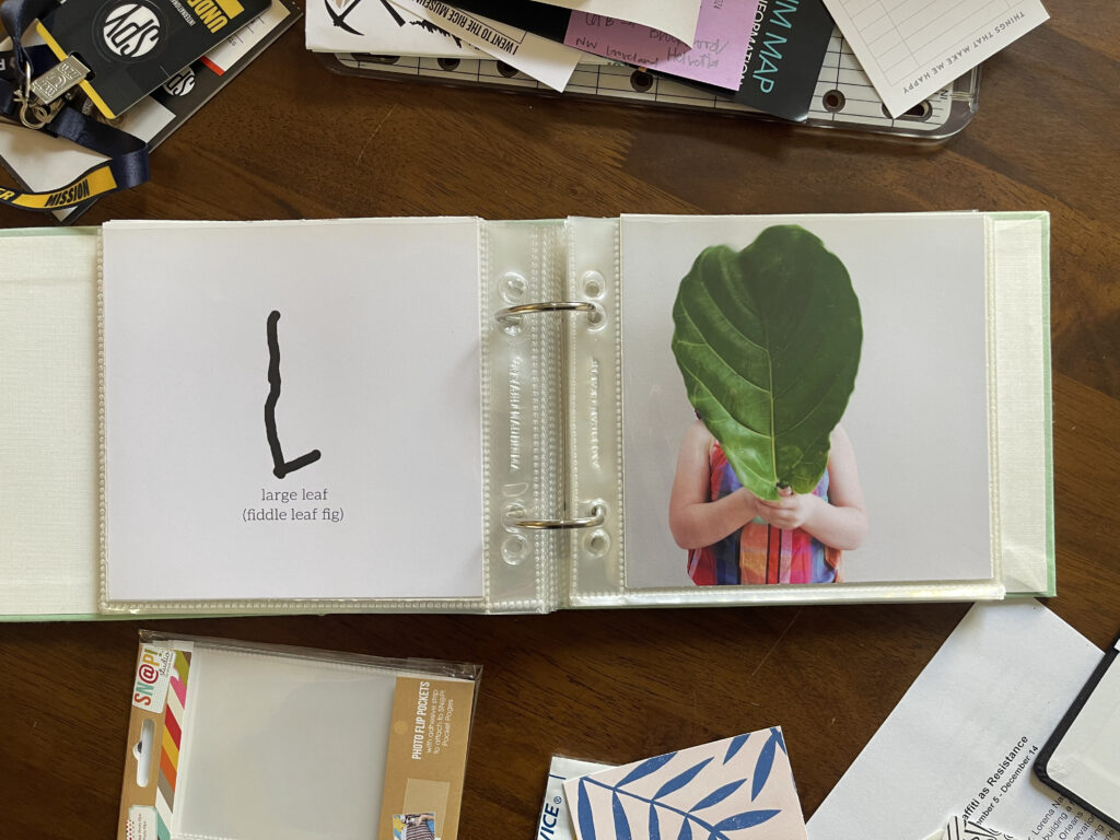
Their class at daycare was learning to write around this time and I wanted to document my kiddo’s handwriting and their progress with their penmanship throughout the course of the year too. So I did. Instead of using alphabet stickers to accompany/introduce each letter, I used my child’s handwriting. I had them use a stylus on my iPad each week to write that week’s letter. Then, I centered the letter on a 6”x6” canvas in Photoshop Elements, typed out whatever item they brought for that week/letter below their handwritten letter, and printed the page on plain white card stock that I cut down to fit in a 6”x6” page protector. For the facing page of each spread I used a photo of my kiddo holding the item they brought for that week/letter.
I recently dug this album out of storage and flipped through it for the first time in years (a decade?). Opening it up, I knew I hadn’t finished it; I thought I’d made it through only the first few letters. Turns out (!), I made it to letter M. I’m definitely bummed that I left it unfinished, and I’m so happy that I made it through as much of this project as I did—I managed to document half the alphabet. Here’s a look inside.
I know it might be hard for some to believe a child would know what an abacus is and choose to bring one to show and tell. Here’s the thing: We are a family of autistics.
Fun fact: This copy of the classic children’s book Everyone Poops belonged to my kiddo’s dad when he was a kid and comes complete with his ripped pages and pen and pencil scribbles throughout. This book, along with B.J. Novak’s modern classic The Book With No Pictures got a lot of laughs in those early years.
Frank!!! Frank was a “fossil” I bought for about $15 at HomeGoods when the kids were very young. He didn’t come with the fedora. That belonged to my youngest. Frank’s head became its home when it wasn’t on my son’s head. Frank was a beloved member of our family for many years. In 2021 we gifted him to a family with an autistic child who LOVED dinosaurs. (We thought Frank was fun and enjoyed having him around. Despite the autism, none of us were (or are) into dinosaurs in the autistic way.)
What can I say? Like everyone with an Instagram account at the time, we had a fiddle leaf fig (and a monstera) in our home.
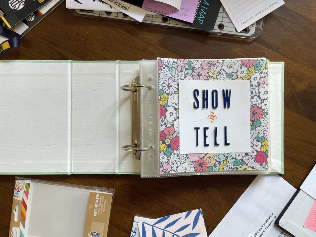
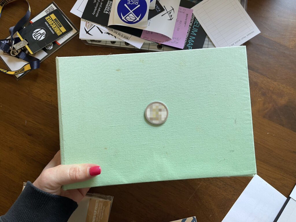
For this project I used an American Crafts cloth-covered album in seafoam (featuring one-of-a-kind accents of stains and smudges acquired from handling and storing and moving over the years). Sadly, this album is no longer available (sadly-er, many memorykeeping brands and supplies and forums and blogs have disappeared in recent years).
To the center of the front cover I affixed a metal-rimmed paper key tag sticker and then stuck a patterned alphabet sticker (blurred) of the letter of my child’s first name in the center of it. I bought a few packs of the paper key tag stickers from Michael’s years and years ago. I can’t find a listing for them on their website. Here’s a similar product from Amazon (sorry!) that you could use without the ring and with double-sided tape, or a double-sided foam sticker, or any strong glue.
For the title page (first photo at the top of the post) I cut down pieces of patterned scrapbook paper and white card stock, and used alphabet stickers and washi tape to spell out “show + tell.” At the time, I wasn’t sold on my title page so I stuck the stickers and tape to the outside of the page protector instead of the piece of white card stock. I wish now that I hadn’t. The alphabet stickers and washi tape are from a monthly scrapbooking kit that no longer exists (RIP). You can find a pretty big selection of alphabet stickers on Scrapbook.com or in-person at Michaels. You can find washi tape at a million places online and in-store at Target and Michaels and the like.
If I were to do this project again—or start it today—I would use a 4″x4″ album instead of a 6″x6″ one—and not just because no one seems to sell 6″x6″ albums anymore. Back in the day I chose the larger size because I thought 4″x4″ would be too small to document my child’s handwriting “enough” (does that make sense?). The smaller size would’ve been perfectly fine. You live and you learn. (Annoyingly, it seems you can’t buy a 6″x6″ album anymore but you can get 6″x6″ page protectors, and you can’t get 4″x4″ page protectors anymore but you can get a 4″x4″ album.)
* * *
Related: There’s a monthly Show and Tell for Grown Ups Meetup in Portland that I think would be super fun to attend. I haven’t been able to make it yet. It’s a new group and they’ve had only two meetups so far, both on weekday evenings at times that are a few hours too late for me. If they ever do a daytime session on a Saturday or Sunday, I’m there.
Years and years ago when the kids were very young and little, my then-partner and I did a lot of at-home date nights after the kids went to bed. Sometimes we’d sit out front and listen to random police scanners while eating dinner or sharing a six-pack. Sometimes we’d buy teeny bopper magazines and do all the quizzes in them while cuddled together on the couch. Sometimes we’d do “Puzzles and Podcasts Night,” which quickly became my favorite at-home date night activity and was exactly what it sounds like: We listened to podcasts while doing a puzzle together.
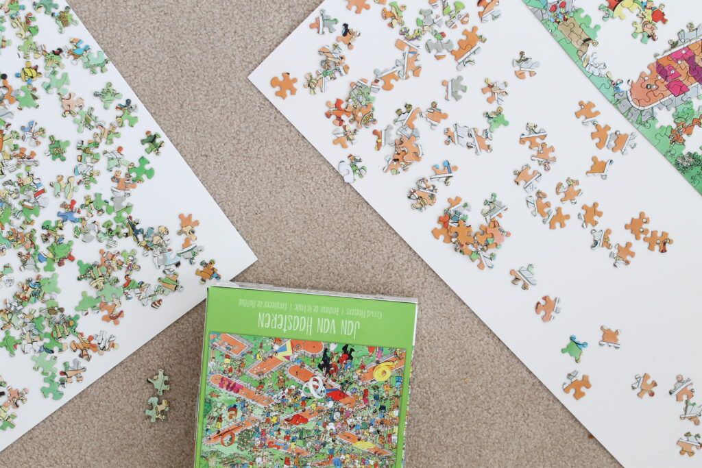
(Fun fact #1: The first podcast both of us ever listened to was season one of Serial—which had just been released and was a local-ish case (we were working in DC and living in the DC suburbs at the time)—and we listened to it while doing our first-ever puzzle together (Crowd Pleasers by Jan van Haasteren, no longer in print).)
A few years later we broke up and as the kids got older life became more hectic for me—a newly single parent—and I stopped doing puzzles. I simply didn’t have the time or the brain space.
And then the pandemic hit.
Since the start of the pandemic I’ve done 23 puzzles. Twenty-one of them are documented in this mini album. I don’t have any photos of the first one I completed during the pandemic (which my then-roommate and I completed as a distraction from the cold during a combination snow storm/power outage rather than as a leisurely activity for fun), and the most recent one I did, I just completed the other day, weeks after I ordered this first batch of photos; once I complete at least nine more puzzles I’ll order another batch of photos and keep adding to this little album.
I titled this project/album “Pandemic Puzzles.” Right now the album includes only a title page and photos of the puzzles in the order that I completed them. I plan to eventually add a puzzle log at either the beginning or the end, and if I can find numerical stickers or stamps that I like I’ll number each puzzle in the center of each left-hand page (and each numbered puzzle will correspond to an entry on the log). Technically that means this project is still incomplete. Whatever! I decided to post it because I don’t know if it will ever be properly finished and I’m trying very hard to (1) get back my memorykeeping mojo and (2) not let perfect be the enemy of good.
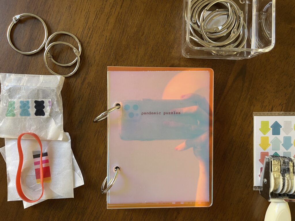
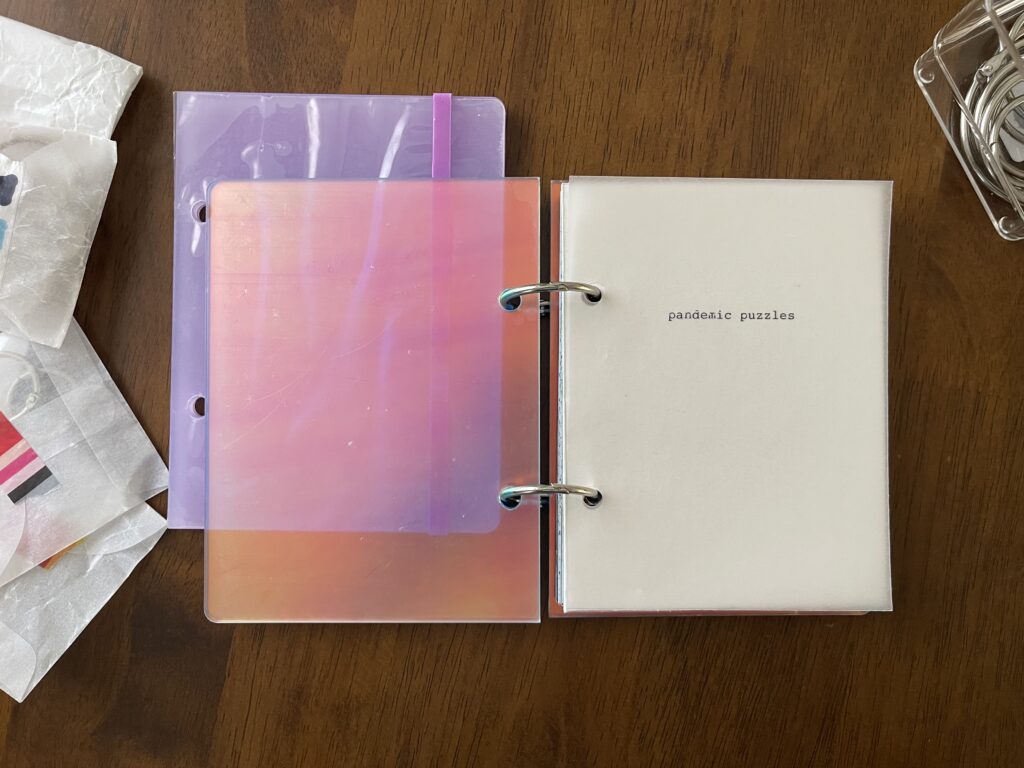
The title page is just the phrase “pandemic puzzles” typed directly onto vellum (yes, typed with an actual typewriter), which is overlaid on top of repurposed cream card stock. I had a handful of other ideas for the cover and ultimately decided on this very simple design (“design”) because all the pages inside are pretty visually heavy and busy. A simple title page feels like a good visual balance to me. If I ever change my mind on the title and/or the title page, it’s easy enough to change.
Alright. Let’s get this show on the road.
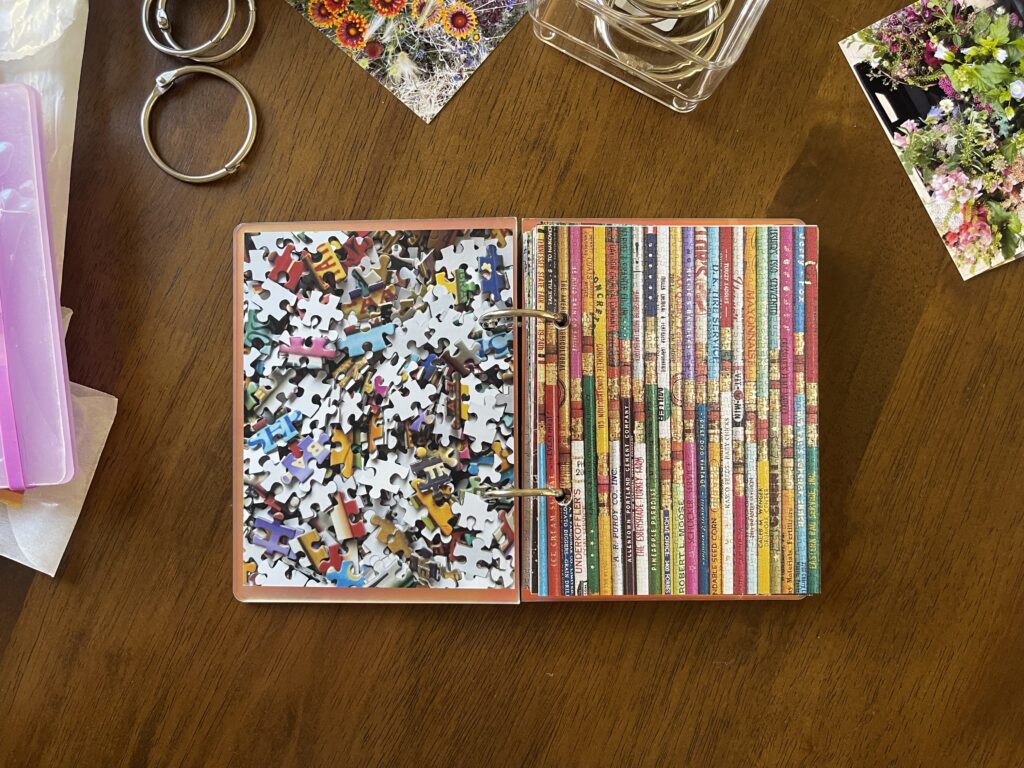
Puzzle details are in each photo’s caption. While I bought most of these puzzles from local stores within walking distance of my apartment, I linked each puzzle below directly to the brand or a puzzle seller. Many of these puzzles are probably available on Amazon for less than their list price. When possible, I encourage you to shop local or buy directly from the brand rather than Amazon.
All of the supplies I used to make this mini album are listed and linked at the bottom of the post. Again, when possible, when shopping for craft supplies I encourage you to shop local or from any retailer that isn’t Amazon or Hobby Lobby.
These next five were picked out by and completed with two of my kids. My youngest is a big fan of the SpongeBob one and regularly checks in with me to make sure I haven’t gotten rid of it (I haven’t (I haven’t gotten rid of any of these puzzles)).
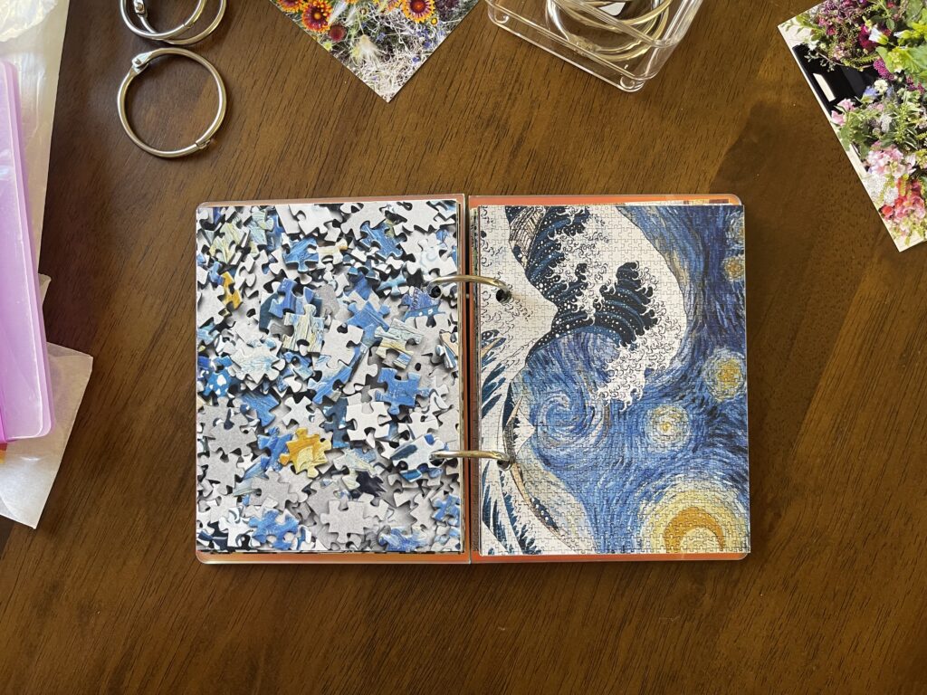
This mash-up of The Great Wave and Starry Night is one of the two most difficult and frustrating puzzles I’ve ever done. Most puzzles take me a day, maybe a weekend. This one took me months. I kept starting it and then shoving it under the couch for weeks at a time. Once, I even broke it down and put it back in the box (and the box in the back of the closet) after starting and stalling on it, which is not something I’d ever done before. I finished it out of spite.
To top it all off (!!!), it was missing a piece. I reached out to the company and they weren’t able to send me just a replacement piece. They sent me an entire other puzzle and I had to dig through all the pieces to find the missing one and, lol, because of how the pieces are cut, it didn’t even fit!!! What an experience (derogatory).
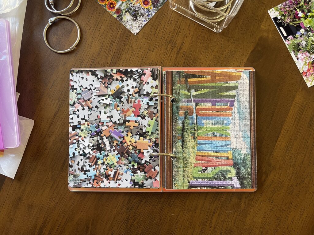
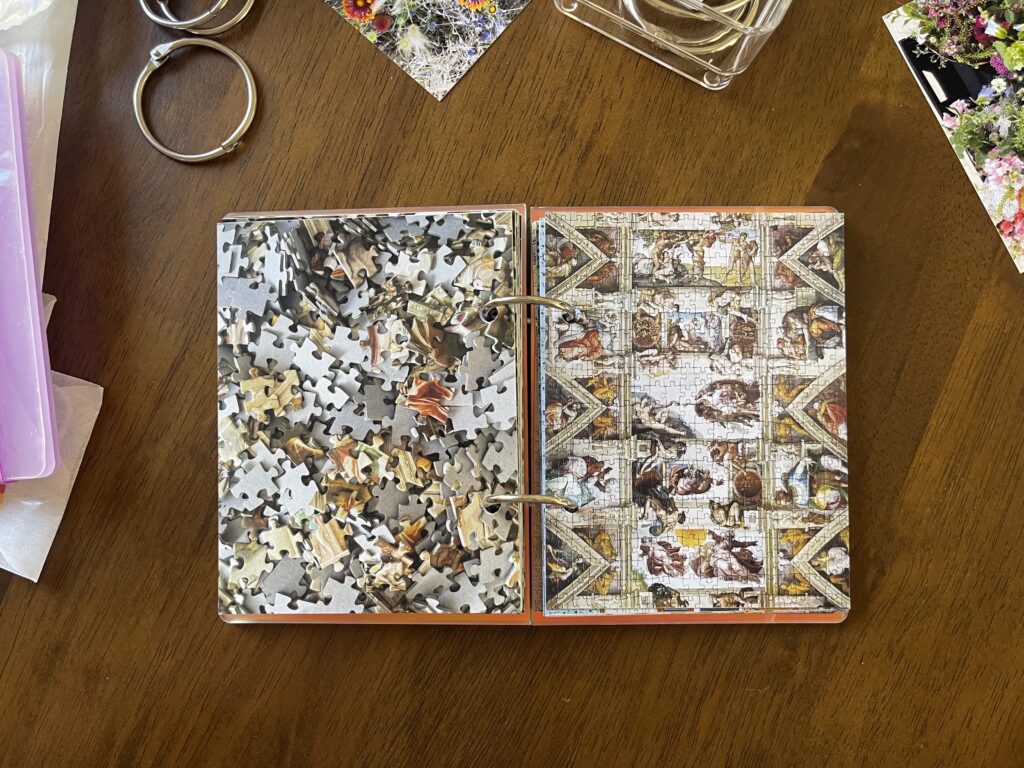
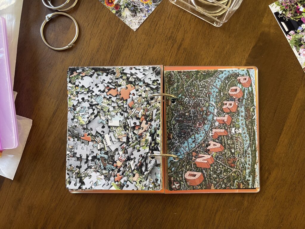
These next two were panoramic puzzles and, sadly, I had to crop out a decent chunk of the finished product to get them to fit on the page. The FANFUCKINGTASTIC one pairs well with this SHITSHOW one. The Sistine Chapel Ceiling one is a personal favorite.
Fun fact #2: I bought this boobs puzzle to do while recovering from getting a boob job in February 2022 (the irony of doing a “you’re perfect” puzzle while recovering from cosmetic surgery, I KNOW). I started it two days after surgery right as news broke that Russia invaded Ukraine. I listened to the news while I completed it, which felt like a full circle “puzzles and podcasts” moment of sorts.
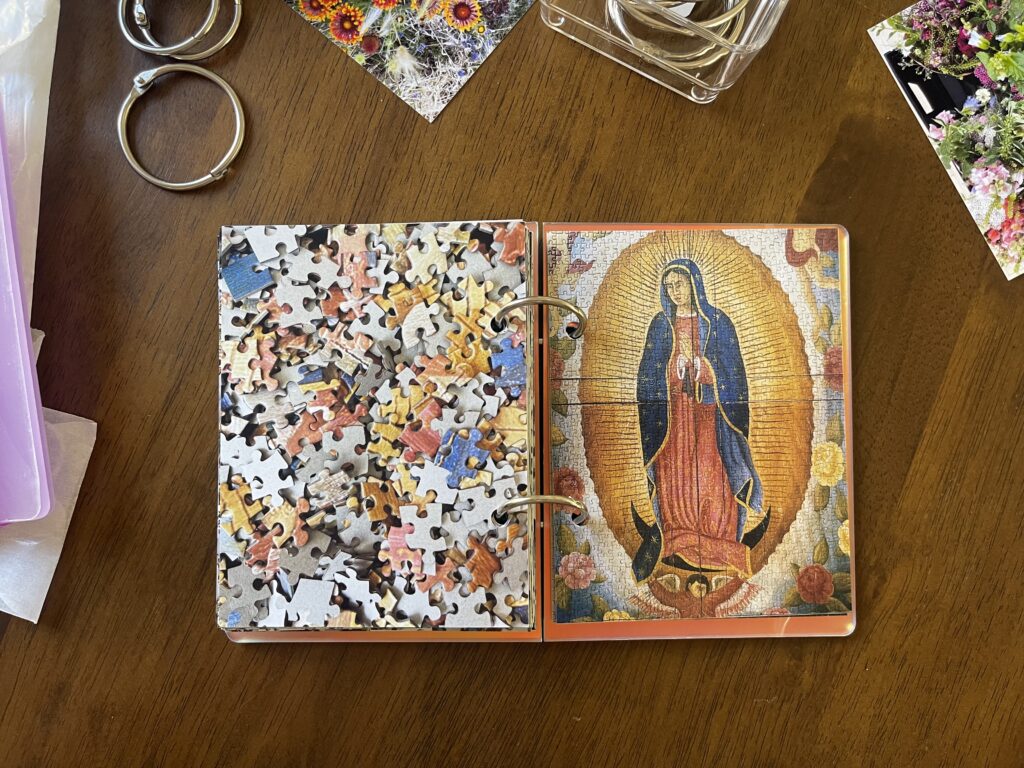
This next puzzle is the first one I completed this summer and it’s the one I counted as the “puzzle” item on my sad girl summer 2024 summer bucket list. I walked to Puddletown, a local game and puzzle shop a few miles from my apartment, to buy it, and, fun fact #3, that walk was the first one I counted toward my “go for more—and longer—walks” summer bucket list item.
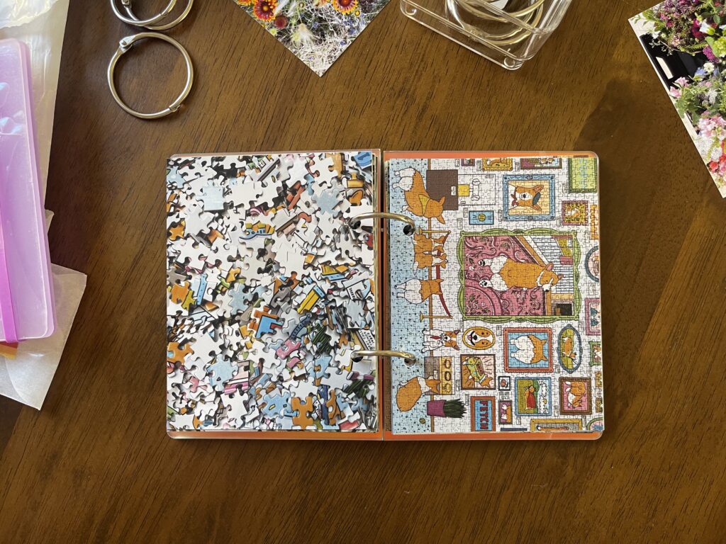
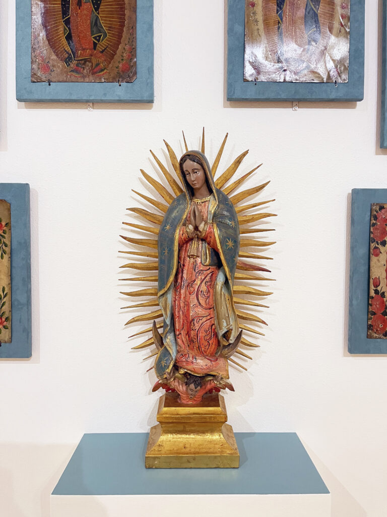
It reminds me of the Marian art at the El Paso Museum of Art, especially that framed image on the top left, which, sadly, I didn’t take a full photo of, I’m sorry!!
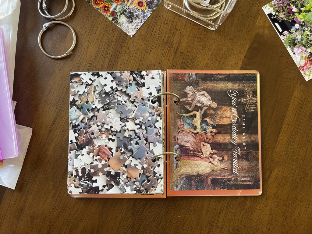
I love the imagery and creativity behind this parody puzzle. It’s by a local artist, Courtney Hiersche, who paints new scenes into existing paintings. I found it at Portland Night Market back in July. Along with the puzzle of the mash-up of The Great Wave and Starry Night, this is one of the two most difficult and frustrating puzzles I’ve ever done. It didn’t take me nearly as long as the Starry Wave puzzle but, just like with the mash-up puzzle, I absolutely did start it, then break it down and put it away before restarting and finishing it, which, just like with Starry Wave, I did out of spite.
Photos: 4 x 5.33-inch photographic prints from Persnickety Prints (janky website, unparalleled quality and customer service). $0.49 per (when you order less than 10), $0.44 per (when you order 10-19), $0.39 per (when you order 20 or more), plus $8.99 standard shipping (unless you live in or near Orem, UT, and can pick your photos up in person)
Photo adhesive: Tombow Mono Permanent Adhesive (used to adhere the backs of photos together to create pages). ~$10.00 regardless of where you buy