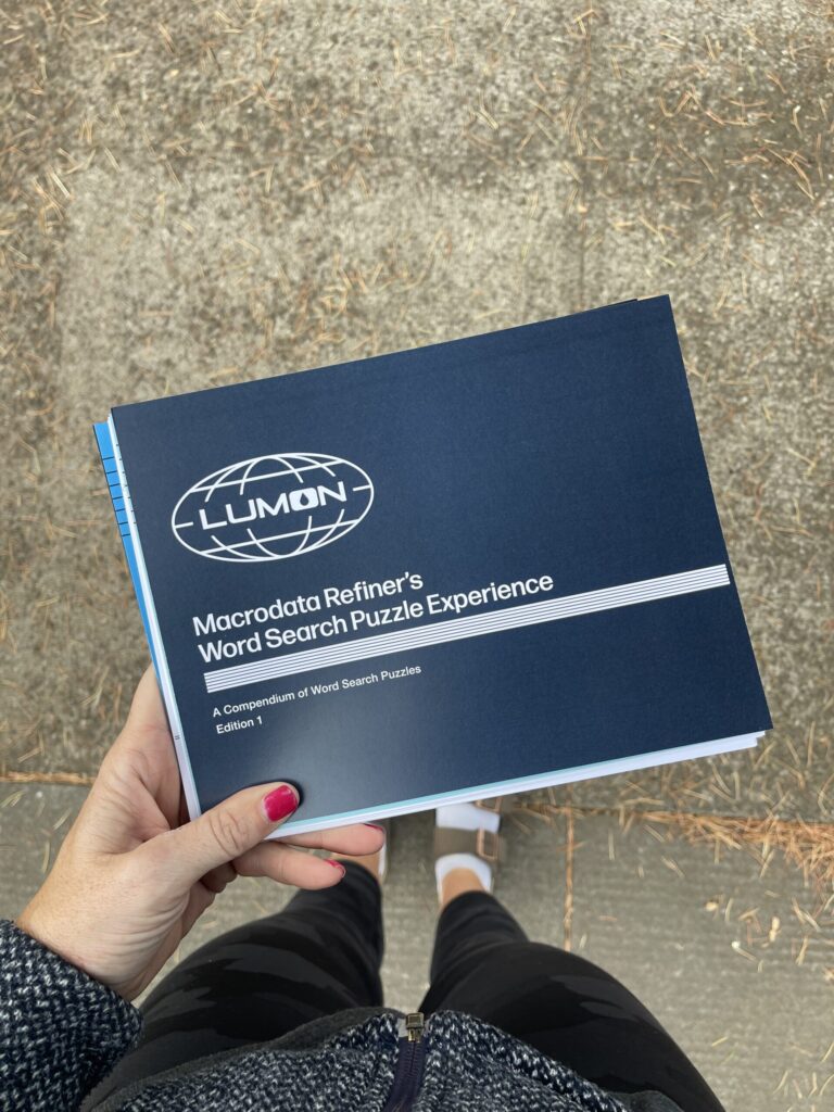
UPDATE – 2/2/2025: I added 11 more word searches—for a total of 24—and made a digital version that you can print at home available for purchase. If you’d like to be notified when a physical, bound version is available, you can sign up here. Thank you for your support!
In early 2025, I got very into word search puzzles. After completing a few hundred of them, I decided to try making my own. Almost immediately—like, minutes after thinking, “I want to make my own set of word searches”—the creative gods blessed me with the idea of making a Severance-themed collection. And so ensued a three-week-long descent into extreme, all-consuming autistic hyperfocus. The result: the most fun outcome possible.
By the end of that first day—the day the creative gods blessed me with this idea—I’d:
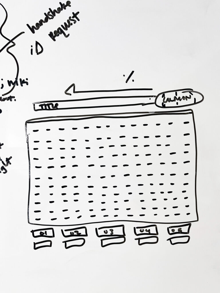
- sketched on my whiteboard a very rough idea of what I envisioned each word search puzzle would look (the MDR terminal screen);
- begun scouring the Severance wiki for every bit of information I could find about the typefaces, colors, and branded assets used for Lumon documents;
- started researching different printing techniques, paper types and suppliers, and local print shops and their capabilities and prices;
- created a spreadsheet to organize puzzle theme ideas;
- and begun the first of a ridiculous number of rewatches of both seasons, to collect possible word search themes in my freshly made spreadsheet, and to note color and design details of documents in the show.
Within a week, I’d:
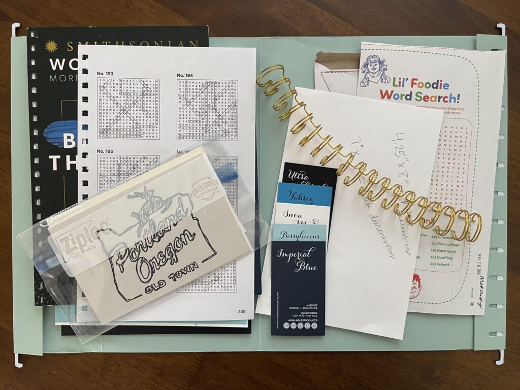
- ordered paper samples,
- emailed various stationery brands and print shops across the U.S. with questions about specific materials and techniques I wanted to use,
- researched word search puzzle generators,
- researched which design program was best for this project (Adobe InDesign),
- watched hours of YouTube tutorials on how to do a bunch of basic things in InDesign,
- scoured YouTube for a decent tutorial on how to create a word search puzzle in InDesign,
- finished several rewatches of the entire series,
- updated my whiteboard to include a very rudimentary checklist of the main project tasks and decisions,
- tentatively decided on a local print shop,
- and started a file of reference material (colors, paper weights, binding examples, printing techniques, etc. I wanted to use) to bring to the print shop with me.
At this point, I also realized I needed to make two important decisions, or else I’d never get the project out of my head and laptop and into my hand:
- I needed to pick a number of word search themes for this first run, and
- I needed to pick a date by which I’d start Adobe’s seven-day free trial.
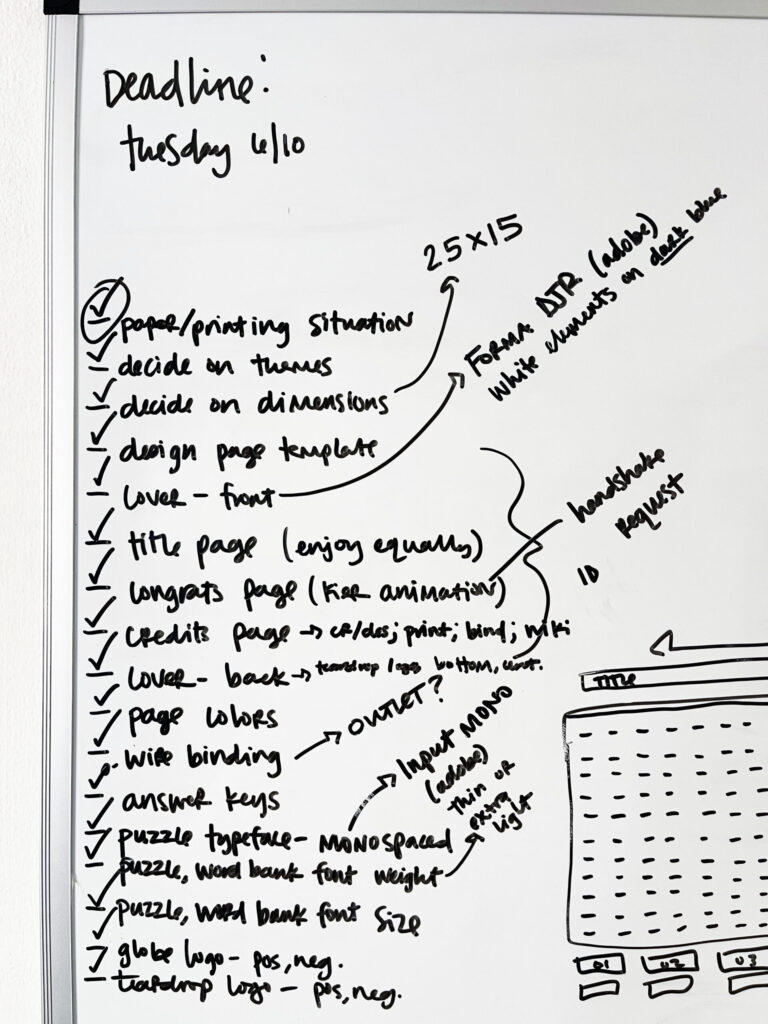
In the spirit of “make it exist first, make it perfect later,” I decided on 13 puzzles and a June 10 deadline, which gave me till June 17 to do everything I needed to in InDesign before the free trial was up.
After deciding on the number of puzzles and my “design by” deadline date, I:
- completed a few more rewatches of the series, each time paying attention to a specific puzzle theme or Lumon document design;
- decided on cover and page colors, and word search dimensions (25 letters across, 15 down);
- reviewed all the entries in my spreadsheet; chose the first 13 themes with word and letter counts that would fit the puzzle dimensions;
- created the word searches using two different online puzzle generators;
- rewatched the YouTube tutorial I found on how to create word searches in InDesign several more times;
- decided which pages would be what color; and
- committed to a printing technique (digital) and local print shop.
Because I was on a tight budget for this project, I needed to complete the entire thing within Adobe’s seven-day free trial window. Before I signed up for the free trial, I made every possible decision about the project’s design that I needed to, including visiting the local print shop I decided to use to select my cover and paper options in person, and watched enough YouTube tutorials enough times to feel confident I could do what I needed to in InDesign to bring this project to life on such a tight timeline.
Then, I researched how to cancel the free trial and walked through the steps to make sure the instructions were accurate—I needed to know in advance how convoluted of a process it would or wouldn’t be so I knew how many spoons to allocate to it (thankfully, and surprisingly, it’s a very straightforward process). Only after confirming Adobe’s cancellation process did I sign up for their free trial—which I immediately cancelled so I didn’t forget to do so later/wasn’t charged at the end of it—and got to work. I had seven days to figure out the program and get the project done.
It took me a few days to create all the puzzles and answer keys; figure out how to format the word banks (which didn’t go as planned); and settle on font sizes and weights, and the placement and spacing of the Lumon logo, letterheads, and lines. During this stage, I spent a lot of time browsing other Severance fan art/projects, mostly on Etsy and Reddit, to study the design choices other people—people with actual graphic design skills and experience and knowledge—made. Once I was happy with my project, I sent it off to the printer. A few days later, I picked up the proof.
I was elated. It was so cool to see something I worked so hard on come to life. To hold it in my hand. Prior to this project, I had no experience with or exposure to InDesign (I’d never even opened the program); I had no experience making word searches; I had no experience with professional printing concepts or conventions; and I had (and still have) no graphic design experience or skills. I was thrilled that it all turned out.
A few months later (finances), I formally approved the proof, which officially moved my project into the print queue, and the rest is history.
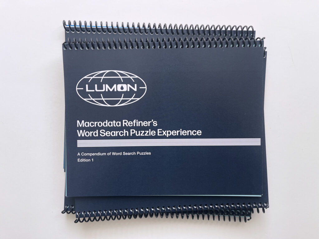
Here’s a closer look at the final product:
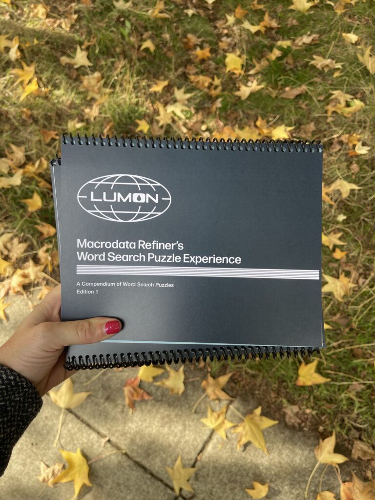
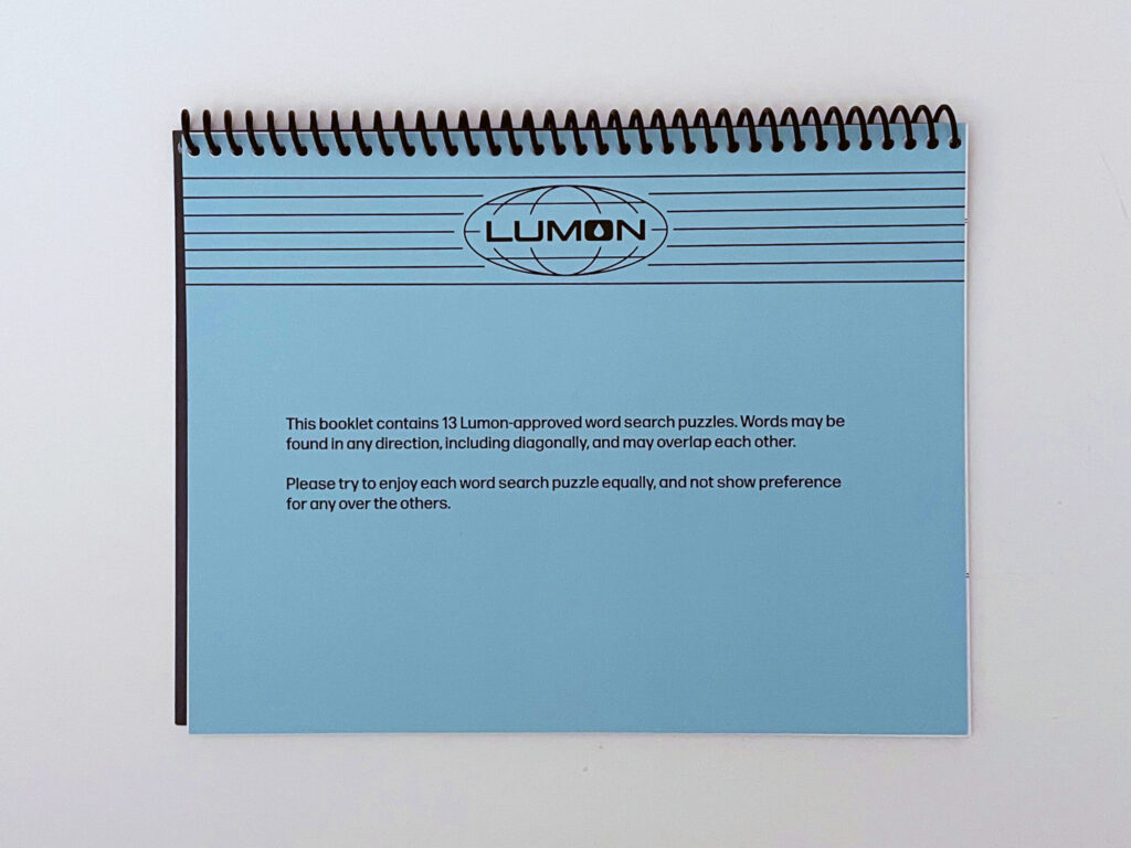
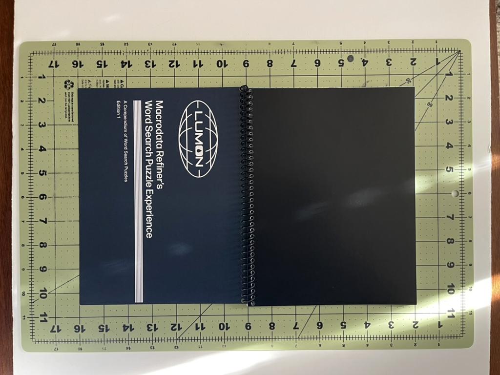
Front cover
Overall, I’m very happy with the front cover—the design, the color, the typography choices I made (typefaces, fonts, leading and kerning, placement in relation to the logo and band of lines).
The Lumon logo is a high-res image from this logo pack. I created the band of lines manually—line by line—in InDesign, using this image, this image, and various other stills from the show I took on my phone as reference for the weight, spacing, and placement, including running the band of lines closer to the right edge than to the left edge.
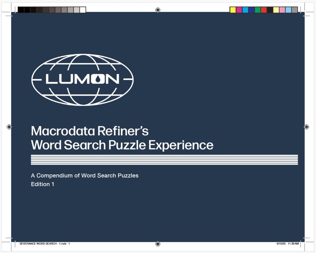
I’m less happy with the actual title. Or, rather, the second word of the title. I’m not sure why I went with “Macrodata Refiner’s…” instead of “Macrodata Refinement…” While some document titles in the show contain a job title (e.g., “Senior Refiner Morning Checklist,” and “Innie Resignation Form”), not a single document I noticed during my rewatches contains a possessive in the document title. These details are important to me—from the beginning, it’s been important to me this project be as true to Lumon branding and design as possible.
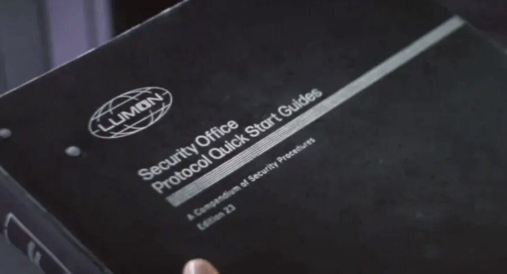
Originally, I’d subtitled the booklet “A Collection of Word Search Puzzles, Volume 1.” Ultimately, I modeled the subtitle off the subtitle of the Security Office Protocol Quick Start Guide, using “Compendium” instead of “Collection” and “Edition” instead of “Volume.”
What I plan to do differently next print run: Change the title to “Macrodata Refinement Word Search Puzzle Experience” (I plan to do this on the “Congratulations” page at the end, too).
* * *
First page
Mostly good.
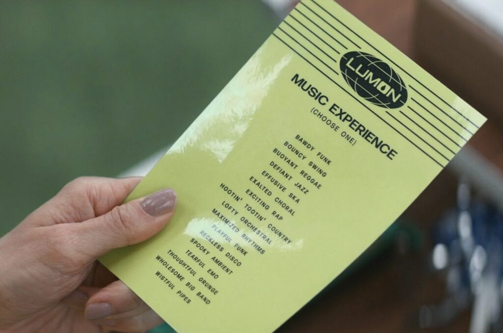
I modeled this page (and the “Congratulations” page at the end) after the Lumon letterhead, as seen on the Music Dance Experience selection card.
I created the letterhead using a high-res logo included in the same logo pack linked above, and by individually drawing each line using the line tool in InDesign. I’m not sure why I didn’t use the black Lumon logo. It’s true that the logo pack I purchased didn’t include it. It’s also true that it’s available on the Severance wiki. I have no clue what I was (or wasn’t) thinking.
What I plan to do differently next print run: Replace the transparent Lumon logo with the black one. Add the word “backward” after “diagonally.”
* * *
Word search pages
Overall, these pages turned out great. I’m very happy with how well they mimic the MDR terminal screen. My biggest frustration: the word banks.
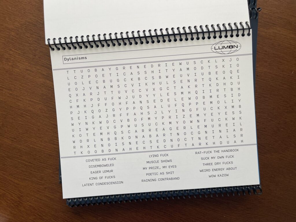
In the show, the MDR terminal screens display five evenly spaced columns at the bottom. I wanted to mimic this and divide the word bank into five evenly spaced columns. To my infinite frustration, I could not for the life of me figure out how to both divide the word bank into five equal columns and, when necessary, get the text to wrap correctly. The only configuration I could get to consistently work across all pages with all word options was three evenly spaced columns.
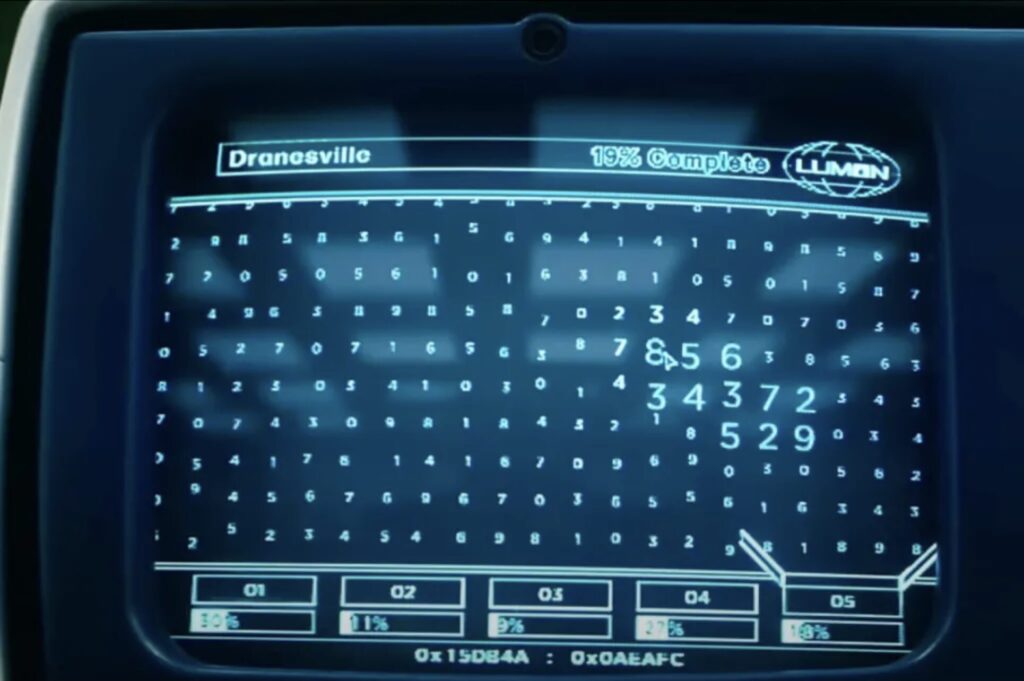
My other frustration: the sets of double lines bounding the top and bottom of the puzzle area don’t fully extend to the left side of the page.
What I plan to do differently next print run: Try to figure out how to divide the word bank into five equal columns and how to get the text to wrap correctly. Ensure the sets of double lines bounding the top and bottom of the puzzle areas fully extend to the left side of each page. Add more word searches (13 isn’t enough!).
* * *
Answer keys
These pages turned out great. I wasn’t sure that they would. To make the answers easier to read, I removed the sets of double lines bounding the top and bottom of the puzzle area. I also removed the word banks and left the placement of each puzzle alone instead of centering it on the page. I wasn’t sure how this would look and feel to the eye. I worried it might look and feel ungrounded. When the proofs came back, I was thrilled at how they turned out.
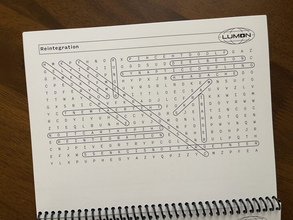
Each puzzle’s answer key is on the back side of the page the puzzle is printed on, with the puzzle reversed so that when you flip up the page you can easily see the answers key without turning the booklet around. The weight of the paper I chose is thick enough that the answer keys aren’t visible through the page.
What I plan to do differently next print run: Nothing.
* * *
“Congratulations” page
Similar to the first page, I’m mostly happy with this page. The color turned out great, and I like the size and placement of the text. My two issues with this page: the transparent Lumon logo, and the possessive in the text.
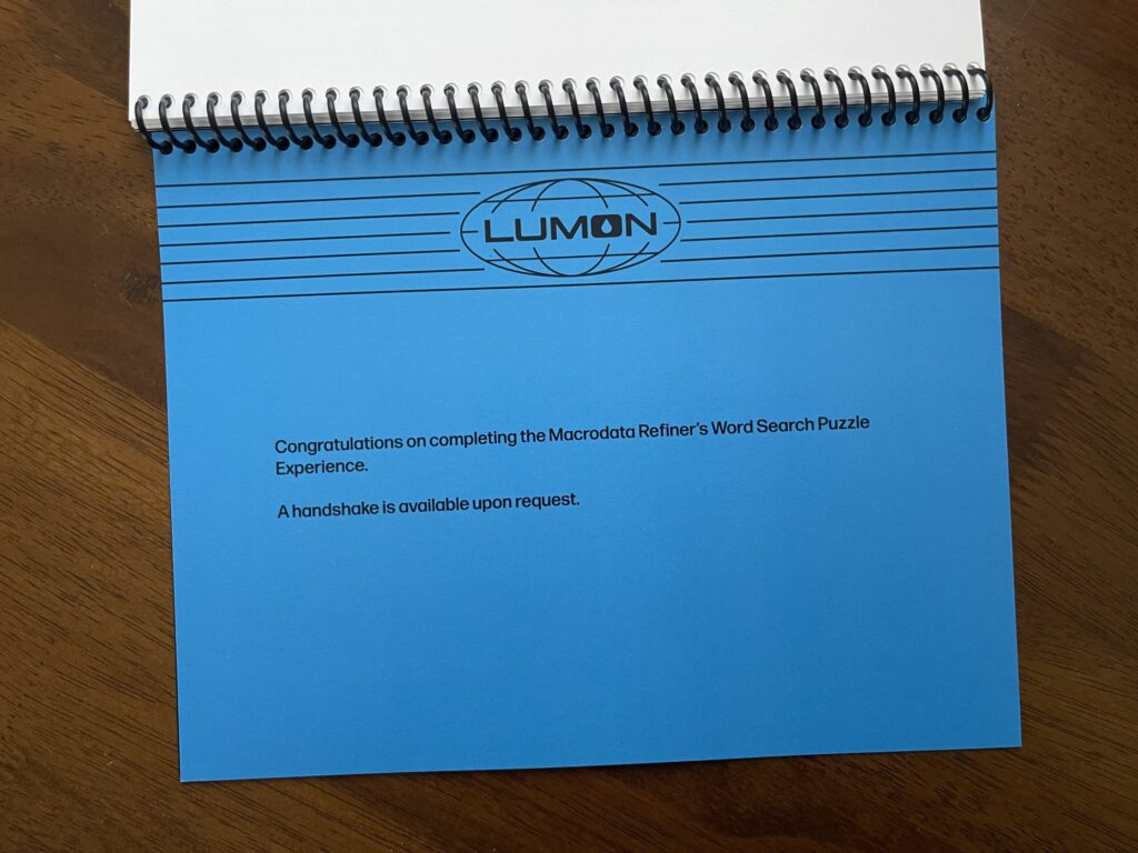
What I plan to do differently next print run: Replace the transparent Lumon logo with the black one. Remove the possessive: change “Macrodata Refiner’s…” to “Macrodata Refinement…”
* * *
Credits page
Modeled after the show’s end credits, I’m very happy with how this page turned out. Perfect. 10/10. No notes.
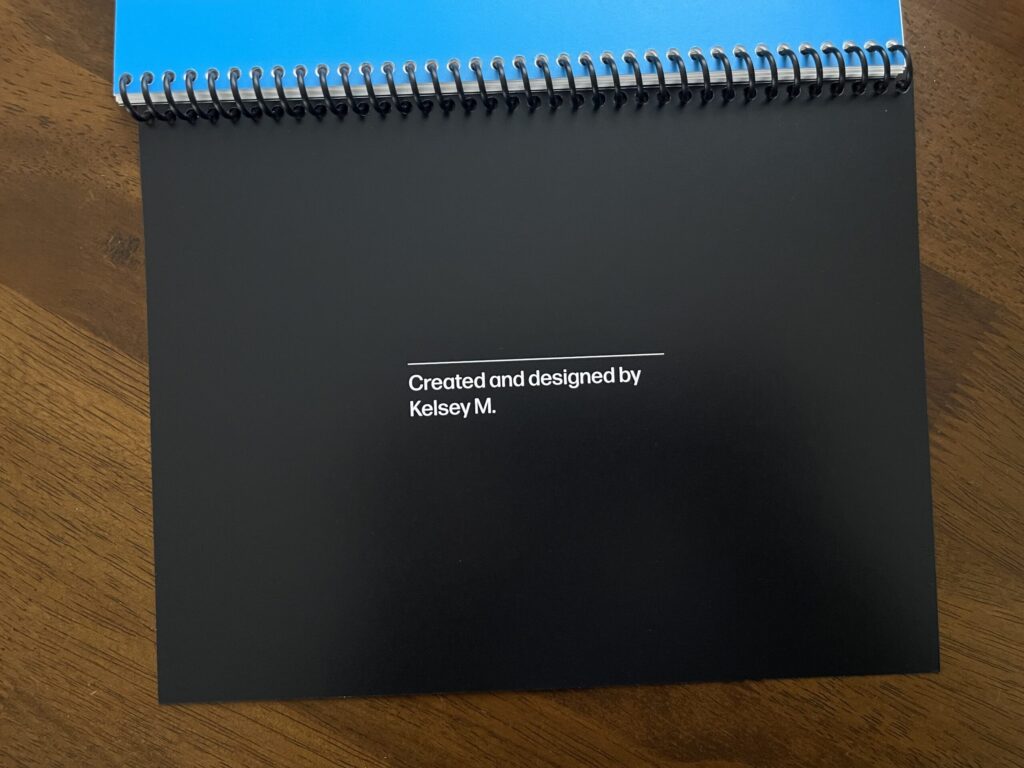
(Related: this interview with the artists responsible for the show’s title sequence.)
What I plan to do differently next print run: Nothing.
* * *
Back cover
In this first run, the “credits” page doubles as the back cover (it’s printed on cover weight paper). It’s fine. In a dream world, the “credits” page would be a regular page and the back cover would be thick chipboard, with a small Lumon teardrop icon debossed into the bottom center on the back. Unfortunately, none of the local printers I asked are able to do this.
What I plan to do differently next print run: Convert the current back cover (which is the “credits page”) to a regular page and use the same cover weight and color of paper as I did for the front cover, with a small white Lumon teardrop icon centered at the bottom on the back.
* * *
Binding
In all of my rewatches of the show, I noticed only one example of a bound notebook—the Wellness Center steno notebooks carried by Ms. Casey (in S1E5, she’s holding one while observing Helly R. in the MDR office upon her return to work after her elevator incident, and is later seen holding a stack of them while walking through the halls). These notebooks are bound using Wire-O binding color-matched to the front cover.
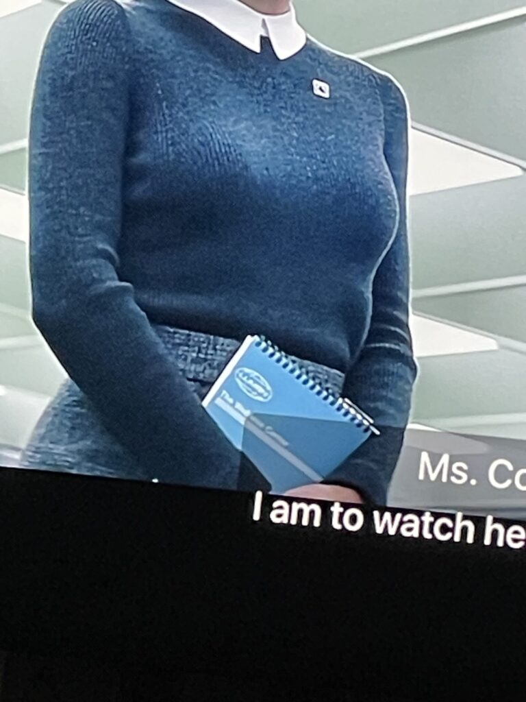
For this reason, I was determined to use Wire-O binding color-matched (as best as possible) to the blue of the booklet’s front cover. Unfortunately, the printer I worked with doesn’t offer Wire-O binding in-house and the binding service they outsource this type of binding to quoted me a ridiculously high dollar amount that was miles outside my budget ($100 for 5 bindings; $20 each). I found a place in town that lets you Wire-O bind your own material using their supplies and tools, for only $0.60 per binding plus a $7 facility day-use fee. After reviewing the proof and seeing how thin each booklet is with only 13 puzzles, I decided to skip Wire-O binding with this first batch and opted to have the printer spiral-bind each booklet in-house, which ran me $5 per booklet.
Two things are true: the binding is well-done, and it’s not what I wanted—and for that second reason alone, I’m not happy with it. I had my heart set on Wire-O binding for three reasons: it’s authentic to the bound notebooks in the show; it’s more durable; and it provides a more polished look. I’m determined to use it for the next print run.
What I plan to do differently next print run: Wire-O binding. The next print run will have more puzzles/pages, and will therefore be thicker and, I anticipate, better suited for Wire-O binding. I’m hoping to use a dark blue identical or similar to the color of the cover. If that’s not an option, I plan to go with black.
* * *
Orientation and dimensions
Because I was set on having the word search puzzles mimic the MDR terminal screens, the collection of puzzles is bound horizontally. It was also important to me that the size of each booklet adhered to common word search book dimensions. Each booklet measures 7″ x 9″, which is similar to many other popular collections of word search puzzles. Before committing to those dimensions, I measured all of the word search books I have at home, and researched the dimensions of a number of top-selling word search book online.
What I plan to do differently next print run: Nothing.
* * *
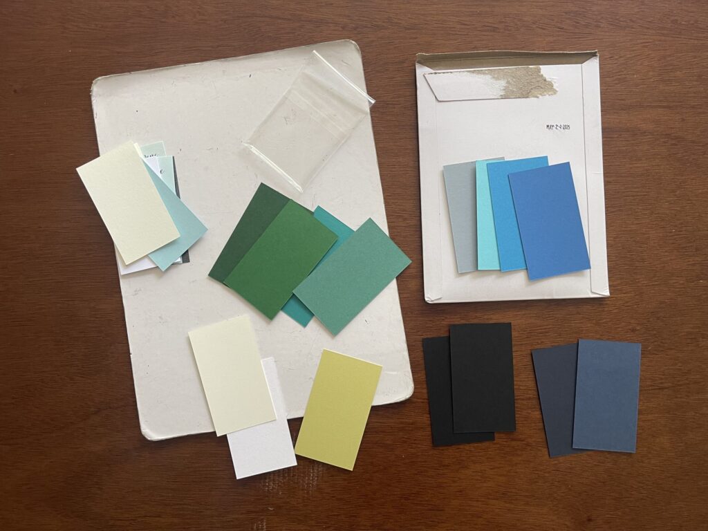
Colors
I’m very happy with the colors I chose.
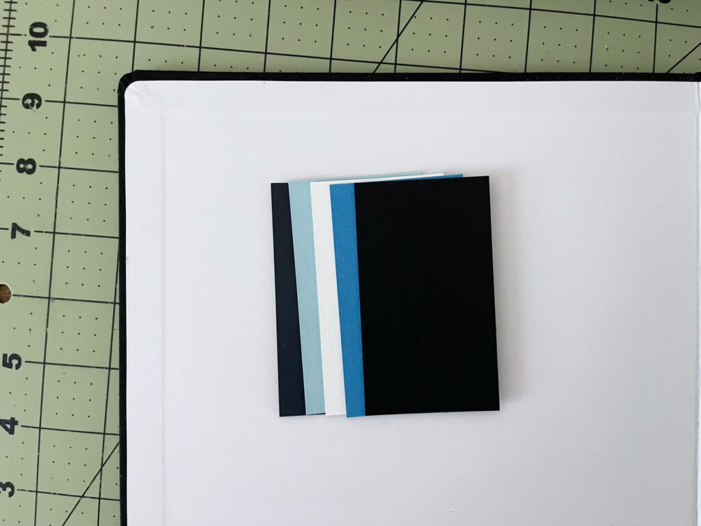
Originally, I was set on having the text of everything except the puzzles and answer keys printed on colored paper, so I ordered a bunch of paper samples in different finishes, weights, and colors. I quickly learned digital printing made more sense for this project (you live and you learn). No problem. I used the CMYK values of the colored paper samples I liked to make each colored page the correct color in InDesign.
What I plan to do differently next print run: Nothing.
* * *
Typography
I stayed as true to the show’s typography as much as Adobe Fonts allowed, and I think the typography—all of it—looks great.
The typography section of the Severance wiki was the primary resource I used when deciding on typefaces and fonts to use. I also found this article—written by the design studio and foundry responsible for one of the typefaces that features most prominently on the show—helpful.
What I plan to do differently next print run: Nothing.
* * *
I’m very grateful I had enough time, executive functioning, and money to take this project on. I had so much fun working on it, I’m very proud of how it turned out, and I cannot wait to bring version 2.0 to life.
UPDATE – 2/2/2025: I added 11 more word searches—for a total of 24—and made a digital version that you can print at home available for purchase. If you’d like to be notified when a physical, bound version is available, you can sign up here. Thank you for your support!